We are in a new space age.
Entrepreneurs, government spinoffs, advocacy groups, scientists, engineers and companies are competing and collaborating with each other to get humans into space on a scale and for reasons vastly different from that of the 1960s, when America and Russia were pretty much the only players, each alternately one-upping each other to prove military and technical superiority.
We have come a long way from simple hand-painted letters & logos on airplane hangars. We live in a world that takes human-made satellites for granted, of a constant human presence in orbit, and where the entire population can download images transmitted from the furthest planets of our solar system.
But many of us are eager for the next steps… an opening of space travel to everyday people, a return to the moon, a first visit to Mars. Those who are acting to get it done have a need to communicate who they are and what they represent quickly and accurately, via the branding they present to the world.
Thus, we present to you a survey of the visual identities of prominent organizations that are endeavoring to bring you and me, along with their logo designs, beyond Earth and into space!
The Nasa Insignia Logo
The famous “meatball” logo, as industry folks call it, has been in use since 1958, when NASA, the National Aeronautics and Space Administration, formed out of NACA, the previous National Advisory Committee on Aeronautics.
![]()
The meatball logo was designed by James Modarelli, who worked at the then Lewis, now Glenn, research lab, and is inspired by a supersonic arrow wing, a design that at the time was at the forefront of flight development. That wing is the red “swoosh” in the mark.
![]()
The above image shows the reference for the red swoosh “a twisted and cambered supersonic wing model, made of wood and designed to be tested in wind tunnels”, and has been taken from the blog What’s The Red Shape in NASA’s Meatball Logo? which is worth a read.
Other symbolism within the logo is fairly straightfoward: it’s circular like a planet, there are faraway stars to show us where we’re going, and an orbiting spacecraft to show us where we are.
Throughout the years, the logo has received its share of criticism, among them that it’s too “pictorial”, “obvious”, “goofy”. As a childhood space fan, I can’t help but love it.
In 1975, as part of an overal “Federal Graphics Improvement Program”, the logo was changed to the red lettered monograph commonly called “The Worm” (see a PDF of the brand guidelines here).
![]()
But the change didn’t last, and since the 1990s the old meatball logo has returned. Sometimes classic is best, especially when it comes with such a rich history.
Roscosmos State Corporation (Роскосмос Russpace) Logo
![]()
During the Cold War, there was no direct Soviet counterpart to NASA.
The USSR’s space program relied on a number of different agencies, sometimes competing, sometimes cooperating, and sometimes subject to their program heads getting sent off to work camps. All of it was classified.
But after the USSR split, the space program did too, into a Russian and Ukranian agency, the most significant of which is the former: today’s Roscosmos State Corporation. Interestingly, this happened the same year that NASA’s logo meatball returned, and some have accused the Russians of “ripping off” the NASA logo.
To be truthful, in the space logo business overall, there are lots of “trends”. Below are a few examples, all of which are clearly inspired by the Nasa logo.
At least one illustrator feels the Roscosmos logo needs a redesign. Tonya Khangishieva worked on a proposaed redesign which we love… What’s your thoughts?
![]()
View the full Roscosmos redesign project on Behance here.
European Space Agency (ESA) Logos
One logo that’s unique in comparison to the others mentioned so far is that of the European intergovernmental organization ESA, which also has a storied history and has had branding consistency since its creation in 1975.
![]()
According to this Reddit Feed on the origins of the ESA logo…
The concept came from the joint effort of three people: Martin-Pierre Hubrecht (ESA Publications Office), Petty Brown (ESA Public Relations Service) and Jean-Marie Schourgnoz, a graphic designer from the company ‘New Print’.
Within the icon sits an e, which represents both Earth and Europe, positioned within the globe icon to show the location of Europe, with the small dot representing a satellite. The concetric lines show parallels, but are also symbolic of a fingerprint, adding a human element to reference ESA’s mission to search for the basics of life on other worlds.
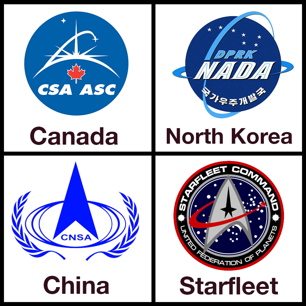
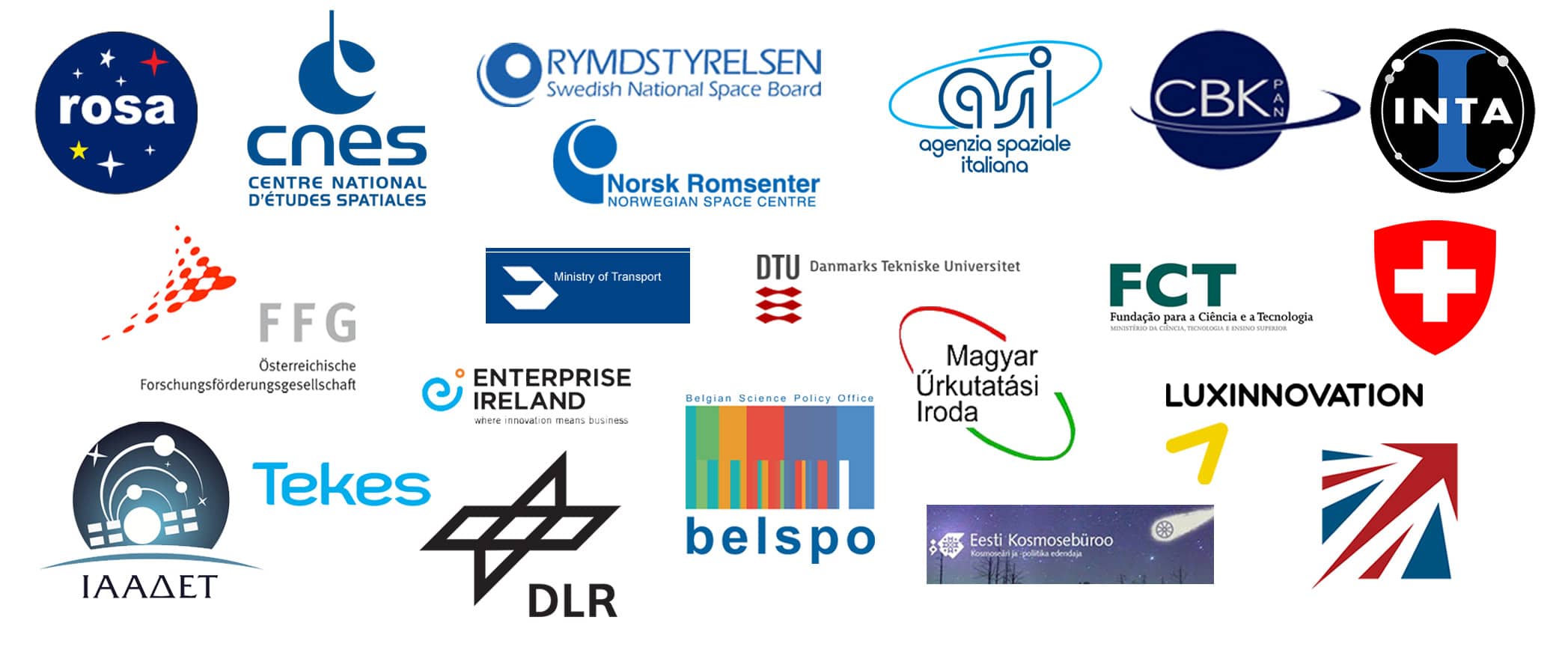
The ESA has over twenty member states, most of which also have their own space programs. Some of their logos are fairly standard, some are inventive, and some are, well… interesting. Take a look for yourself below…
European Southern Observatory (ESO) Logo
![]()
The European Southern Observatory does not send satellites or humans into space, but it does send our eyeballs and imaginations.
The ESO operates and oversees powerful telescopes in the Southern Hemisphere, primarily in Chile, that are shared among researchers from all over Europe and other partner nations. They’ve been in the news lately, as one of those scopes, the Trappist, confirmed the discovery of a exoplanetary system containing seven earth-like planets.
As to the emblem itself, the stars are those of the constellation Crux, or Southern Cross, and the lettering is indicative of the era in which it was born (1962).
The artist was a Mrs. G. M. Pot, who simply submitted a few designs to a Committee, and in what must be one of the easiest branding selections in the history of a multimillion dollar organization, simply chose the one in which “the stars show at their best”
The Planetary Society
![]()
The Planetary Society is a nonprofit whose mission is “To empower the world’s citizens to advance space science and exploration”. It was founded in 1980 by Carl Sagan, Bruce Murray, and Louis Freeman.
Prominent members and leaders include Buzz Aldrin, Neil deGrasse Tyson, and current CEO Bill Nye.
The logo does share a planetary curvature and a swoosh like some of the others presented here, but in this case they come together to form both the “P” of the main word, and the evocation of a distant ringed planet partially lit by the sun.
In its whole I personally feel this logo has composition problems, however, the “P” icon is really nicely designed (see below), and is often used in isolation for easier branding, printing, and recognition.
![]()
Space X Logo Design
![]()
SpaceX is no longer a startup, but it feels like one, a very successful one.
In its short teenage life, it has completed a vertical rocket take off and landing, been the only privately funded company to dock a spacecraft at the International Space Station, and generally helped to inspire a new Space Race.
The SpaceX logo goes against an aerospace tradition of preceding or following the words of the company with a graphic symbol by heavily styling their last letter, the “X”, which stands for “eXploration”. According to Elon Musk, the founder and company CEO, the stylized “X” is meant to represent a rocket trajectory.
The mark was designed by Prado Studio, in collaboration with Ro Studio. Prado also designed marks for SpaceX crafts themselves, mainly the Falcon launch vehicle and the Dragon space capsule.
![]()
Airbus Wordmark
![]()
When talking space specifically, we’re talking “Airbus Defense And Space”, one of three divisions that make up the European conglomerate, Airbus.
Although it is one of the oldest entities around when it comes to things that go into orbit and beyond, a signficant corporate consolidation and rebrand in 2013-2014 resulted in an overall new look and mark that has been quite consistent over the entire Airbus Group. Thus, the logo itself is one of the very newest of the aerospace and space industries.
The rebranding effort was led by agency Lambie-Narn, who endeavoured to create an identity that symbolized confidence going forward as a new organization, but that also didn’t forget over half a century of history (in one form or another – there’s been plenty of structural fluidity in that time, via mergers, acquisitions, name changes, what have you). Satellites, launch vehicles, components of the ISS, planetary probes and planetary landers are all part of Airbus’ story.
When placed among its competitors and rivals, the logo proves unique and bold, relying solely on simple, elegant lettering. There is no swoosh, no direct symbolism, no real attempt to fit or adopt any of the much-used tropes seen in other marks, like circles, stars, or what you may notice referencing the rest of this article.
Fulfilling a desire to increase brand awareness among the wider public as much as possible requires simplicity and stability, and went into the decision to reform and revisualize as they did.
Virgin Galactic Logo
![]()
What’s a record company doing on this list?
Well, yes, Virgin started as a record company. That’s why the logo looks like a scrawl you may see on a napkin, or the walls of a club bathroom – that’s what owner and longtime face of the company Sir Richard Branson was supposedly going for when he signed the Sex Pistols back in 1979.
But now Virgin is the parent of an airline company, and is aspiring to be the parent of a space tourism company under the name “Virgin Galactic“.
The Virgin logo is already widely recognized, so the agency that got the gig, GBH, didn’t change or reboot, but placed the existing mark inside the iris of an eye, in fact, Branson’s eye, and made it “spacey”. The typeface is Elevon, created explicitly for the GBH project by Dalton Maag, and it’s as science fiction, or shall we say science reality, as you can get.
The imagery lends itself to excellent marketing opportunities, and it does achieve a feel like it belongs in a real future, for example as illustrated in these promotional materials. Check out the Virgin Galactic promotional video below.
Here’s hoping we indeed see the iris flying on the side of a spaceplane above earth’s atmosphere soon. The company has not yet brought any tourists into space, but it has had a number of flight milestones and has contracts to launch various satellites into orbit, testing for which is scheduled to begin in 2017.
Hubble ESA Information Center Logo
![]()
It may be a division of an overall organization we’ve already included, but it’s really cool when the shape of the instrument your group is all about can conveniently substitute as the first letter that begins that instrument’s name.
This logo also bucks some of the other trends, by not being round, by being easily reproduced in one-color, and by using simple lettering and working basic shapes to build up to the overall form.
Credit for this icon goes to Martin Kornmesser and Lars Lindberg Christensen.
Space.com Logo
When you have the best URL by far of any space-based media site, you have to pair it up with a good logo.
![]()
In order to get there, Space.com has gone through several rebrands over its 17 year history, more than NASA and more than the ESA combined, over all their total years.
The latest Space.com logo, introduced in 2016, does have a little bit of similarity to the NASA “Worm”, in its omission of the crossbar of the “A”.
The new look is tighter, smaller, and works better with all the new media and mediums that a modern logotype needs to communicate in.
Space.com may never put their mark on the wings of a space shuttle, but they will continue to be integral in spreading the news about who is, and what we’re doing and finding out there.
And some final words…
Spaceflight involves a vast number of people and organizations, some of whom direct their services towards the wider public (a space tourism outfit), and some towards a very narrow audience (an engine parts manufacturer).
For all involved, though, any customer is going to require confidence in the brand… from the smallest component to humanity’s most expensive and exotic vacation, space travel is a risky endeavour and those bringing it about are not faint-hearted or reticent to attempt big things.
So when an entity does want to brand, and brand well, there is a need to have the visual identity reinforce this sense of sureness, adventure, and, let’s not forget, pride. When you do something exceptional, you want the solar system to know it. You leave your name, a symbol, a recognised design, where you’ve intrepidly endeavoured. After all, people and countries have been leaving their marks and flags as long as we’ve been exploring.
So make those marks count.
Learn how to create custom type logo designs
Many of the designs featured in this post make use of custom typography. If you’re a designer and want to learn more about customising type, I highly recommend checking out this new course from one of my design heros, Aaron Draplin, Customizing Type with Draplin: Creating Wordmarks That Work. By clicking the link you’ll also get a free months premium subscription giving you access to a wide range of logo design tutorial videos. Enjoy!
A big thank you to Breyen Katz for writing this post. To follow Breyen and his work visit www.gazfilm.com