

In this episode of the Logo Geek Podcast, Ian chats with Bill Gardner, the founder of corporate/brand identity design firm Gardner Designs as well as Logo Lounge, the searchable logo design database who release an annual trend report for graphic designers. Bill is also the author of Logo Creed, which is a fantastic read. In this episode we discuss Logo Lounge and the annual logo design trend report.
What is Logo Lounge?
Logo Lounge, founded by Bill Gardner, is a huge online database of logo designs submitted by a community graphic designers, including some of the biggest names in the business.

To access this database there is a small annual fee, but it offers impressive search filters including country, type, colour and keyword, that makes Logo Lounge one of the best places to search for and find logo design inspiration when working on your next project.
Along with your subscription, each logo you submit is also considered to be included in the best-selling book series from Logo Lounge, which is now on its 10th book.

I was really proud to be on the jury for book 9 and to also have a couple of my logo designs included in that book too. For me that opportunity was a very rewarding part of my career as a freelance designer, and fellow designers who have been included in the books take pride in their achievement.
The Logo Design Trend Report
Every year Bill puts together an annual logo design trend report, which details any noteworthy changes for that year. In this episode we discuss just a few of the trends from 2017, however, click here if you’d like to see the full set. Below are a couple of the trends discussed, including Shadow Breaks, and Simplicity.
Shadow Breaks
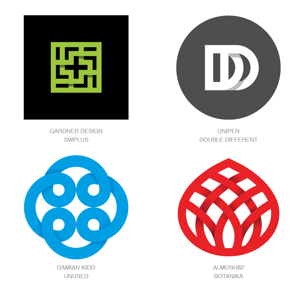
Simplicity

If you prefer to watch and listen rather than read, you can watch Bill talk about the trend report in his series with Lynda Learning on the subject. Below is a short segment from that series, which I discovered on YouTube!
–
Black & White Logos?
In this episode we talk about how logo design no longer really needs to be designed to be used in black and white. However, there are still some instances where a single colour logo might be needed, so it’s important to create a separate version of the logo for this purpose to ensure the logo you design is versatile.
We spoke about the BT logo as an example, and for comparison below I have shown an image of the full colour logo, and to the right a black and white variant. This is a great example of how it should be done!

I discuss this topic in a previous blog, which you might be interested in reading: Does a logo need to work in black and white.
For more great insights listen to the podcast interview with Bill Gardner. You can listen on iTunes, SoundCloud, Stitcher or Google Play Music.
Thank you to FreshBooks for sponsoring this episode of the Logo Geek Podcast.