Question: Does a logo design need to work in black and white to be successful?
Answer: No, but it depends on the needs of the business.
Not so long ago colour was a premium to reproduce, so it was standard practice for a business to have a black and white version of its logo to use in single colour documents which could be printed at a fraction of the cost. Now however print costs have been considerably slashed removing the need. What’s more is that we no longer live in a paper dominated world, but instead consume information through our phones, tablets, laptops and desktop computers, and there’s certainly no premium to use colour in the digital world.
The first logo design to challenge designers on this topic was the original identity created for Microsoft Network back in 2000 and was panned by the design community as being impractical. Within an age of changing technology, however, it demonstrated that age-old logo design rules were no longer a necessity online.

Although no longer essential, before a designer and business owner should abandon the possibility of having a single colour version of a logo there are some considerations which need to be taken seriously. You should work out where the logo design will be used, and question if a single colour design is a necessity for your business needs.
Where could a single colour logo design be used?
Although we live in the digital age, there are still a high number of ‘offline’ locations where a business may need to resort to a black and white (or single colour) version of its logo. In most cases there are workarounds, however, in some instances it would cost substantially more to have a full-colour version.
Let’s look at a few examples where a single colour version may be used.
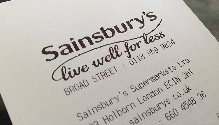
Printed logo on Receipts
If you’re going to sell products in a shop you will need a till system that prints out receipts. Although it’s now possible to purchase colour receipt printers, they do cost more to purchase and run, meaning you will most likely use a black and white version.
You do however have the option of having paper printed rolls where your logo design is printed in full colour on the reverse side.

Frosted vinyl’s on glass windows
If you have an office and have glass meeting rooms or entrance doors it’s a nice feature to have frosted vinyl’s stuck to the glass, giving a sense of professionalism and luxury. A logo which doesn’t work in single colour would not allow this to happen.

Newspapers and books
It’s becoming less of a necessity to promote your business in this method, but some newspapers and books (such as the Yellow pages) are still prominently printed in black and white, so your logo needs to at least work in grey-scale to be printed in this way.
It’s easy to disregard this one, but it’s important to consider that it’s not always only you who will be using the logo. On occasion, you may need to pass your logo files to a 3rd party company, such as an event organiser who wishes to feature your logo in their show materials. Even if print cost is not a problem for you, don’t forget that you don’t have any control over how your logo will be reproduced by others.
Promotional Merchandise
If you plan to promote your business at exhibitions and events you will most likely want to have promotional merchandise such as pens, notepads and bouncy balls. Due to the process involved to produce these, it’s common to have the logo printed in a single colour.
It’s not something I’ve looked out for myself, but it’s likely that promotional printing suppliers can print more complex coloured logo designs, but I expect this will substantially impact on production costs.

Image source: http://www.promo-brand.co.uk/
Logo Engraving / Embossing
If you want to get your logo engraved or embossed on something, the design will need to work in single colour. This is most likely essential for jewelry companies.

Design the logo for the best of both worlds
I’m a strong believer of a logo working in single colour, so when I design a logo I aim to have the best of both worlds. It’s actually possible to have a logo design that works well in full colour as well as single colour, providing a modified version is created and used in these scenarios.
Let me show you an example of a logo design I created for Geek Eyewear, which doesn’t immediately work in single colour. The below example shows what would happen if I turned this directly from colour to black and white.

As you can see all the hair of the heads have now gone, and the identity no longer works.
When working on this design I understood this would be a problem, so I also designed a version which would function in a single colour (see below) so the logo will work in all the scenarios mentioned above. I make sure to include this as part of my logo design process, so every logo I design works in single colour.

The future of logo design
It’s only really been in the last few years that print costs have been considerably reduced, and digital environments have become more commonplace. This means that we’re in a new age for logo and identity design and that the guidelines set out by the early design pioneers of are becoming less relevant.
Although there are some scenarios where a single colour logo design is still needed, these situations are becoming less with each year, so its becoming less of a problem.
Now is an exciting time for graphic designers and start-up business alike. We are the generation who can break the mould. Now is the time to break boundaries and take identity design further than has ever been done before!
What’s your thoughts on the topic? I’d love to hear. Share your thoughts in the comments box below.
* Featured image source from Should we retire the black and white logotype?
