Last week Google made a tiny tweak to its logo design, repositioning the lowercase L and G. Although a minor change this did cause a lot of online discussions, with mocking from the non-design community such as: “Can You Spot Google’s Hilariously Imperceptible Logo Redesign?”
Here’s a before and after comparison, so you can see for yourself – can you see the difference?

As discussed in a related post by The Drum, this change wasn’t actually pointed out by an ‘eagle-eye’ graphic designer, but instead, a Reddit user who noticed the image location URL had changed from “logo10w” to a “logo11w”. Google hasn’t made any official statement why the logo change was made, although after some thought I believe I understand the reason why from a design perspective.
Refining the Logo Kerning and Alignment
Below I have added a guideline to the ‘before’ logo showing the alignment of the letters. As you can see the ‘L’ sits above the others, with no obvious reason why. I’m not a font expert so not certain if there would be a justifiable reason for the original alignment, however, personally I feel this is something that needed fixing.

When you reposition the L, the kerning (spacing) between the ‘L’ and ‘E’ becomes subtly too wide in proportion to the remaining text, so it would then make sense to reposition the L to the right subtly to close the gap.
By moving the L right, the space between the lowercase G and L becomes slightly too large, and thus needs modifying, so it makes sense to also reposition the G as they did in the revised version.
Looking at the Bigger Picture
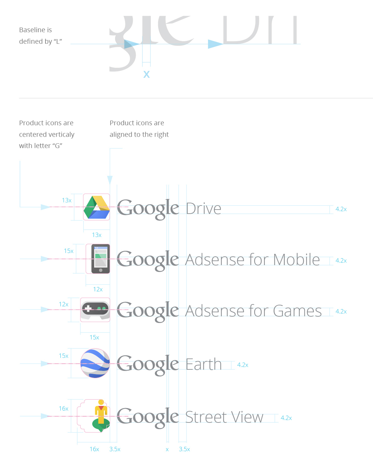
When you start to look at the bigger picture, the reasoning for the above logo changes become much more evident. I discovered Googles Visual Assets Guidelines on Behance. Included within this document are mockups showing the logo lockups for marketing materials. Looking at the image below you will notice that the baseline of the supporting text lines up with the ‘l’, thus essentially being misaligned with the rest of the logo.

It’s easy to question why the designers at this stage of the process didn’t ‘correct’ the logo, or align the logo lockups with the e’s and o’s, which at first would make more sense.
Firstly, if you was working on logo designs for one of the world’s highest profile companies, would you feel you could ‘mess’ with the logo? Probably not. Even if you wanted to, can you imagine the volume management levels and approvals you would need to allow such a change?
With the logo lockups in this case, if the text was lined up with the e, it would look wrong due to the visual dominance of the L. It therefore makes sense from a visual perspective to line it up with the L.
At a small scale, the apparent error is less evident, but in larger formats, it would become clearer.
Are more logo design changes needed?
If we’re going to start getting really picky with the design, personally I believe there are some other ‘minor’ areas of the logo design which could be refined further.
As Google have now moved the lowercase G subtly over to the right, the kerning between the O and G now looks wrong. Also, since we are aligning the L, the capital G could also be subtly repositioned accordingly. To maintain alignment I would also increase the height of the L so it lines up with the tip of the G.
To illustrate my subtle refinements I have included an animated image below showing the comparisons between the logo designs.

And here’s the logo refinements with guidelines included to illustrate the design changes.

Was the original logo actually ‘wrong’? What’s your thoughts on my modification? Would you make any further refinements? I’d love to hear your comments and thoughts below.
