Almost everyone has a smartphone, and almost all of us use Social Media. It’s transformed how we communicate and consume content on a daily basis. This change is having a direct impact on how designers are approaching logo design, and in this blog, I want to talk through a few of the developments I’ve noticed.
We need to design for super tiny sizes
Social media has become one of the fastest, cheapest and easiest ways to interact with your target audience. For that reason, it’s very likely to be the place where people will see and engage with a companies brand identity the most.
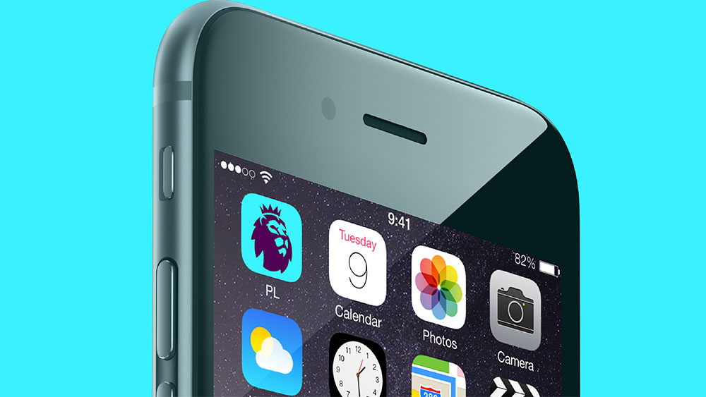
This means your logo needs to be instantly recognisable at about 8mm (depending on your phone of course).
Designing for small sizes is nothing new. It’s common practice to design a logo that’s versatile (read my SMART logo principles for more common practice logo design tips), but before social media, a super tiny logo was not so important. In the pre-smartphone-era, a logo would most commonly be seen in an email signature, on the top bar of a website, on the packaging, and the shops exterior – meaning 50mm was realistically the smallest a logo would be seen (I’m ignoring 16-pixel favicons as they have always been tucked away anyway). Here today, because of social media, for an identity to have an impact it must look good at super tiny sizes.
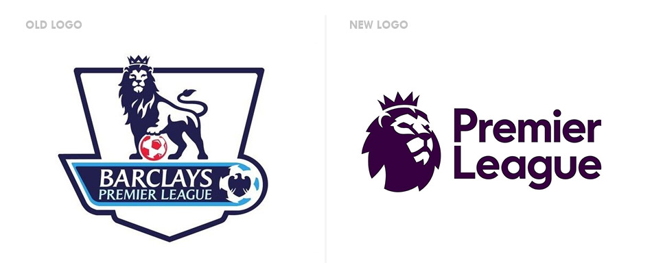
An example of a brand identity that’s evolved because of the developments in social media is The Premier League, who launched a new logo in February 2016 designed by global agency DesignStudio and Robin Brand Consultants.
The previous Premier League logo included a full lion, wearing a crown, and holding a football with its paw. At a small size the illustration within the logo looked too complex and cluttered, appearing somewhat unprofessional. The revised design includes only the lion’s head, which is a much more simplified icon that looks great on social media, yet still has a dramatic impact at larger sizes too.

(Note: I hate football, so this is the most excited you’ll see me about it ever, and hopefully the last time in a while I’ll bring it up again… ☺)
An identity of this magnitude will definitely have a direct impact on how sports logos are designed, but I also expect it to have a wider impact too. Designing with social media in mind is definitely the way to go, especially if you know that’s where your main audience will interact with your brand.
Logos designed to adapt and change
Because of how we interact with brands and communicate online logos can be changed instantly. This has presented a unique opportunity where logos can be adapted at any point to raise awareness of ideas, topics and situations.
The term ‘Logo Systems’ has been used to describe this type of logo, and they are designed as a framework that can be modified, whilst remaining identifiable.
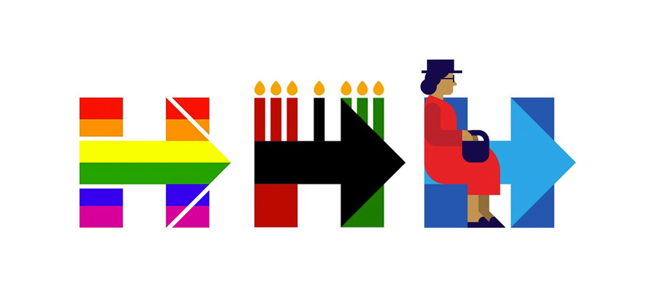
The most interesting identity of its type is the logo designed by Pentagram partner Michael Bierut for presidential candidate Hillary Clinton. This is another logo that works effectively at super small sizes on social media, but I’ve found how it’s been used to be very interesting. The logo acts as an identifiable window to raise awareness and draw attention to political issues, events and ideas.
It has a lot of power and influence. By changing only her twitter icon to a variant of its logo, Hillary Clinton is able to draw attention to any topic, without using words or any other imagery than her logo.

What’s even more interesting is that the general public can join in too, by customising the logo for things that matter to them, and simultaneously supporting the presidential candidate in the process. The logo is simple enough to be drawn by anyone, unlocking endless doors for brand engagement by just about anyone.
I stumbled across a video featuring Michael Bierut, where he discusses his design for Hillary, logo systems, and what makes a truly great logo. Check it out below (If you’re a designer it’s well worth your time – I promise).
Negative feedback & designing identities to impress
When a logo is launched it sparks huge discussion online. Thanks to social media we can instantly share our opinions of a logo, and every man and his dog have an opinion to share. What’s scary is that this feedback is instant, and globally visible to anyone, meaning both the company it represents and the designer responsible will see every word of it.
My worry is that this will put pressure on designers and influence their design decisions… I’m concerned designers will feel pushed into designing something new, clever and exciting, in the hope the world will love the work, instead of designing what’s ‘right’ – and what’s right might just be a little… ‘uninspiring’.
People don’t like change – I get that. It means any change, even if it’s good will cause some form of negativity. Brands are an important part of people’s lives, so messing with a brand identity in any way can be upsetting for some. But the media and even some professional designers give such shocking negative feedback that if you’re the designer at the end of it, you’ll likely take some of it to heart.
(Note: If you’re a designer please don’t be one of those that send an instant jabs of negativity. It’s unfair to publicly scrutinise another designers work, and it just makes you look stupid. Take the time to understand why it’s designed that way. Think something’s not right? Maybe you lack some knowledge. Read into it more, or speak to the designer to learn from them. They are the one working on high profile design work for a reason. Read my blog ‘I don’t like that logo redesign‘ for more discussion on this topic)
I believe that the most successful logos are those that correctly symbolise what that brand stands for and successfully meets set goals. A logo doesn’t need to be clever or original, but the social world wants to see ‘creativity’ and ‘clever and original work’ – if it’s not that, they don’t like it.
As a designer if you’ve succeeded to meet goals, and can back up your decisions, you can proudly stand by your work, and know you’ve designed something great. Yes, you’ll get negative jabs, but ignore it and crack on with the next high profile and successful project. In 20 years time once the design has settled in you’ll be seen as one of the greatest designers of your time ☺.
Want to discuss anything mentioned in this blog post? Find me on twitter – lets chat.


