When it comes to logo design, personally I don’t believe there are any rules. In the words of Paul Rand: A logos primary goal is to identify… to say who the company is, and that’s its only function.
Although rules don’t exist as such, there are proven guidelines that can be learned from the great graphic designers of the past – we can see what’s worked for them (as they have stood the test of time), and what hasn’t. Looking at past logo designs, we can see principles which apply to all the best of these. These principles can be made into a simple acronym… SMART:
- Simple
- Memorable
- Appropriate
- Resizable
- Timeless
I’m really proud to be on the jury for Logo Lounge book 9, so part of the way I will rate the designs will be based on how ‘SMART’ the design is (although a major part of a good logo is its execution – a well thought out logo design which has been badly executed is quite simply… a bad logo).
Below I have described why each of these factors is smart choices when designing a professional logo design.
Simple
Logos that have stood the test of time, and that have been successful have been very simple – just look at identities such as Nike, Apple, IBM and Mcdonalds for proof of this. In fact, you will notice that all the top 100 most powerful brands have simple logos.
We’ve also seen that designs which were complex from the outset have been simplified over time to increase recognition. Take a look at the Starbucks logo evolution below for proof of this in action…
![]()
Jeff Fisher, a logo designer and book author sums this up nicely in this quote:
“Simple logos are often easily recognised, incredibly memorable and the most effective in conveying the requirements of the client.”
Paul Rand, one of the greatest identity designers of all time (an inspiring figure for me), made the following comment in his book Design Form and Chaos
“A design that is complex, fussy, or obscure harbors a self-destructive mechanism. No amount of literal illustration will do what most people imagine it will do. This will only make identification more difficult and the “message” more obscure.”
I go into more detail on this topic in my blog from earlier in the year: Maximum message using the minimum of means.
Memorable
The company logo is the one component of a brand identity which is likely to be included on every business touch-point, therefore, you want people to remember it. Memorability is achieved through simplicity, as people remember simple shapes faster.
Colour plays a vital role in the recognition of an identity too. This is proven in an experiment by Brazilian graphic designer Paula Rupolo, who swapped the colour schemes of competing brands.
“Colours are the first thing you notice in a logo, what gets fastest to our brains,” she says. “Then you read a logo’s shape, icons, or typography.”
![]()
Appropriate
A logo should be appropriate for its intended audience.
For example, if you aim to target children you might, for example, use a fun, bold typeface, whilst this same style wouldn’t be appropriate at all for a corporate law firm.
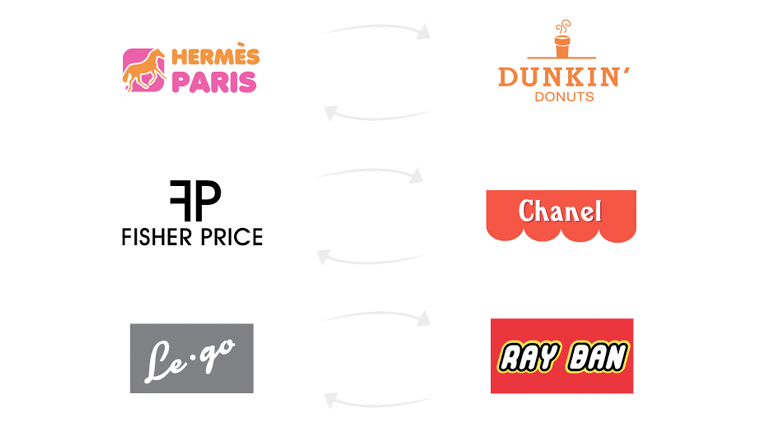
The best way to illustrate the impact of this is by showing an experiment by Hanna Giles, which is similar to the one mentioned above, however, this time the designer has swapped the styling of iconic brands instead.
“The brands I chose couldn’t be further from each other in terms of style,” she explains. “This is probably the only time you’ll ever see a Chanel/Fisher Price mash-up, but that’s really the point. What works for one type of product doesn’t necessarily make sense for another.
“All the small details and choices you make when creating a new logo matter, so be thorough and make sure you’re selling to the right audience.”
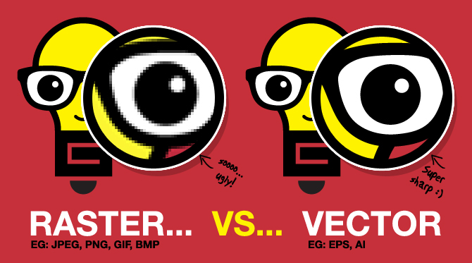
Resizable
A business logo will be used in a number of different locations, from the side of a pen to the side of a building – It needs to work effectively at both 10 millimetres and 10 meters. Go back to the top 100 brands, and you’ll notice that almost all of these are instantly recognisable at even the smallest sizes.
For this reason, a logo should be designed in vector format, to ensure it can be scaled and easily reproduced any required size. Click on the image below to read a blog I wrote which discusses what a vector file is, and why it matters.
Timeless
An effective logo should be timeless and stand the test of time. How will the design look in 5, 10 or even 50 years? Avoid using logo design trends as they date quickly. David Airey, author of Logo Design Love makes a good point in his comment below:
Leave trends to the fashion industry – Trends come and go, and when you’re talking about changing a pair of jeans, or buying a new dress, that’s fine, but where your brand identity is concerned, longevity is key. Don’t follow the pack. Stand out.
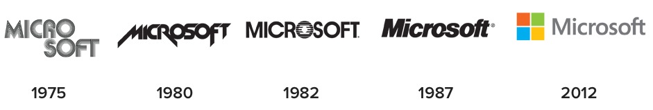
You only need to look at the history of the Microsoft logo below to see the effect following trends has on a logo – they continue to this day to follow trends with each revision.
And how about the Radio Shack logo below? It’s clearly from the 60s and 70s, but at the time it would have been seen as ‘on trend’. Now however it looks dated (although retro, which is kinda cool again I think!).

So the next time you design a logo remember to think smart. Do you have anything to add to the list? Share your thoughts and comments below.
This blog was inspired by an excellent article ‘what makes a good logo’ by Jacob Cass, which I highly recommend reading.