Around this time last year I received an email that announced that I had won a gold award in the International Visual Identity Awards for my logo design work for Bathily. Thanks to that I was kindly invited to be on the jury for the 2015/16 awards.
The Q2 2016 awards are now open for entries, and after pulling some strings I’m able to offer you 10% off the entry fee. Click here to submit your entries. All you need to do is enter the promotional code LOGOGEEK during the payment phase to save some money. I’ll be judging again, so I’m really excited to see your best identity design work.
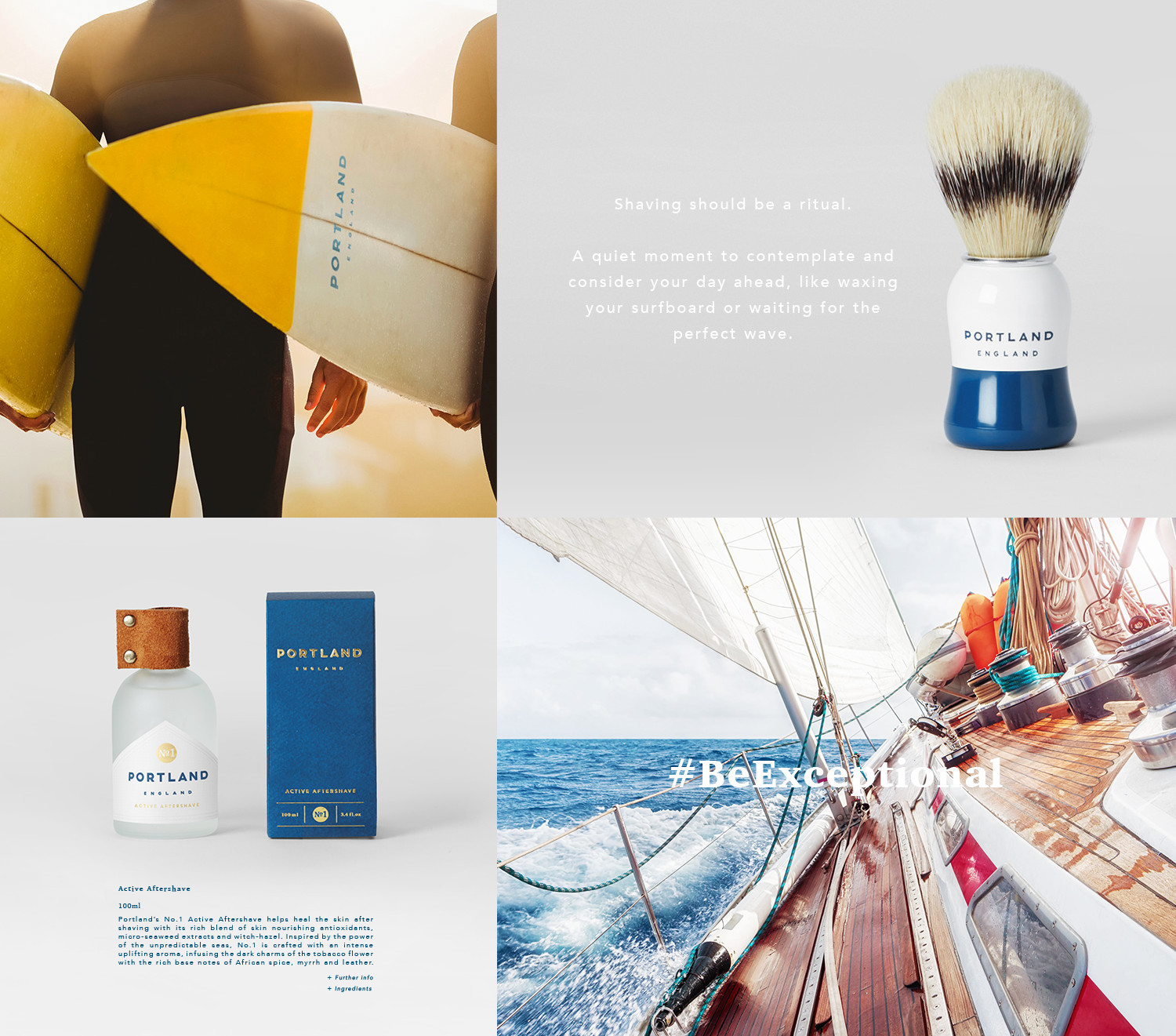
Winning an award is a big moment for any designer, but winning the award for the International Visual Identity of the Year is a very special moment that you’ll remember for the rest of your life. This year, James Burton won that very award for his brand identity design work for Portland England. I caught up with James for an interview to find out a little more about him and the work that won him this esteemed award.

Hi James. Congratulations on winning Visual Identity of the Year! Could you briefly introduce yourself to our readers?
Thanks! Hi I’m James Burton, I’m a freelance graphic designer living in East London specialising in branding design.
How did you react when you found out you won?
It was a fantastic moment! I was over the moon that we’d won our category, let alone the overall award for Visual Identity of the Year. It’s such an accolade and justifies all of the hard work and effort that was put into the project.
How did you get involved in the Portland project?
From my work with Nook London on their Nostalgia Lights branding and packaging. The Portland team approached me from seeing that work and asked me to come on board.
What is your usual design process and how did it come to life on this project?
I don’t know if I have a ‘definitive’ design process so to speak, as I believe the approach should adjust accordingly to each project. However, saying that, in this instance, I was involved in the very early days of the brand’s inception. It was a great learning curve and a new area for me to delve into.
Normally there are set requirements given to you by the client but with the Portland team, we worked together more as strategic thinking partners. I did extensive research early on, looking into the men’s grooming market — from that, I created a lot of concepts exploring how and where a new brand could sit within the market visually.
Once we had honed in on the requirements the brand needed to fulfil, I then moved on to more of a usual design process.
How would you describe working with the client?
It’s been a great relationship and we work well together; they are very helpful in delivering the brief and a project ethos to the table in a way that allows it to be easily translated visually. We’ve gone on to work on a number of other projects since. I think there’s a good balance between us that works well.
What was the most rewarding part of the project?
The whole project was very rewarding for various different reasons. To pinpoint one moment, I guess it would be when we received the first run of all of the samples. It was great to see all of the hard work all in one place and in physical form.
What was the most challenging/difficult part?
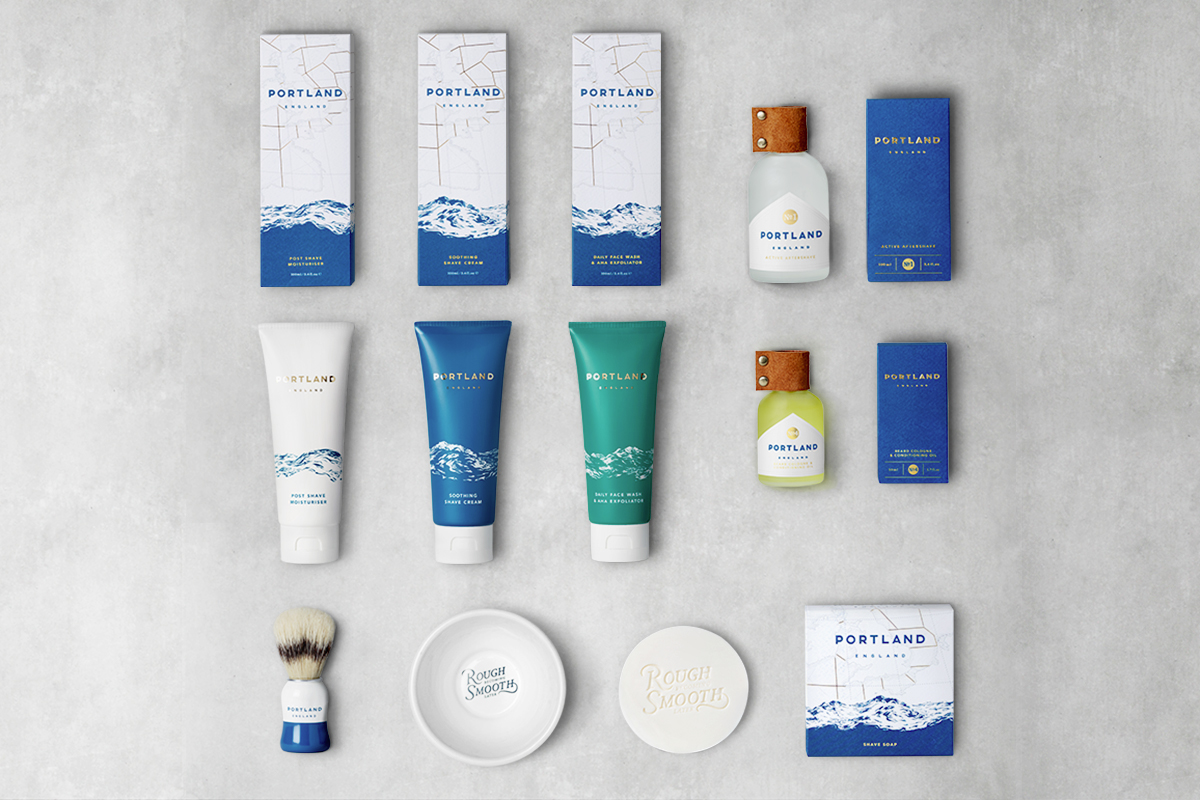
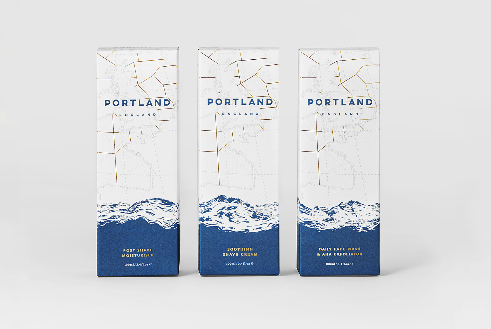
There were a few hurdles to overcome along the way. The wave was one of them as it had to work across the three boxes and with the boxes in any order. With the packaging, there were quite a few different materials being used and so there were a few technical printing aspects that had to be considered to ensure everything worked across the board.
Where do you turn to for inspiration in your design work?
I’m always looking at other work and what other designers / studios are producing. I try to keep abreast of what the next visual trends are and see where I can bring these into a project. I also try to turn to areas outside of the field of design.
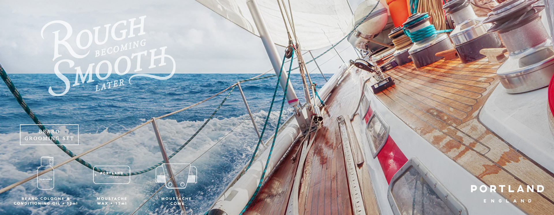
If there’re certain elements relating to the branding/project, things from the brand’s heritage and origins that I can look into. For instance, with Portland, I spent some time absorbing myself with any visual elements I could find about the Shipping Forecast and the British seas.
Why and how did you become a designer?
I think from an early age it was evident that I would wind up working in a creative industry. I’m rather inquisitive and I don’t settle at ‘that looks nice’ — I’ve always wanted to know ‘why is it that that looks nice?’. Design is a great vessel for that discovery process. I really enjoy that it’s constantly throwing you new challenges, techniques to learn and avenues to explore.
I initially started out creating visuals with a camera. I have a degree in documentary photography so I’m not a ‘classically trained’ designer. After graduating, I was making short animated films for a production company and realised that a lot of what I was doing involved design. From there I jumped head first into it and haven’t looked back since. The early days of my design career were in e-commerce and from there I moved into branding design.
Who would you describe as your mentors and how have they influenced your work?
Well, I didn’t come into design down the traditional path so I probably don’t have that archetypal designer mentor / pupil relationship that I think a lot of designers have had. I’ve compensated for that by having a lovely selection of creative peers that I can turn to, and sometimes the most valuable feedback can come from people who may not necessarily consider themselves to be ‘creative’.
What would be your dream project?
I’m not sure if there is a specific project that I would dream of, as I often find it’s whatever project I’m currently working on that is the most interesting to me at that time. I guess to narrow it down, it would be a project working with a talented bunch of folk for an awesome client. I like to be very hands-on, exploring new creative avenues, so it would involve those processes and ultimately I enjoy being challenged, so it would have to push me on further. Oh, and also if it was a project that was somehow for the greater good of mankind, I’d quite like to be involved in that too.
What is the most important piece of advice you have received as a designer?
See ‘failure’ as a ‘success’, As Edison once said “I have not failed. I’ve just found 10,000 ways that won’t work” — that was 10,000 successful steps to get to the finished article.
Where do you hope to see yourself in the next 3-5 years?
Ideally in a hammock on a beach with amazing wifi connection but to answer more in the realms of reality, to be still working on projects I love and to have the opportunity / time to be able to explore more of my personal projects and ventures.
What would be the one piece of advice you would like to give to someone considering entering the Visual Identity Awards?
The presentation is key — just because you’ve had really positive feedback on that final design, don’t just submit a 2D representation of it. It’s just as important to show how and where your design might be used and interact with society. If you can, take photographs of any physical elements or mock them up.
Will you be the next winner?
Hopefully, this interview with James has inspired you to enter your own design work. Maybe you could be the designer of the next Visual Identity of the Year? Ready to enter? Click here to submit your entries. Don’t forget you can get 10% off just by entering the promotional code LOGOGEEK at checkout. Good luck!
![]()