The below article has been taken from the Logo Designers Boxset, which is totally free to download here.
Coming up with the perfect logo design idea can be a challenging process.
Whilst there’s no set in stone formula, to help you with idea generation I have put together a few thoughts and approaches that work well for me.
But before we jump into that it’s important you have a clear understanding of what makes a great logo…
What makes a great logo
When it comes to logo design I personally believe there are no rules. As Paul Rand once said, “a logos primary goal is to identify… to say who the company is, and that’s its only function”.
Although rules don’t exist, there are a number of proven guidelines that can be learned from the great graphic designers of the past. This is because we can see which designs are still working today after 50-60 years of use.
Looking at the designs that have stood the test of time, we can see principles that apply to all of them. They are…
- Simple
- Memorable
- Appropriate
- Versatile
- Timeless
Lets take a closer look at what each of these mean…
Simple
Logos that have stood the test of time are those that are simple – just look the logos for Nike, Apple, IBM and McDonalds for proof of this.
We’ve also seen that designs that were complex at the start of the business have been simplified over time to increase recognition. Starbucks is a great example.

Paul Rand, one of the greatest identity designers of all time made the following comment in his book Design Form and Chaos, which also backs this up.
“A design that is complex, fussy, or obscure harbours a self-destructive mechanism. No amount of literal illustration will do what most people imagine it will do. This will only make identification more difficult and the “message” more obscure.”
Memorable
A logo is likely to be used on everything a business does, therefore, you want people to recognised and remember it.
Memorability is achieved through simplicity, as people remember simple shapes faster.
Colour also plays a vital role in the recognition of an identity too. This is proven in an experiment by Brazilian graphic designer Paula Rupolo, who swapped the colour schemes of competing brands.
“Colours are the first thing you notice in a logo, what gets fastest to our brains,” she says. “Then you read a logo’s shape, icons, or typography.”
To be memorable, the logo and supporting brand identity also needs to differentiate from it’s competitors, so make sure to do your research. It’s a valuable exercise to keep a visual record of the competitor’s logos and identities to reference your designs against at a later date.
Appropriate
A logo should be appropriate for the business and its intended audience.
For example, if you aim to target children you might use a bouncy and bold typeface, whilst this same style wouldn’t be appropriate for a corporate law firm.
Versatile
A logo will be used on anything from a button to a building. That means that the logo you design will need to work just as effectively at 10 millimetres as it does at 10 meters.
The logo will also need to work in a range of scenarios, including different background colours. This means the logo will need to work just as effectively in single colour (both black and white) as it does in full colour.
The logo will also ideally allow for different layouts and configurations to ensure the logo will look its best, no matter where it’s used.
Because of this, when working on ideas consider how the design might work at different sizes. If the design becomes illegible at smaller sizes, see what you can do to simplify and refine the design further.
Timeless
An effective logo should stand the test of time.
Avoid using trends. They might look great today, but they date quickly. David Airey, author of Logo Design Love makes a good point in his comment below:
“Leave trends to the fashion industry – Trends come and go, and when you’re talking about changing a pair of jeans, or buying a new dress, that’s fine, but where your brand identity is concerned, longevity is key. Don’t follow the pack. Stand out.”
So now we know what makes a great logo, lets take a look at how we can use that knowledge to start developing logo ideas…
Have a clear direction
It’s hard to come up with ideas without a clear roadmap of where you’re heading, so before coming up with any ideas it’s essential you’ve created a logo design brief to clearly understand the business, competition and audience.
Discover the right aesthetic…
When I first started out designing logos I focussed on coming up with clever ideas – the more clever they were the better… I thought I was being smart, but actually I realise now that it wasn’t the best approach.
I’ve learned that as part of the design process you need to ‘discover’ the solution that’s most relevant for that business… Something that has the right ‘feel’, and the right aesthetic for such a business.
A useful thought exercise
I was lucky enough a few years back to spend time with Myles Newlyn, the designer behind logos for companies including Sky, EE and Unilever to name just a few.
He taught me a thought exercise that he carries out before working on any logos, and I found it immensely valuable, so wanted to share this with you too…
Imagine a leaflet coming through your door from the business you’re creating the logo for. How does it look? How does it feel? What’s the weight of paper and finish? Paint a picture in your mind of what you would expect.
What you picture will be drawn from your personal experiences. Where you travel, what films and tv you watch, what you read and where you eat will all contribute to a mental toolbox of aesthetics and visual associations that you can draw from, so be sure to experience the wonders of life!
From time to time I find it helpful to start building a mood board to give myself a little more clarity, and to also have something to reference when working on my logo ideas.
Creating a mood board
To create a mood board, pull together images that have the right ‘feel’ for the company, then paste them all into a large PSD (or PowerPoint or keynote document, whatever is easiest for you).
Pull together fonts, designs, images. Any kind of imagery that has the appropriate aesthetic.
Look in books, magazines, Google, Pinterest, Behance, Dribbble etc…
Don’t worry about ideas at this point. Focus only on what has the appropriate look and feel, and what “feels” right.
Sketching Ideas
By now you should have some clarity on the direction you want to take the design. But now we need to discover the perfect solution!
Some designers will jump directly onto a computer. But I want to encourage you to work through the idea generation process on paper.
Aaron Draplin explains why perfectly in this quote:
“Always start on paper. There’s something liberating about the freedom, wobbliness and humanity of a pencil sketch. There’s a speed to it. An unpredictability. Accidents happen. You can get to the magic that much faster on paper, than on some cold screen. Be it a stick in the dirt, charcoal on a cave wall or a pencil in you memo book, you are tapping into the time-tested method of communication, formulating and invention.”
Staring at a blank piece of paper can be daunting, so I carry out a few exercises to help me along the way…
Word Mapping
Word mapping is an amazing technique to help you think of ideas outside the box.
Start by writing down a word related to the business in the middle of a piece of paper. Then draw lines extending from this, adding as many associated words as you can think of. (Use a thesaurus if needed).
As an example, if you was designing a logo for a property letting company, you may start with the word “Estate Agent” then add associated words such as rent, house, moving, property, flat etc. From the word ‘moving’ you would add words such as delivery van, boxes, packing, and tape.
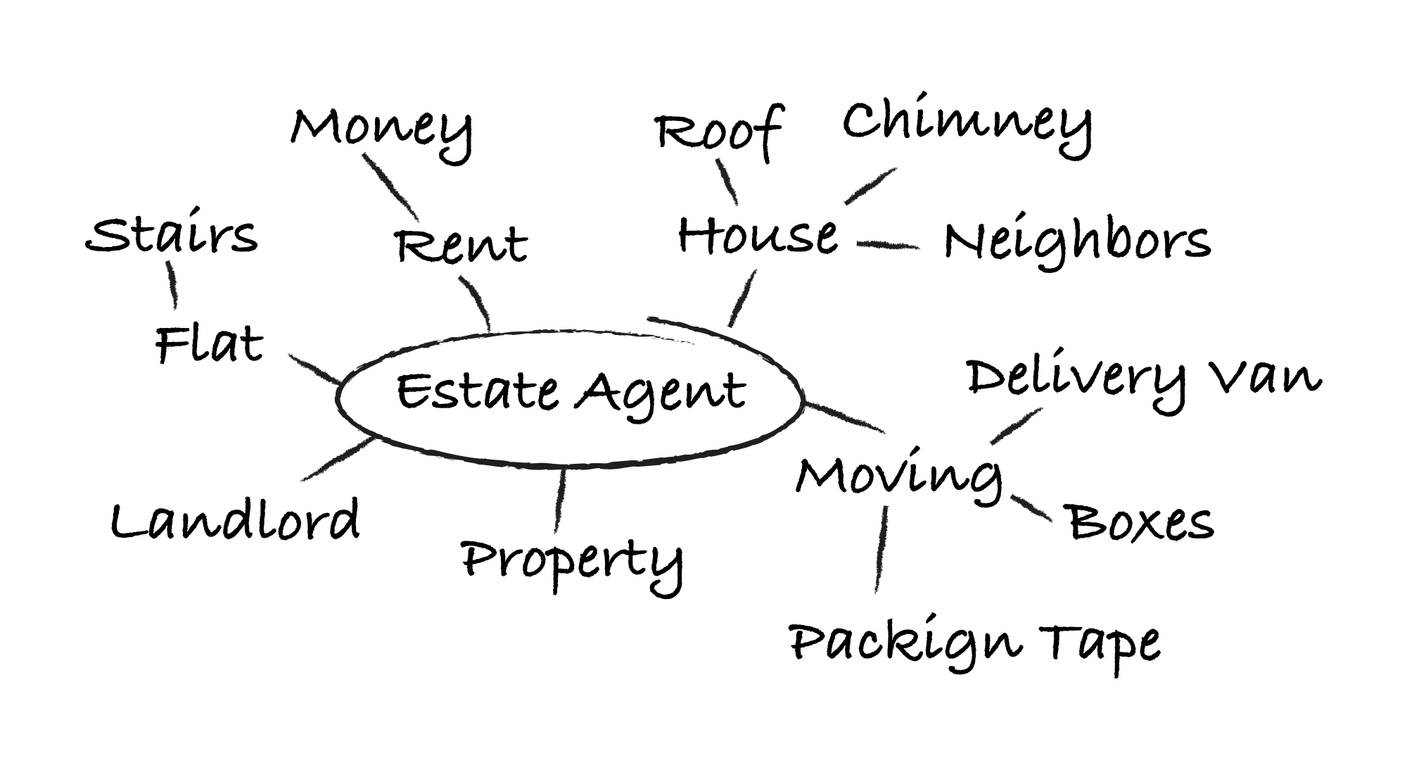
Do the same exercise with as many related words as you need. These can be related to the company name, the type of products or services they offer, their tagline etc… anything you feel that will help you come up with ideas.
After a few hours (or days if the budget allows for it) you will have at least one whole page of words. It’s now that you can get a highlighter pen to pull out specific words that you feel could form the foundations of a great idea.
As an example of how this exercise helped me, when working on the logo for British Overland, a company who provide adventure holidays, I started out with the word ‘British’… and that eventually lead me to the word ‘Lion’. This single word allowed me to picture a lion running with pride through the British Overland, which formed the foundations for the final logo design.
Picture Mapping
Another exercise that I like to do is similar to the word exercise above, but I draw pictures instead. I draw icons, shapes and symbols.
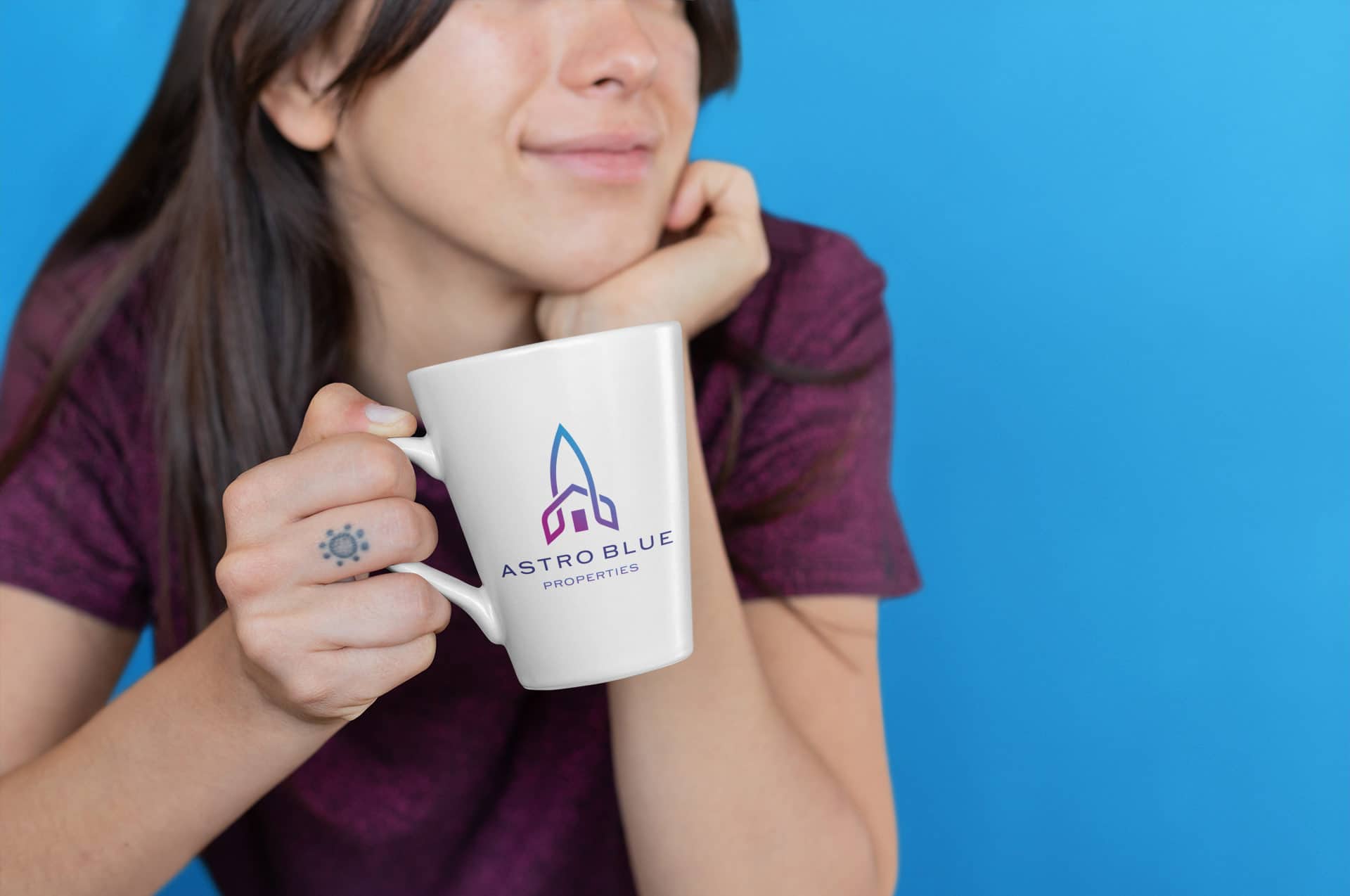
As an example, when I worked on the design for Astro Blue Properties, an estate agent, I drew a Rocket and Planets to reference the word Astro, and a house to reference estate agents. I realised when seeing it on paper that I could combine the shape of a rocket with the shape of a house to create a really effective solution for the business.
Can you tell a story?
Within the brief you might find that you can leverage something to tell a story in a visual way.
As an example, I recently worked on a logo for a business called Soul Somatic who offer a type of therapy called Somatic Experiencing (SE) which is designed to help heal trauma and other stress related disorders.
SE therapy works by asking the individual to pay attention to their body and to name the sensation. For example, the tightness that they feel in their body when they speak of a stressful event. As the individual speaks of the event, they follow the story, the emotions, thoughts, images that come to the mind, but keep coming back to the sensations as they change and move in the body.
The aim of the therapy is to find the point when the client can overcome the traumatic shock, and they are asked to follow their body’s fight or flight impulses to complete what the central nervous system couldn’t at the time of the event to release the traumatic energy, and return to harmony.

The doctor who developed the therapy mentions that ancient cultures have healing systems that draws on the body’s natural healing energy in the way SE does. For this reason the logo took direct inspiration from indigenous communities from the Amazon rainforest.
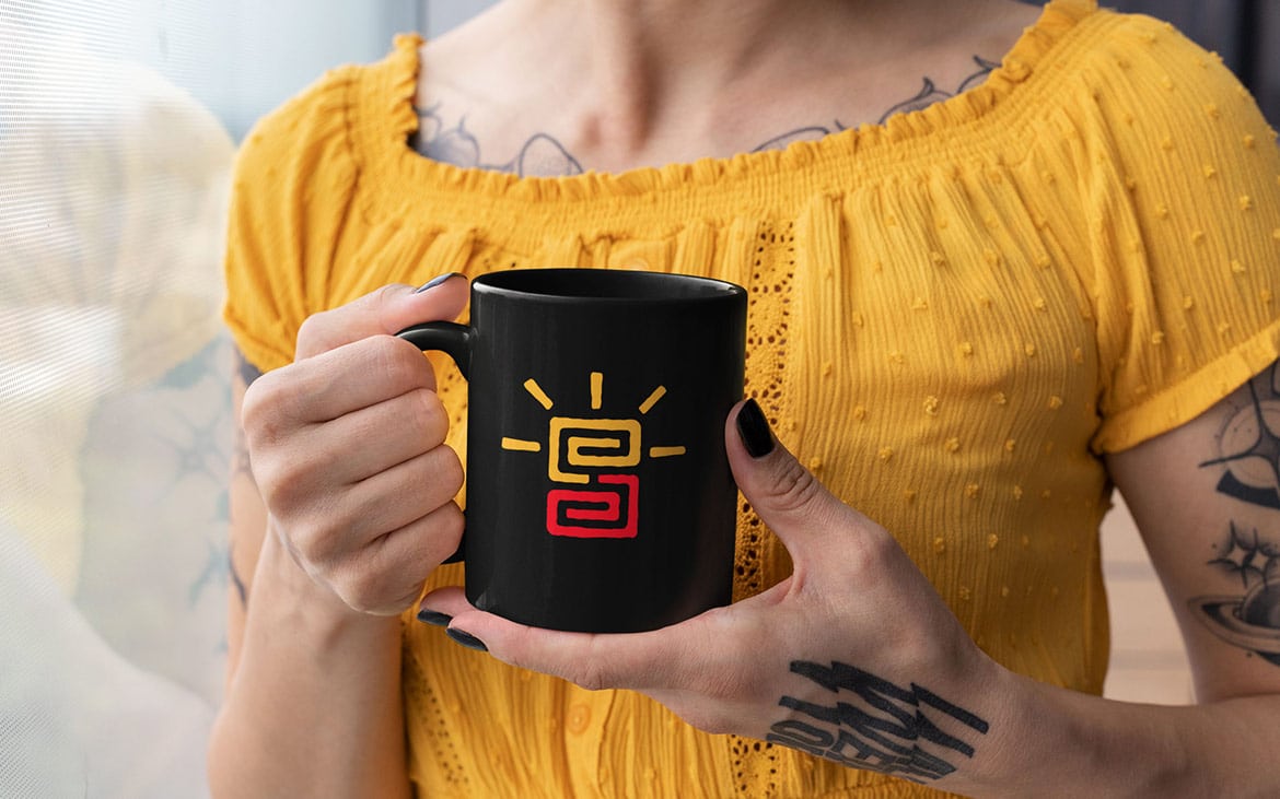
Through observation of tribal ceramics, body paint, head dresses and tribal art I discovered that swirl like symbols representing energy are used throughout, as well as bold, bright colours. This became a key reference for the final logo design.
Aside from simply creating a tribal type symbol I wanted to ensure the logo would have a direct association to SE in some way.
To achieve this I explored ideas around experiencing trauma, then experiencing it again a second time to find a cure. This was done by using 2 swirls. The first representing the original trauma, then the same shape is repeated to show that the event is being experienced a second time. Lines then shine out from the second swirl like rays of the sun to symbolise the release of pain, and a cure found.
Sketch Everything
When sketching, remember that nobody is going to see it. It’s simply an approach to get ideas out of your head, so sketch everything… even the rubbish ideas.
You’ll often be surprised that once you see something on paper that seemed boring or silly in your mind, you may realise that it actually has potential, so let those ideas develop on paper. Don’t sit thinking about them… just draw, and keep drawing…
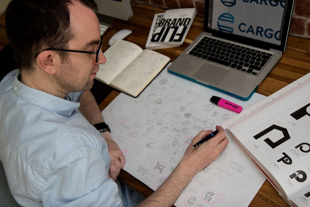
You may end up sketching hundreds of ideas, but keep going until you have a handful of ideas that have real potential for further development. Don’t just stop once you have one solution, keep experimenting and exploring. Spend several days on this if you need to.
You don’t need to draw perfectly or be an artist. All that’s being put on paper at this stage is the underlying ideas.
Below is a slightly staged photo, but see the big sheet of paper? I do several pages that look something like this for each project.
Combating Creative Block
Unless you’re insanely gifted, coming up with an original, simple logo that correctly represents the business, and differentiates from the competition too is really, really hard.
Because it’s hard it will mean that you’ll frequently feel that you’re making no progress or that you’ve hit creative block, spending all day sketching to only reach the end of the day without a single good idea.
But don’t worry… the muddy mess of exploring and testing ideas is all part of the process. You might have hundreds of terrible scribbles, but… all you need is one incredible idea. Keep going until you find it.
If you ever feel completely drained of ideas it’s ok to take a break.
Go for a walk. Get some rest. Play a game. Do the washing up. Sleep on it if needed. You’ll return with a fresh perspective. You may even find that during the time away from the pressure of working, you’ll dream up unexpected ideas… so keep a sketchbook in your back pocket just in case!
Ideas can come from weird places, so don’t give up! Trust the process.
If you enjoyed this post, be sure to check out The Logo Designers Box Set, which is totally free to download.
