As a logo designer who’s worked with countless clients over the years, one thing I’ve learned is that critiquing a logo design isn’t always easy, especially if you’re not a designer yourself. It’s easy to go with gut instinct or base feedback on personal taste, but that approach often misses what really makes a logo effective. And as one my design heroes, Paul Rand, once said, “Design is the silent ambassador of your brand.”
So, whether you’re a designer presenting work or a client evaluating options, this guide will walk you through how to review a logo design properly… with clarity, confidence, and purpose.
Why Critiquing a Logo Matters
A logo is often the first impression someone has of a business. It’s the face of a brand. That tiny icon on a business card or website has the power to communicate values, evoke emotions, and build recognition over time.
When critiquing a logo, the goal isn’t to decide if it looks cool. It’s to assess whether it communicates the right message, connects with the intended audience, and functions well in real-world situations.
Step 1: Go Back to the Brief
Before you even look at the design, revisit the logo brief. What was the brand trying to achieve? Who is the target audience? What are the core values? What message should the logo communicate?
Good logo design is rooted in strategy, not decoration. If the logo aligns with the brief, it’s already off to a good start. If it doesn’t, even if it looks attractive, it’s worth discussing why.
Questions to Ask:
- Does this logo reflect the brand’s personality and values?
- Would the target audience understand and connect with this design?
- Is the tone appropriate (e.g., friendly, professional, luxurious, innovative)?
Step 2: Consider Simplicity and Memorability
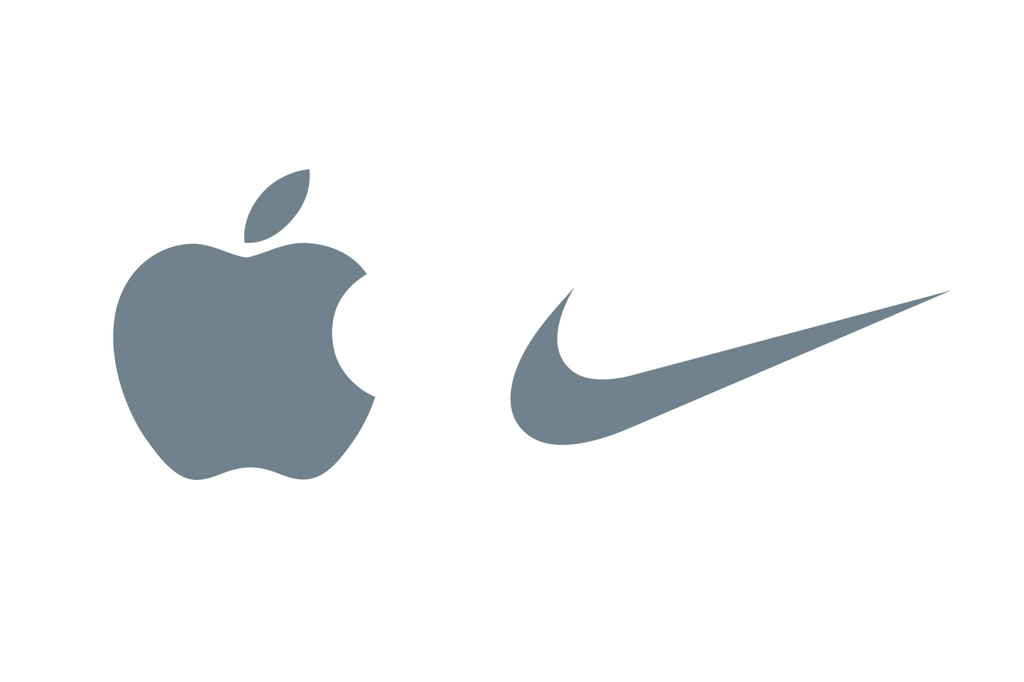
Paul Rand famously said, “A logo derives meaning from the quality of the thing it symbolises, not the other way around.” Rand was also a huge proponent of simplicity. The best logos are simple, yet distinctive.
Think Apple, Nike, or WWF. These logos are not overly detailed, but they stick in your mind. Saul Bass, another design legend, echoed this idea when he said, “I want to make beautiful things, even if nobody cares.”
Ask Yourself:
- Is the logo easy to recognise and recall after just a glance?
- Does it rely on unnecessary detail or try to say too much?
- Would it work on a billboard as well as on a mobile screen?
Step 3: Assess Scalability and Versatility
A good logo works in all sizes and across a range of media. This includes everything from a website favicon to embroidery on a polo shirt.
A well-reviewed logo should:
- Be legible at small sizes
- Work in black and white as well as colour
- Function well on light and dark backgrounds
- Be recognisable when reversed or simplified
If your logo only works in full colour on a white background, it’s not versatile enough.
Step 4: Evaluate Relevance to the Industry
This doesn’t mean your logo needs to look like your competitors’ logos, but it should feel appropriate for your market. A logo for a children’s toy company will naturally look different from one for a law firm.
Relevance helps with instant recognition. It also prevents your audience from misinterpreting your brand.
Questions to Reflect On:
- Does the style suit the industry?
- Could it be confused with a competitor or unrelated business?
Step 5: Test for Timelessness
Design trends come and go, but a good logo should last for years… ideally decades. Think about logos like Coca-Cola, Shell, or IBM. They may get small tweaks over time, but the core idea endures.
Avoid chasing logo design trends. What’s cool now may look dated in a year or two. Good design feels classic – not because it’s old-fashioned, but because it’s rooted in clarity and meaning.
Ask:
- Will this still feel appropriate in 5–10 years?
- Is this design built on a solid idea or just trendy visuals?
Step 6: Look at Typography and Colour Choice
Typography and colour aren’t just aesthetic choices, they’re strategic ones. Fonts carry personality, and colours evoke emotion.
A strong logotype (wordmark) should have custom or well-considered typography. It should also be readable, even at smaller sizes.
When it comes to colour:
- Is there a reason behind each colour choice?
- Does the palette suit the brand’s identity?
- Is there a black-and-white version that still works?
Colour psychology is worth considering, but cultural context and accessibility are just as important.
Step 7: Consider Emotional Impact
Logos aren’t just visual. They’re emotional. As Saul Bass noted, “Design is thinking made visual.” When you look at a logo, it should evoke something.
That could be trust, excitement, nostalgia, joy… whatever makes sense for the brand.
Ask yourself:
- What feeling does this logo evoke?
- Is that emotion aligned with what the brand stands for?
Step 8: Functionality in Real-World Contexts
It’s one thing to look at a logo in isolation, but how does it hold up in real-world applications? Mockups are helpful, but if you can, ask to see the logo on things like:
- Business cards
- Social media profiles
- Website headers
- Packaging
- Signage
This shows how well the design integrates with a brand’s touchpoints. Below is an example mockup image using Placeit that I put together for the recent logo case study for Trade Mark Wizards.

Step 9: Gather Feedback (But Carefully)
It’s natural to want to share logo options with friends, family, or colleagues (or other designers in the Logo Geek Community)… and sometimes this can be useful. But take opinions with a pinch of salt, especially if they’re from people who don’t understand your business goals or design strategy.
Instead, focus on:
- Strategic alignment
- Audience relevance
- Functional performance
Avoid making decisions purely by committee or personal taste, make sure to ask strategic questions. This interview on Consumer Research that I did with Michele Ronsen, the founder of Curiosity Tank, an agency who specialises user research will be a worthwhile listen to understand what questions to ask, and more importantly… what not to ask.
Step 10: Trust the Process (and the Designer)
If you’ve hired a professional logo designer, trust that there’s logic behind every choice. A good designer doesn’t just pick fonts or icons because they “look nice.” There’s intention, rationale, and years of experience baked into their work. That said, it’s also important that you feel connected to your logo. If something feels off, speak up, but try to express why, rather than asking for superficial changes.
Conclusion
Critiquing a logo is more than a yes-or-no decision. It’s about looking beneath the surface to understand how well a design communicates, performs, and resonates. By following a thoughtful review process, grounded in the principles of legends like Paul Rand and Saul Bass, you’ll make more informed decisions and end up with a stronger brand.
Remember, the best logos don’t just look good. They work. They endure. And they mean something.
If you’re ever unsure, return to the core question: does this design represent the brand in the best possible way?
Want help reviewing your logo? Or need a second opinion? Feel free to reach out – I’m always happy to offer guidance, if you’re a potential client, or a designer who needs a holding hand.