

I was recently approached to design a new logo for Glitch Guild, an AI-powered career platform built to help Disabled and Neurodivergent professionals recognise their strengths.
Disabilities force people to live differently, and that experience gives them a unique advantage. Glitch Guild helps work out what that advantage is, and connects those individuals with employers who actively want that perspective on their team.
It's a platform that helps people see their disability as a "glitch." Not a weakness to hide or accommodate, but a competitive advantage.
This is a powerful idea. Get the branding right, and the company could become something much bigger than a career platform... it could become a global movement in how disability and neurodivergence are seen in the workplace.
Get it wrong, and it risks feeling exactly like the compliance-driven, deficit-based messaging Glitch Guild exists to move away from. The logo plays a role in that.
As a professional logo designer, I've always believed my job is about more than creating something that looks good. If I can help my clients succeed, that success reflects back on my work and ultimately leads to more opportunities.
But this project felt different. The mission was bigger than any logo I'd designed before, and the thought of getting it wrong carried a weight.
This design had to be right. Not just "client happy" right... properly right. The kind of project where you hold yourself to a higher bar because of what it represents, so I was far more critical of my work on this one than I am day to day. No pressure.
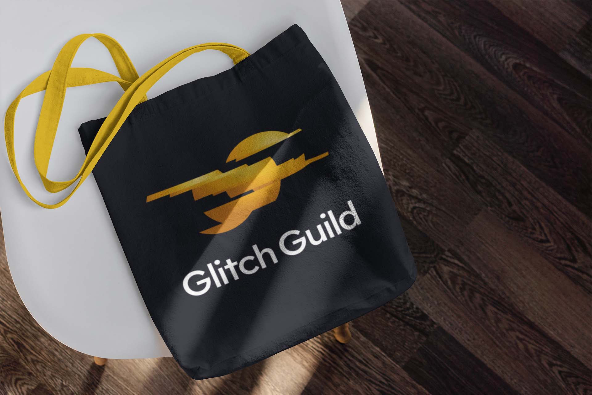
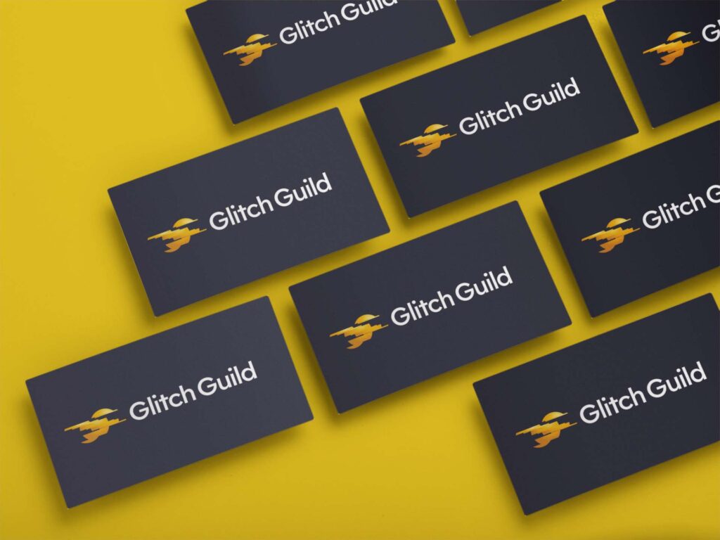
The image above shows the logo in its final form. Now let's go behind the scenes and explore how it came together, because finding the right solution was far more challenging than it might appear.
Where the Idea for Glitch Guild Came From
Before founding Glitch Guild, its founder, Cristian Brownlee, ran a company called Adapt Ability, supplying hands-free wheelchairs. Cristian appeared on Dragons' Den to pitch the business (you can watch the clip below) and the appearance generated thousands of enquiries from the disabled community.
Many of those conversations started with people asking about funding for equipment through employment. But a pattern kept surfacing that had nothing to do with wheelchairs at all: genuinely talented people were being overlooked professionally, again and again, because their skills didn't fit into a standard CV format.
What Cristian noticed was the sheer ingenuity behind how these individuals navigated daily life. The workarounds, the adjustments, the problem-solving. These weren't just coping mechanisms, they were advanced skills that most people never have to develop. That observation became the founding idea behind Glitch Guild: reframe the "glitch" as the asset it actually is, and build a platform around proving it.
That mission, and Cristian's clear, ongoing commitment to it, made this project feel important from the very first call.
Defining the Project Goals
As with every project, I started with strategy rather than a blank page. I wanted to properly understand the business, the audience on both sides of the platform (members and the employers hiring them), and what would make Glitch Guild distinct from other players already working in this space.
A few of the key goals that came out of that process:
- Design a symbol that represents a "positive glitch" - abstract, intelligent, and completely free of the clichés this space tends to fall back on: no puzzle pieces, no brains, no gears, no lightbulbs, and nothing literal like a wheelchair.
- Create an identity that works for two distinct audiences at once: Disabled and Neurodivergent professionals looking for empowerment and community, and forward-thinking employers looking for a genuine strategic edge.
- Build something that feels professional and credible enough for corporate clients and investors, while still feeling human, warm and authentic to members.
- Make sure the mark is versatile enough to work everywhere from a favicon to signage, merchandise, and pitch decks.
- Land on a message of confidence rather than sympathy: Glitch Guild isn't a support service, it's a talent accelerator.
With those goals locked in, it was time to start exploring.
Finding the Right Symbol
I knew from the outset this needed a symbol, not just a wordmark. Something that could be recognised globally. The big question was what would this symbol be?... My initial thoughts split me in a few directions...
- Something related to disability directly?
- A distinct abstract shape?
- A GG monogram, which, designed the right way, could even look like a glitch itself?
I ruled out anything that leaned on disability as the visual subject fairly quickly. It felt like exactly the wrong message for a brand built around positivity and reframing, not representation for its own sake.
I always sketch every idea, even rubbish ones. So let's get the GG monogram out the way. This could work, but it's far too generic.
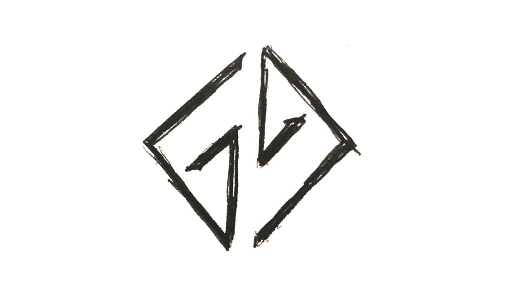
The more sketching and exploring I did, I kept coming back to one idea: a glitch that enables flight.
One of my earliest concepts was a flying penguin. A bird that, by nature, shouldn't be able to fly, unless something changed. Visually, it had potential. It's simple, and instantly understood.
But the idea of a flying penguin didn't sit right with me.
A glitch shouldn't give someone an ability that others don't have. While it's an interesting visial, it's not an honest reflection of what having a "glitch" actually means in real life.
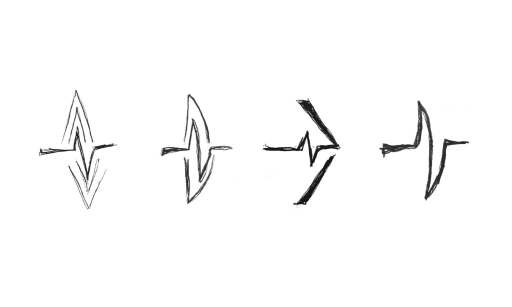
So I simplified further. What if the symbol was just a single line, with a glitch partway through it, shaped so it reads as a wing, or a pair of wings in flight? Not literal flight, but freedom... the sense that while most of us can't physically fly, we can still move through life on our own terms. Seeing a "glitch," or a disability, as a different kind of freedom rather than a limitation felt like the right emotional territory.
I pitched (and, honestly, pushed for) this direction, showed the client early sketches to help explain my thought process and direction (which you can see below), and got full buy-in to develop it further.
When a Good Idea Doesn't Quite Work
This is the part of the process I don't always share publicly, but it's the most important part of this project.
As I experimented the glitched-wing symbol, a problem kept surfacing that I couldn't design my way around: it looked like a heart-rate pulse. The kind of line you see on a hospital monitor. The type associated with something going wrong, not something going right.
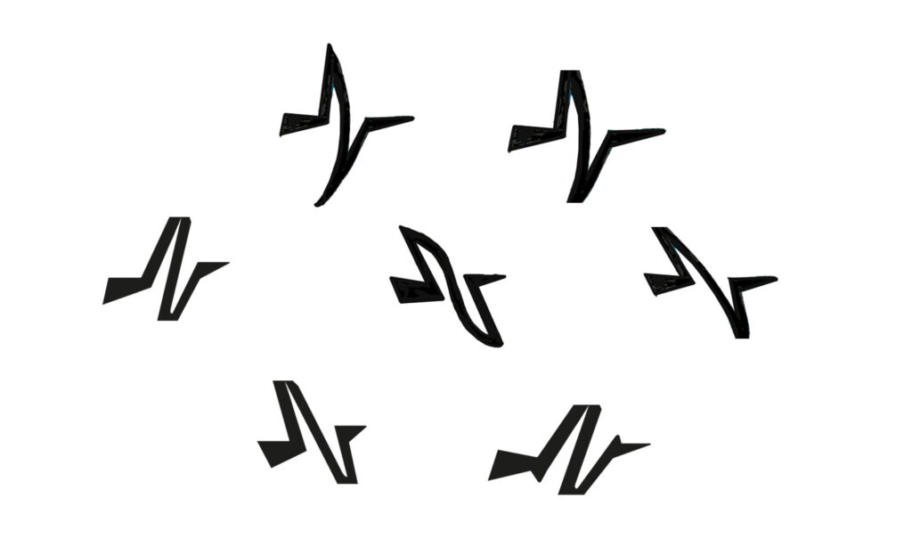
I could make it read more like a bird. But no matter how I adjusted it, that heartbeat association kept pulling through. And that's the exact opposite of what Glitch Guild is about. Hospitals, illness, crisis... none of that is hope, positivity or freedom.
The idea of "a glitch in flight" was still right. The execution wasn't.
I'd already spent days developing it, and I already had client buy-in. But I take what I do seriously, so I went back to Cristian, explained honestly why I felt the concept needed to be scrapped, and told him I needed to step back and rethink.
I sat with the problem for a while. I experimented. And then came the moment that turned the project around...
The Eureka Moment: A Ball, Sliced Into Flight
I started initially exploring glitched shapes that could look like a bird. Then experimenting with shapes sliced up, but glitched into a thing that looks like it's flying...
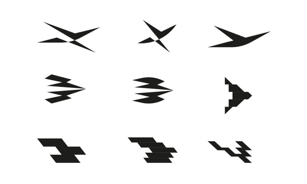
The seeds of something was there... but nothing looked good...
...and then... it hit me. What if I started with a ball?
A ball can roll, bounce, pivot, sit still, or be thrown in any direction. It's a shape that represents full capability... you can do anything with it.
Now slice that ball into segments. It can no longer roll or bounce the way it did. But it hasn't stopped being useful. It's simply become a different shape, with a different set of possibilities.
If that new, sliced shape could adapt into something else entirely... the ability to fly, for instance... it represents a kind of freedom that the original, unsliced ball never had.
It's a metaphor that actually holds up: nothing has been lost, something new has been gained.
I explored the idea initially as flat shapes, testing different ways of slicing a circle so the segments read clearly as a bird in flight, while also experimenting with effects to make it feel like it's glitching out of shape. Now we're onto something...
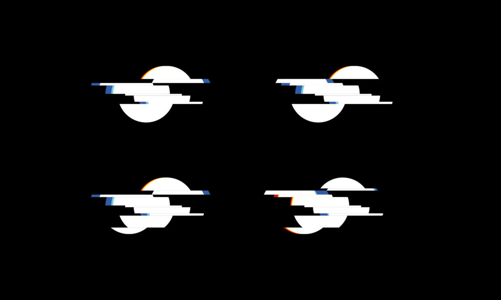
Getting the Colour Right
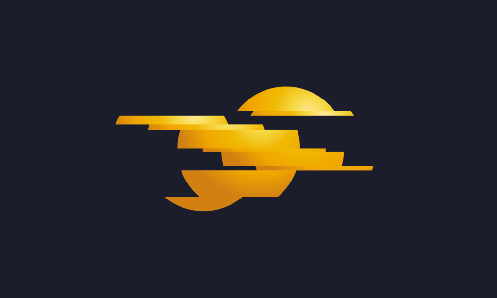
Once the configuration felt right, I introduced gradients to give the ball real dimension.
That made a big difference. It meant the "ball" shape stayed clear and recognisable even as it glitched into the shape of a bird, and it opened the door to animating the mark: starting as a solid sphere, and glitching into flight.
Colour needed just as much thought as the symbol itself.
An early direction explored blue, tying into the idea of a "bluebird" as a symbol of hope. But in practice, the bird shape combined with blue read too close to the old Twitter bird... a mark that, even though no longer commercially used, is still instantly recognised worldwide (Elon Musk made a big branding blunder there). An association with twitter was not what Glitch Guild needed.
The identity moved instead to yellow: a colour that feels hopeful, energetic and optimistic. It reframes the ball shape as something closer to a sun... a fresh start, a new day, a small rebirth. It's a much better emotional match for a brand built around reframing your glitch as a strength.
Typography
For the wordmark, I wanted to choose typography for the logo that complemented the roundness of the symbol without competing with it. A technical, sharp-edged typeface felt at odds with the warmth the brand needed for its members.
I landed on a clean, accessible sans-serif. Easy to read, unpretentious, and a good fit for a brand whose audience includes people who may be navigating dyslexia or other visual processing differences. Accessibility wasn't an afterthought here; it needed to be built into the choice itself.
Wrapping Up
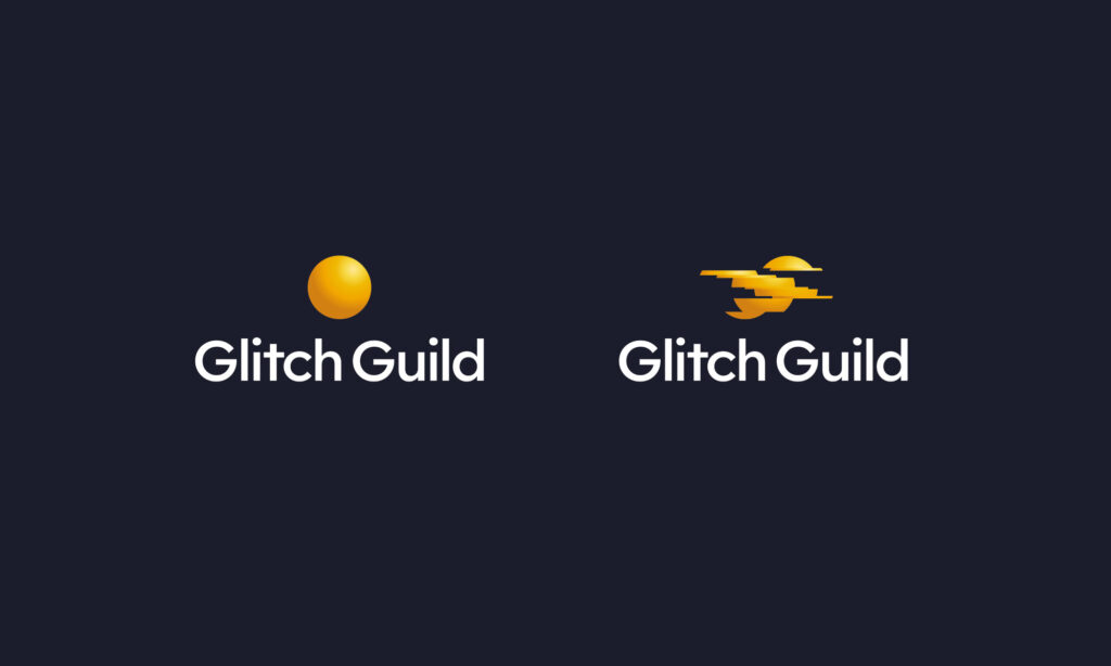
The final Glitch Guild symbol takes a sliced, glitched sphere and turns it into a bird mid-flight. An original distinct mark built entirely around the idea that a "glitch" doesn't take something away, it changes the shape of what's possible.
This was a project where getting it "almost right" wasn't good enough. Scrapping a concept the client had already approved, after days of work, is never a comfortable conversation to have. But it was the right call, and it's exactly the kind of honesty I think this project deserved.
If you enjoyed this look behind the scenes, or you're working on something that needs this kind of thinking, get in touch.

About the Author
Ian Paget is a UK-based logo and brand identity designer with over 20 years of experience, specialising in logo design for the past 15+ years. He is the founder of Logo Geek, a globally recognised logo design studio, podcast, and educational platform followed by over 100,000 designers and creatives.
Ian is the author of Make a Living Designing Logos and host of The Logo Geek Podcast, featuring leading designers and brand experts from around the world. His work has been featured in publications including AdWeek, Entrepreneur, and Creative Bloq, and he focuses on creating logos that are strategic, simple, and built for long-term recognition.
I'd love to hear your thoughts.