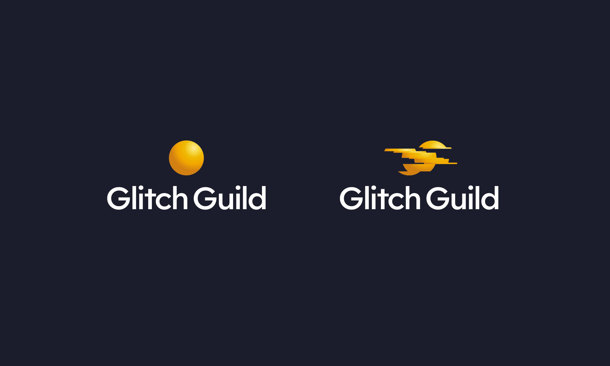
Glitch Guild is a pioneering career platform and recruitment service on a mission to become the definitive global hub for Disabled and Neurodivergent professionals, a place where difference isn't just accepted, but celebrated as a genuine competitive advantage.
Ian Paget was commissioned to design a logo that could carry this mission: a symbol that reframes the idea of a "glitch" from something negative into a source of strength, freedom and possibility, without leaning on the tired, clichéd visual language so often used in the disability and neurodiversity space.
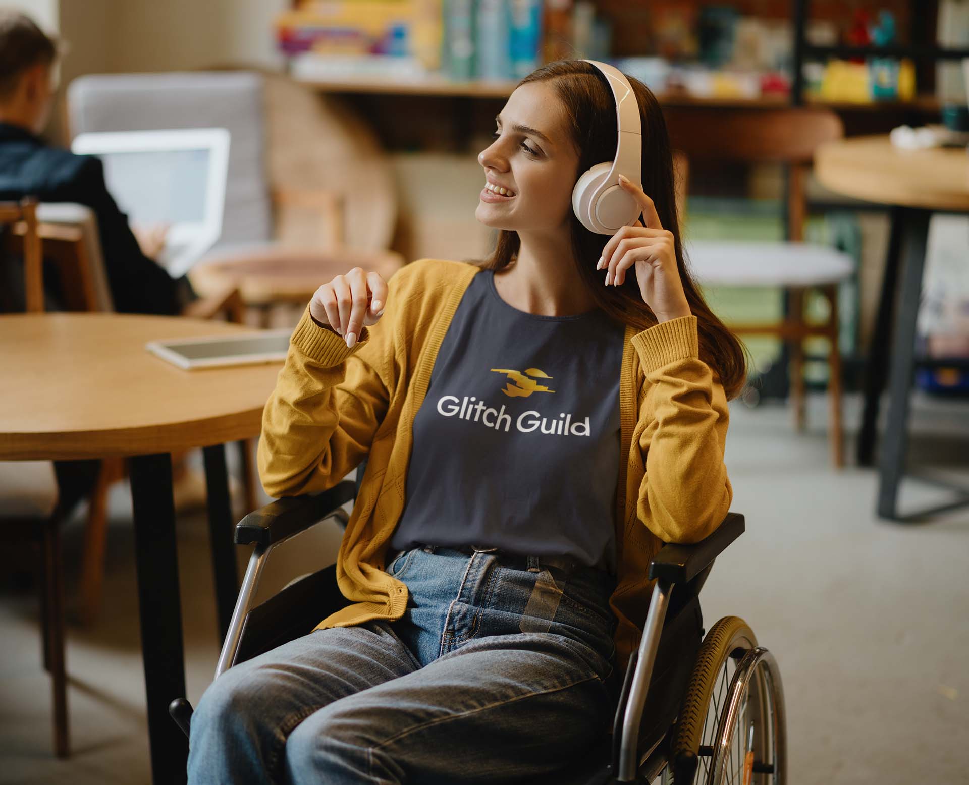
Glitch Guild was founded on a simple but powerful realisation. Its founder, Cristian Brownlee, had previously run Adapt Ability, a company supplying hands-free wheelchairs. After an appearance on Dragons' Den, he was contacted by thousands of people in the disabled community, and a pattern quickly emerged: brilliant, resourceful people were being consistently overlooked by the professional world, simply because their skills didn't fit a standard CV.
Glitch Guild exists to flip that narrative. Rather than treating disability or neurodivergence as something to accommodate, it helps members identify the genuine, hard-won skills their "glitch" has given them. From creativity to resilience, hyper-focus and problem-solving, and turning that into a professional profile that employers actively seek out.
That meant the logo had a lot of weight to carry. It needed to feel human, warm and empowering to the professionals using the platform, while also projecting the credibility and strategic confidence needed to win over corporate clients.
And crucially, it had to avoid every overused symbol in this space: no puzzle pieces, no brains, no gears, no lightbulbs, and nothing literal like a wheelchair.
Ian's starting point was to find a universal idea of a "positive glitch." Something that didn't need explaining, in any language, on any screen size.
Early exploration looked at a "glitch that enables flight." One of the first sketches was a flying penguin: a creature that, by nature, shouldn't fly, but does if something changes. It was a fun idea, but it raised a concern. A glitch shouldn't give someone an ability that others don't have, because that's not an honest reflection of lived experience.
That thinking led to a simpler idea: a single line, glitched partway through, so it reads like a bird in flight, or a pair of wings. It's a metaphor for freedom rather than superpowers, and a nod to the idea that a different way of moving through the world can still be its own kind of flight. Ian pitched the direction to the client and got the go-ahead to develop it further.
The problem showed up once the concept was refined: glitched into a wing shape, the symbol kept reading as a heart-rate pulse... the kind you see on a hospital monitor. That association pulled the design in exactly the wrong direction, toward illness and crisis, rather than hope and possibility. Rather than force it, Ian went back to the client, explained the issue honestly, and paused to rethink.
The breakthrough came from a different starting point: a ball. A ball can roll, bounce, pivot and move freely in any direction... a visual stand-in for full capability. Slice that ball into segments and glitch it out of shape, and it can transform into something new: a bird in flight. The metaphor works both ways. The shape has changed, but it hasn't lost anything. It's simply found a new way to move.
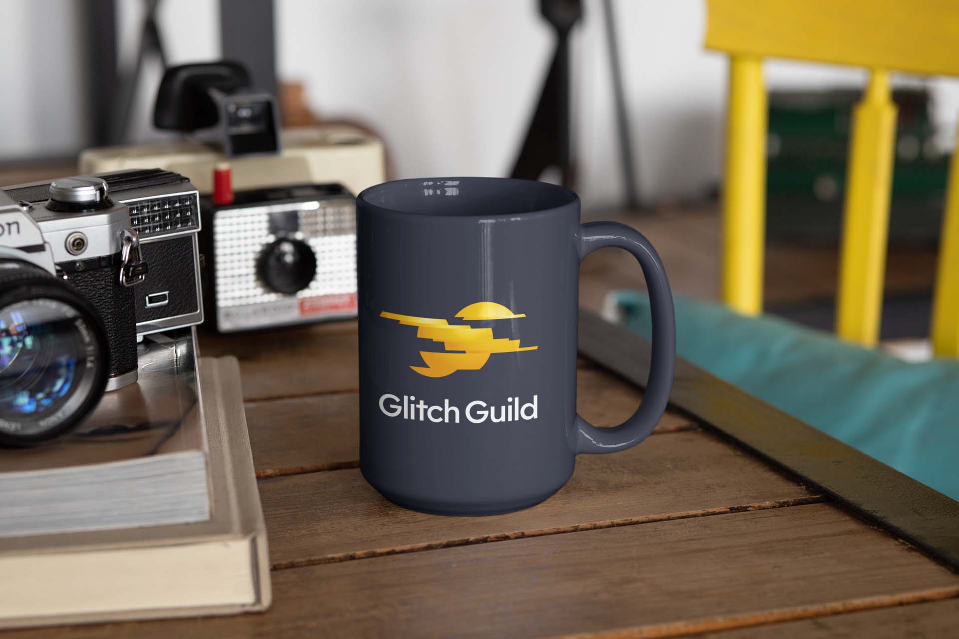
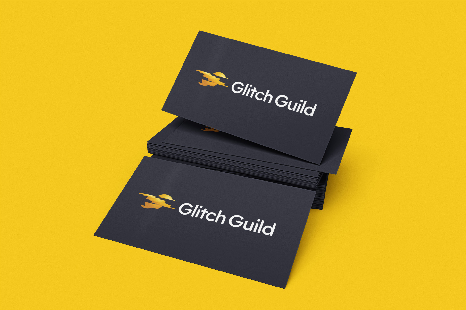
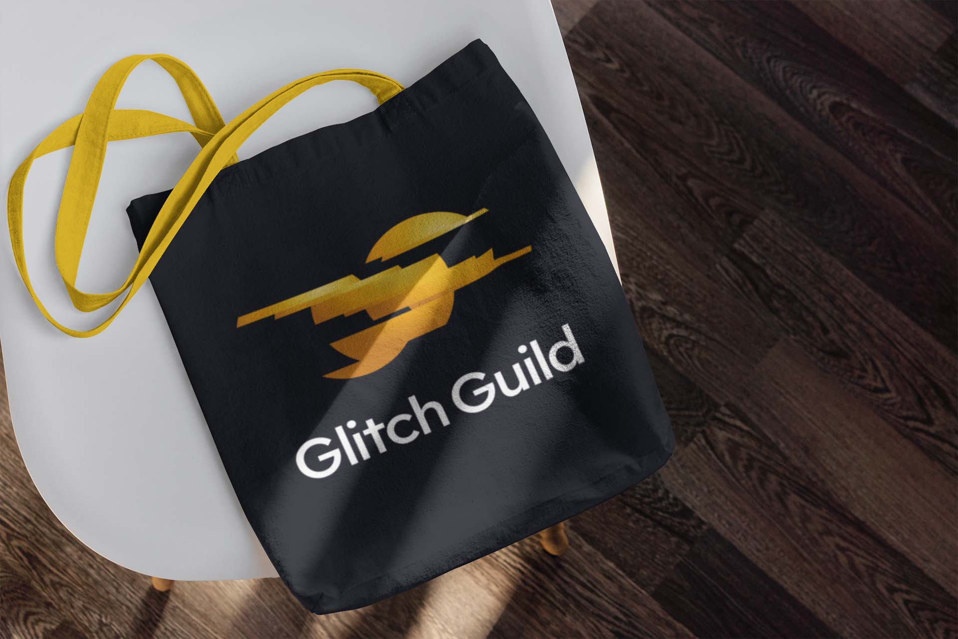
The final Glitch Guild symbol takes a sliced, three-dimensional sphere and glitches it into the form of a bird mid-flight. Rendered with gradients rather than flat colour, the shape reads clearly as a ball first, making the transformation into a bird immediately legible, and giving the mark the option to animate from one state into the other.
Colour played a key role in landing the right tone. An early blue direction was explored to reinforce the "blue bird" idea of hope and positivity, but it read too closely to the old Twitter bird, a shape still globally recognised despite the platform's rebrand. The identity moved instead to a warm, confident yellow. A colour associated with optimism, energy and new beginnings, and one that reinforces the sense of the symbol as a small sun taking shape.
The wordmark uses a clean, highly legible sans-serif, chosen to match the rounded geometry of the symbol while keeping the brand approachable and accessible. A deliberate choice for a company whose entire audience includes people who may be navigating dyslexia, visual processing differences, or other access needs.
Together, the identity gives Glitch Guild a mark that works as hard as its mission: distinctive, optimistic, and built entirely around the idea that a "glitch" isn't a flaw to fix, it's the shape of something new.
"Working with Ian on the branding for Glitch Guild was a brilliant experience. What sets him apart is that he doesn't just make things look good; he actually thinks about the business strategy behind the design. He was incredibly transparent with his process. At one point he walked me through why he was scrapping an initial concept because it didn't feel right for our future goals. That kind of honesty gave me total confidence in him. The final logo is high energy, distinct, and exactly what we needed to stand out. If you want a designer who really listens and isn't afraid to pivot to get the best result, have a chat with Ian."
— Cristian Brownlee, Founder, Glitch Guild
Want to take a deep-dive look behind the scenes at how this logo came together? Check out my blog post: Designing the Logo for Glitch Guild.
Looking for a logo designer? Get in touch with Ian Paget today to discuss your project. Request a Quote.