

Every so often, a project lands in my inbox that feels personal in a way most don't, and this was one of those.
I was contacted to design a logo for Cirencester Music Academy, a brand new music school and instrument shop opening in the centre of Cirencester.

This one came through a proper old-fashioned referral. My sister, Hayley, is heavily involved in the music scene around Cirencester, and she's friends with the founders, Stuart and Nicki Elwin.
When the couple shared their ambitions on Facebook and started asking around for a suitable logo designer, my sister put my name forward.
Stuart and Nicki got in touch, and we jumped on a Zoom call not long after.
They were genuinely lovely people. I spent that first call getting to know their ambitions and dreams for the academy, and it was clear straight away that this was a project I wanted to be part of. Not just because of the connection, but because their vision for the place was so clearly heartfelt.
What made it particularly special is that I grew up in Cirencester myself, and still have family living there, so I know the town, and what it's missing, better than most designers ever could for a client.
Since I've just finished a case study for the project, I thought I'd also give you a more personal, behind-the-scenes look at how the logo actually came together.
Let's get into how the strategy and design came together, and the thinking that shaped the final solution.
Defining the Project Goals
As with every project I take on, the first step is strategy, not sketching.
Before any design work begins, I need to understand the business, its audience, and what makes it different from the competition. If you've read my book, Make a Living Designing Logos, you'll know this is non-negotiable for me.
With Cirencester Music Academy, the founders had a genuinely great origin story to work with. They'd built up a strong local reputation over several years running a hugely popular monthly open mic night at The Bear, and in 2025 they were asked to run a brand new acoustic stage at the Phoenix Festival, extending the festival by an extra day to make room for it.
One of the founders, Stuart, had also spent 13 years teaching guitar locally through "Let's Play Music." Between the open mic, the festival stage, and over a decade of tuition, they'd already earned a reputation as the go-to people for music and encouragement in the area, this was simply the next natural step.
Cirencester Music Academy Logo Design Goals
From there, I put together a clear set of project goals to act as a compass for the design work ahead. Some of the key goals included:
- To design a versatile logo that would work across the shop exterior, website, social media, staff clothing, product tags and other retail materials.
- To differentiate the academy from individual home tutors already offering lessons in Cirencester, by reflecting a professional, town centre destination with a wide range of qualified teachers.
- To appeal to a broad age range, from primary school children through to retirees, feeling credible to adults but exciting and approachable for younger learners.
- To avoid the visual clichés of music branding: no treble clefs, no music notes, no sound waves, no microphones. The founders felt these symbols were either old-fashioned or risked implying formal music theory, which isn't what the academy is about.
- To feel fun, modern, inclusive, safe and trusted, local, and expert without ever tipping into intimidating.
- To use vibrant, bold colour rather than muted or pastel tones.
- To avoid leaning on Cotswolds clichés like rustic or twee, heritage-style visuals, despite the location.
With the tagline "Instrument tuition tailored to you" as an anchor, the brief was clear: this needed to be a modern, energetic identity, not a traditional music school crest.
Finding a Creative Direction
With the goals locked in, the next stage was figuring out the right creative direction, and this is where knowing Cirencester so well genuinely shaped my thinking.
At the time, there wasn't a dedicated music shop anywhere in the town. I also know from experience that "Cirencester Music Academy" is a mouthful, ten syllables long, and names that long rarely survive intact in everyday conversation.
I was confident that locals would quickly shorten it in conversation, referring to it simply as "that music shop" in town.
That insight mattered a lot. If people are going to talk about the brand in shorthand, the identity itself needs to do some of that work visually... it needs to be memorable and distinctive enough to be recognised and repeated, even when the full name isn't being used.
Two Very Different Directions
Normally, I sketch a lot on paper, exploring ideas loosely before committing to anything. On this occasion though, I had an unusually clear vision from the very outset.
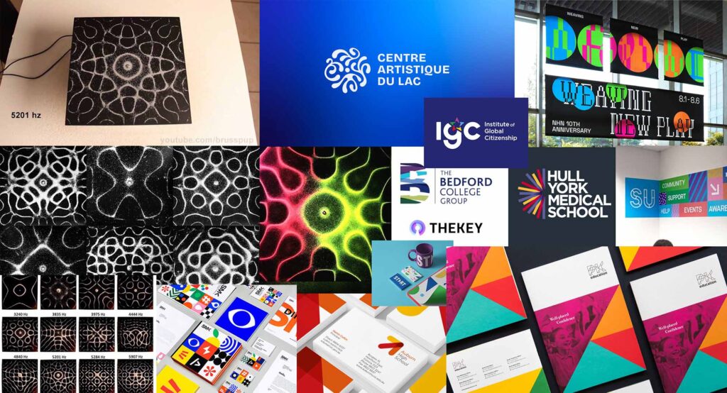
I knew it was going to be one of two things: either a slick, geometric identity inspired by the way sound resonance experiments move sand...
...or a very bold piece of custom MUSIC typography.
I did explore a third route too, built around the initials "CMA," but it felt completely wrong almost immediately. It stripped away everything that made the name and the business distinctive, and leaned into the kind of generic, corporate feel this company was actively trying to avoid. It didn't take much scribbling to rule that one out.
So, with just a handful of scribbles behind me rather than a full sketchbook, the two directions worth pursuing properly were clear.
Adding an intermediate step
Normally, my process is to settle on a single direction internally, develop it, and present the finished journey to the client. Occasionally though, when two ideas feel genuinely strong but pull in completely different directions, I'll introduce an extra "intermediate step" and get early feedback before committing fully to one path. This was one of those occasions.
Direction 1: Sound Resonance
The first direction explored the idea of visually representing sound itself. I'd come across Resonance Experiments, where sound waves generate patterns, and imagined an abstract symbol built from simplified versions of those patterns, with the potential to even be animated. This would be paired with a sophisticated typeface, aiming for a more polished, professional feel.
Check out the moodboard I put together to help explain that first direction...
Direction 2: A Bespoke MUSIC wordmark
The second direction was something else entirely: bright, colourful and full of energy. Rather than an abstract symbol, this concept put the word "Music" itself centre stage, with each letter individually styled to feel like a different sound.
Instead of illustrating an instrument, the identity would simply be a fun, bold piece of typography that stood apart from every generic music logo built around a guitar or a note.
And here's the moodboard I used to help explain that idea...
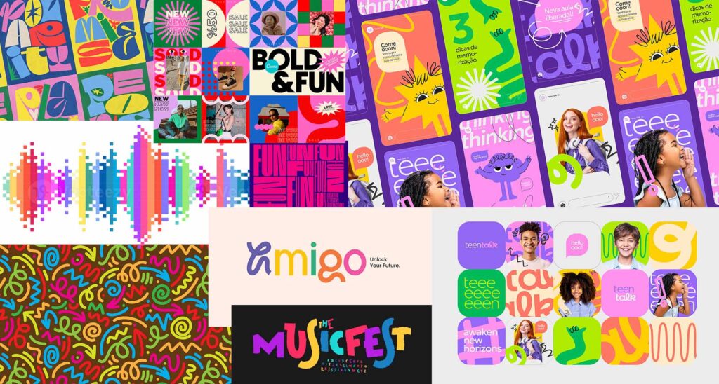
Because the two directions were so different in tone and execution, I put together mood boards for each, as shared above. These are collections of found images that captured the feeling I was aiming for, rather than jumping straight into detailed logo development.
Before investing further time, I shared both directions with the founders to see which one resonated.
They responded immediately to the second direction, the bold, colourful typographic concept. That gave me the confidence to commit my full attention to it, and to start developing a custom set of letterforms for the word "Music."
Developing the Custom Typography
With a clear direction chosen, the real craft began, and again, this wasn't a sketchbook exercise. Instead, I spent hours searching for typefaces with a genuinely distinct look, ones where individual letters already felt like they had a personality or a sound of their own.
I pulled together a wide range of these typefaces, then spent time mixing and matching individual letters from across them, testing combinations until "Music" started to feel visually right as a set.
The brief for myself was simple: every letter needed to feel like it had its own distinct instrument or sound to it, while the word as a whole still needed to read clearly and hang together as one cohesive piece of type, rather than five unrelated shapes competing for attention.

Once I'd landed on the right combination of source letters, as you'll see below, I moved into customising them further, refining proportions, weight and detail so the final set worked seamlessly as a single, unified wordmark, rather than looking like a mismatch of random fonts.

Selecting a colour palette
With the set of letters working effectively in a single colour, I moved on to colouring each one individually, drawing inspiration from the mood board I'd already presented.
I wanted every letter to differ in colour, each reflecting its own distinct sound, while still working together as a whole to create a fun, dramatic music logo.
Getting there took a lot of trial and error, testing countless combinations before landing on a palette that worked beautifully.
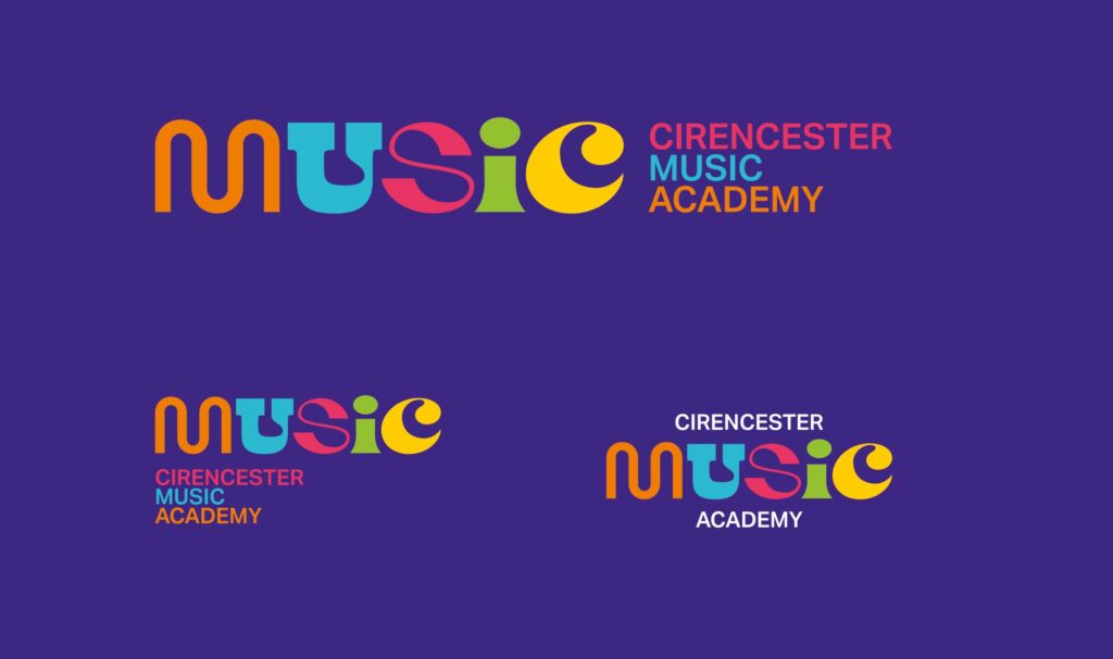
The final logo pairs that custom "MUSIC" wordmark with the full "Cirencester Music Academy" name set alongside it in a simpler, more restrained typeface, so the boldness stays concentrated in the one place it matters most.
To keep the logo genuinely versatile across everything from a shop front to a product tag, I developed several different lockups of that pairing: one with the full name sitting to the right of "MUSIC," another with it stacked underneath, and a third variant with "Cirencester" set above the wordmark and "Academy" below it.
Having that range of configurations meant the logo could adapt to almost any format or aspect ratio without ever losing its identity.
Presenting the Process
Whenever I share a finished logo with a client, I don't just drop the final file in their inbox. I walk them through the thinking, the directions considered, the reasoning behind the choice, so they understand not just what the logo looks like, but why it's right for their business.
In this case, because the mood board stage had already narrowed things down to one direction, the final presentation was able to focus entirely on bringing that concept to life, showing the wordmark in context: on a shop front, on staff clothing, on product tags, and across web and social media, to demonstrate just how versatile it could be.

The response was immediate. The founders loved it on sight and asked for no amendments at all, which, as any designer will tell you, is a rare and brilliant thing.

A Little Extra Pressure, in a Good Way
Growing up in Cirencester added a layer to this project that most clients never bring with them.
School friends and close family will walk past that shop regularly, and I visit the town a few times a year myself. That meant this logo wasn't just going out into the world for strangers to judge, it was going up somewhere I'd be confronted with it in person, where people who know me would likely say "my brother did that" (or in my sister's case, simply take the credit for the introduction).
I needed to be genuinely, proudly happy every time I saw it, not just professionally satisfied.

Seeing It Come to Life
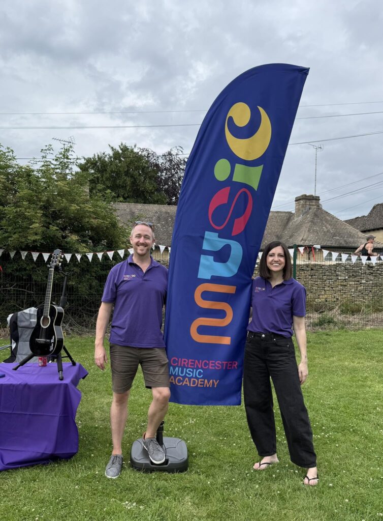
One of the best parts of this project has been watching Stuart and Nicki actually launch the shop and start promoting it around Cirencester. They've been out and about holding up flags with the logo on, wearing custom t-shirts featuring the design, and clearly enjoying showing it off.
There's a real sense of pride there, and it's exactly what a logo like this should be doing, helping them stand out, feel proud of what they've built, and pull people through the door of the new shop.
Wrapping Up
The final logo for Cirencester Music Academy does exactly what it needed to do. It's bold, colourful and unmistakably modern, built entirely around custom typography rather than the well-worn symbols so many music brands default to. It's memorable enough to be recognised even when the town inevitably shortens the name in conversation, and versatile enough to work everywhere from a shop window to a t-shirt.
I hope this behind-the-scenes look gave you a clearer picture of what goes into a project like this, from early strategy and honest local insight, through to mood boards, custom typography, and a confident final presentation.
If you enjoyed this blog, and you're a client looking for a logo designer, reach out to me here.
...or, if you're a designer, be sure to check out my book Make a Living Designing Logos, where I take a deep dive into my design process and share practical, honest advice on building a successful design business. You can also take a look at my Ultimate guide to Logo Design. From attracting clients and establishing authority to managing projects and navigating client relationships, I've packed in everything I've learned, so you can make a living doing what you love... designing logos.

About the Author
Ian Paget is a UK-based logo and brand identity designer with over 20 years of experience, specialising in logo design for the past 15+ years. He is the founder of Logo Geek, a globally recognised logo design studio, podcast, and educational platform followed by over 100,000 designers and creatives.
Ian is the author of Make a Living Designing Logos and host of The Logo Geek Podcast, featuring leading designers and brand experts from around the world. His work has been featured in publications including AdWeek, Entrepreneur, and Creative Bloq, and he focuses on creating logos that are strategic, simple, and built for long-term recognition.
I'd love to hear your thoughts.