Cirencester Music Academy is a new music school and instrument shop opening in the heart of Cirencester, offering tuition on a wide range of instruments. Founded by musicians with a strong local reputation built through open mic nights, festival stages, and years of one-to-one teaching, the academy needed a logo design that could carry that reputation into a brand new, town centre location.
Ian Paget was commissioned to design a music school logo that would feel bright, modern and welcoming, one that could work equally well on a shop front, a website, staff clothing and product tags, while standing out from the traditional music notes and treble clefs so many music brands rely on.

Cirencester Music Academy is opening with a clear ambition: to become the hub of musical education in the town, welcoming everyone from primary school children to retirees. With no dedicated music shop currently in Cirencester, and only individual home tutors offering lessons locally, the academy set out to be the first proper destination for music tuition and instruments alike, a safe, sociable, town centre space with DBS-checked teachers and a genuinely tailored approach to learning.
The brief was built around the tagline "Instrument tuition tailored to you", and a clear set of values for the brand identity: fun, modern, inclusive, safe and trusted, local, and expert without ever feeling intimidating. The founders were adamant that the logo should avoid the well-worn symbols of music branding, no treble clefs, no sound waves, no microphones, and avoid clichéd Cotswolds imagery too. What they wanted instead was something contemporary, vibrant and versatile enough to work across web, print, retail and even staff uniforms.


Having grown up in Cirencester myself, with family still local to the area, I understood the significance of that gap in the market. I also had a strong instinct about how people would talk about the business day to day. "Cirencester Music Academy" is a ten syllable name, and in my experience, names that long tend to get shortened in conversation. I expected locals to simply refer to it as "that music shop" in town, so the identity needed to work hard as a memorable, standalone piece of branding rather than relying on the full name being said or read every time.
With that in mind, I developed two genuinely different creative directions rather than settling on one early.
The first explored the idea of visually representing sound itself. Inspired by resonance experiments, this direction imagined an abstract mark built from simplified sound patterns, paired with a refined, sophisticated typeface for a more polished, professional feel.
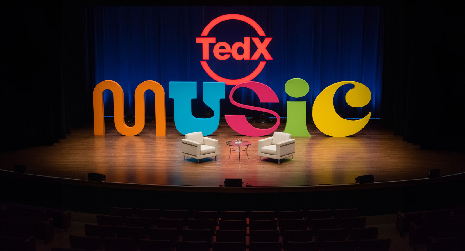
The second direction took a completely different approach: bold, colourful, and full of energy. Rather than illustrating an instrument or a symbol, this concept focused entirely on custom typography, treating the word "Music" itself as the logo, with each letter individually styled to feel like a different sound or personality.
Because the two directions were so distinct, I put together mood boards for each before progressing further, and shared them with the founders to gauge which direction resonated most. This is something I don't always do on every project, but when two ideas pull in such different directions, it's a valuable way to make sure creative energy is invested in the right place before detailed design work begins.
The founders responded immediately to the second direction, the bold, multicoloured typographic approach, which meant I could commit my full attention to refining a custom set of letterforms for the word "Music." Each character was designed to abstractly represent a different sound, giving the wordmark a sense of rhythm and playfulness while staying clean and legible enough to scale down onto tags, staff clothing, or up onto a shop exterior.
To dive deeper into the behind the scenes design process, take a look at my blog post "Behind the Scenes: Designing the Logo for Cirencester Music Academy"

The result is a vibrant, distinctive music academy logo that avoids every cliché typically associated with music branding, no notes, no clefs, no sound waves, in favour of something far more ownable: a custom typographic treatment of the word "Music" itself, built to be recognised and repeated even if the full academy name isn't. It's bright, inclusive and unmistakably modern, credible enough for parents and retirees, exciting enough for teenagers, and versatile enough to travel from the shop window to the website to a t-shirt without losing any of its energy.
If you're looking for a logo designer who takes the time to understand your community, your customers and what makes your brand different, get in touch with Ian Paget today to discuss your project.
The founders kindly shared the below testimonial shortly after the project completed:
"Ian designed our logo for us and it's hard to put into words how perfect it is! From the moment we met Ian for an initial chat about the project we knew we were in safe hands. His process was strategic and well thought through with each stage of the design process communicated clearly. We received amazing updates throughout the design process giving us lots of opportunity to feed back on his ideas. As soon as we saw the design we loved it instantly and literally had no amendments. We couldn't be happier - if you want great logo design, Ian is your man!"