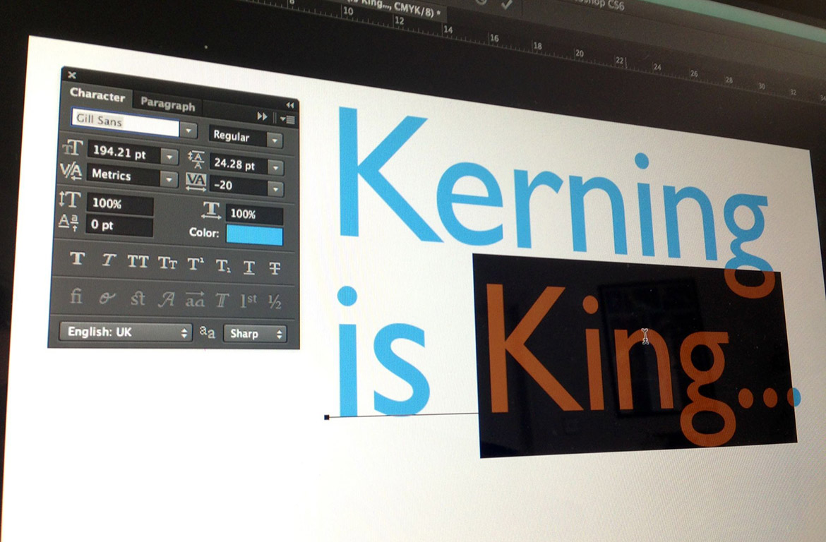
When working with typography, kerning is the term used to describe the space between two individual characters within a font. In logo design getting the kerning right is paramount as it makes the difference between looking professional, and having a logo that’s ‘not quite right’. The kerning applied automatically by a design program is typically […]
Continue Reading