I started my design career working in print design (brochures, leaflets etc), where I applied grid systems to my designs, and it made the work look super professional. When I started designing logos I applied similar rules to my work and found it brought the same level of uniformity I had hoped.
But there was something not quite right… sometimes my logo designs just didn’t look as professional as I’d liked. My work simply wasn’t on par with the work I benchmarked myself against, and I couldn’t work out what I was doing wrong… I felt my ideas were good, but the execution was a little ‘off’.
That’s when I met up with a designer who’d been creating high profile logos for years (a real master in the industry) and he pointed out an error with my type design… He told me I needed to apply ‘optical corrections’ to my typography design work. At first, I couldn’t see the problems he was pointing out, but now I look back it’s so obvious to me where I went wrong, and I now see so many other designers making the same mistakes I was making.
Guides, rules and grids are great, but the reality is that you need to make optical corrections that ‘break the rules’. Yep… sometimes you need to ignore that grid, and correct by eye so the design ‘looks’ like it’s applied to a grid (sounds weird and somewhat counterintuitive, but hear me out with this).
After this discovery, I noticed a number of optical illusions that logo designers need to consider, and I’ve seen that all the big branding agencies take these into consideration when designing identities. This understanding has helped to take my logo design work up a notch, and I want to share what I’ve learned so far with you.
Perfect can look imperfect (and vice versa)
Last year Google released a new identity, and part of that was a G icon that the company used on its social media profiles.
![]()
I loved the full Google redesign but noticed a designer who wasn’t so sure. They pointed out some apparent ‘issues’ that became visible when applying ‘perfect’ guides to the design. This designer corrected the logo (see below), but the results look slightly unbalanced. Although physically mathematically correct, this new proposed design look slightly wrong, whilst the original ‘non-perfect’ design above looks perfect.
![]()
The Google G icon is a nice example of when the designer has applied considerations to the design based on how it looked, rather than sticking to perfect grids and guides. Sometimes you’ll need to do the same, and your work will look much better for it.
In summary… use grids only as a guide, and not a rule. Correct by eye.
Type design ‘Overshoot’
There’s a really great blog by type designer Tobias Frere-Jones that explains Type Mechanics which I recommend reading to really understand the macro details needed to design really great type, but one area from his blog series I want to raise here is Overshoot.
Take a look at the image below of a square next to a circle. When the circle is mathematically the same height as the square it appears to be too small… to counteract that the height needs to be increased slightly so it looks correct to the human eye. This height increase is called ‘Overshoot’.
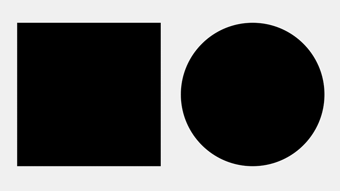
Image credit: Typeface Mechanics by Tobias Frere-Jones
Take time to really study the typography that surrounds you… Now I’ve pointed this out you’ll see it everywhere and come just as obsessed with type as I have been this past year.
Gestalt theory
The human brain can do some amazing things. As the world around us is so complicated, our brain attempt to organise visual components into groups of ‘unified wholes’. There’s a physiological term to describe this, and it’s called Gestalt.
There are a number of gestalt principles that can be applied to your logo design work, which includes; similarity, continuation, closure, proximity, figure and ground. To learn more about each of these I recommend reading the in-depth post on Gestalt Theory from the team over at Canva.
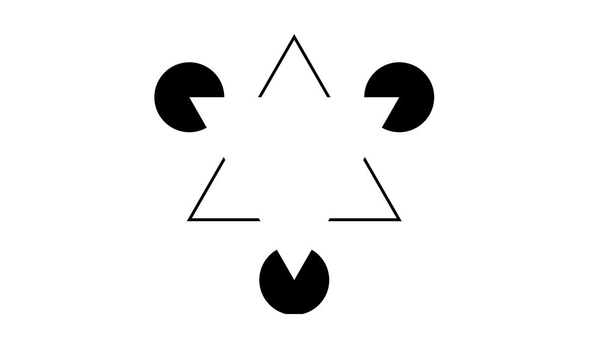
My favourite example of gestalt theory in practice is the panda icon included in the WWF logo, which uses the gestalt principle of ‘closure’ to look like a panda bear, despite in reality, being a number of separate objects.
![]()
Gestalt theory is a nice reminder that you need to design not only what’s there, but also what’s not there too… (easy right?)
Irradiation Phenomenon
If you design a dark logo on a white background you’ll most likely need to design a white version too so the logo is versatile.
Most people think all you need to do is change the colour to white and you’re done. But… that’s not the case. Something weird happens… the logo actually looks ‘fatter’. The contrasting difference has made the exact same logo look like it’s put on some weight!… weird right? This illusion is called Irradiation Phenomenon.
![]()
Thankfully there is a simple solution. When designing a white version of your logo designs you can simply apply a thin stroke, expand the shape and use the pathfinder tool in illustrator to remove it. How much ‘weight’ you remove will need to be done by eye, but the aim is to make the design look optically the same in white on black as it does when black on white.
That’s a few examples of optical illusions in logo design that I’ve seen and considered in my work. Have you seen/used any others? Let me know by sending me a message, or by starting a chat on twitter. Would love to hear your thoughts.