As part of my plan for 2017 to roll out more frequent content, I’m also pulling in guest posts from the Logo Geek community to share graphic design insights and wisdom that I can learn from too. This is a superb guest blog post from Evan Brown, who is a Marketing Manager and Blogger over at DesignMantic. In this post, he discusses Gestalt Theory and the role it plays in Logo Design. I hope you enjoy it as much as I did…
In the 1920s, a group of German psychologists came up with a series of theories of visual perception, analysing how humans group together different objects into a single coherent whole or in groups, when presented with separate elements arranged together in a particular way. Kurt Koffka, Wolfgang Kohler, and Max Wertheimer are the prominent founders of the collection of principles and theories, collectively known as the Gestalt Effect.
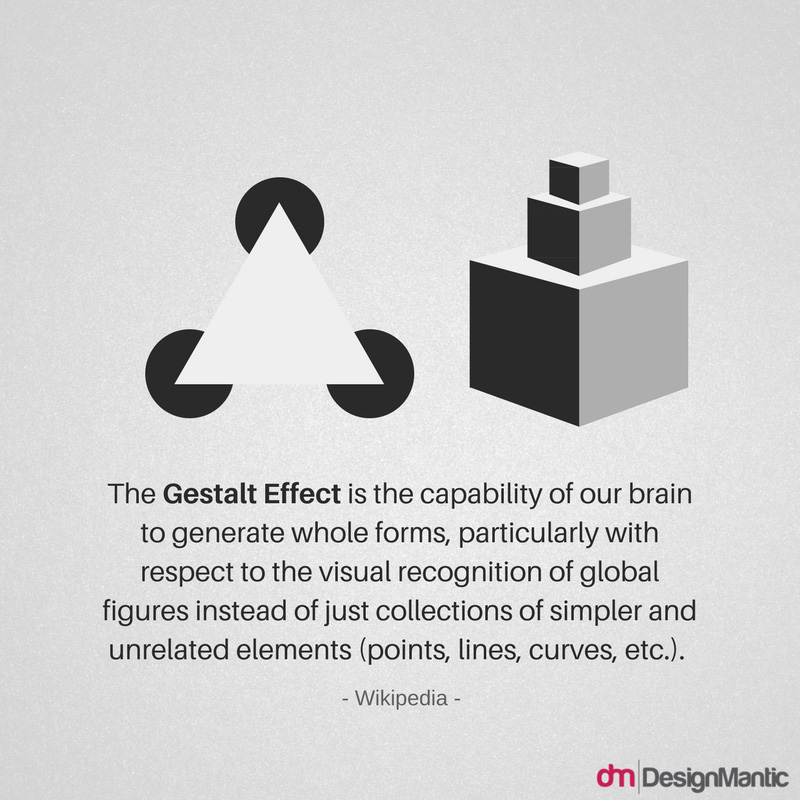
Since then, the word Gestalt has been thrown around a lot in design. Derived from the German word for “shape”, pattern”, “structure”, or “shape”, it hints at the overall look of something that is greater than the sum of its parts. In the jargon of psychology, gestalt refers to the basic principles that aid us in visually perceiving order.
Designers are often curious about what happens when someone’s eye meets their design creation, and how their mind reacts to the piece being shared. Understanding how a design is interpreted and perceived is a crucial asset that visual hierarchy and communicators aspire to possess. These principles are fundamental building blocks for creating visual meaning, especially in the field of logo design.
Here’s a logo-designer-oriented crash course to help you utilise gestalt principles in your work!
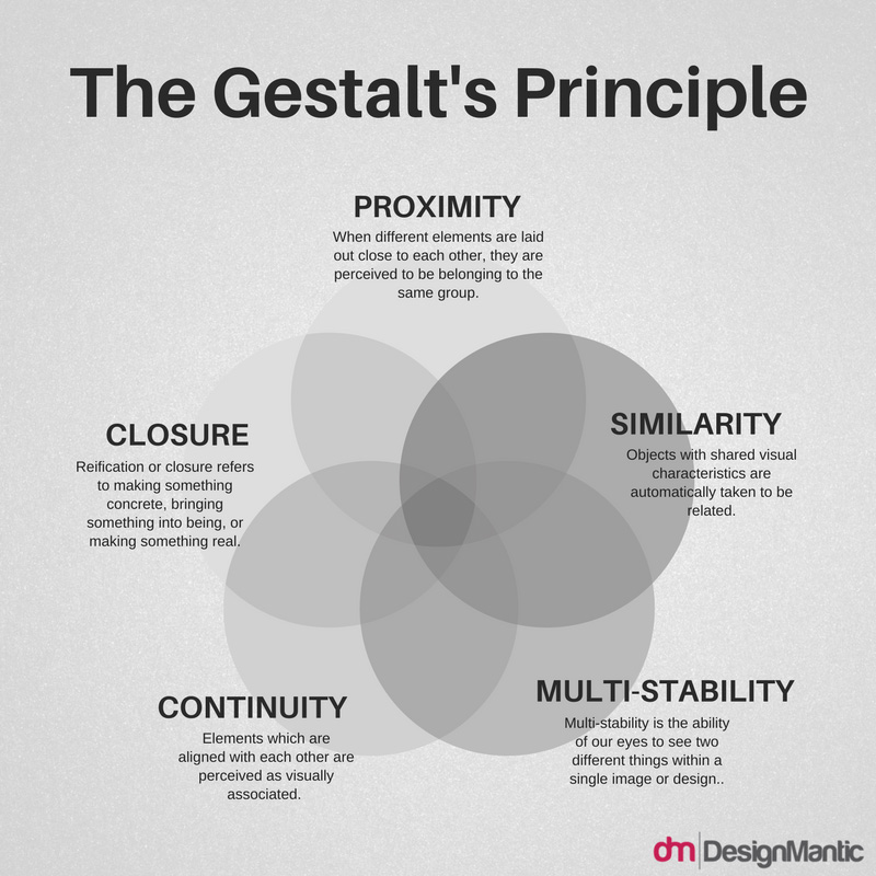
1. Proximity
When different elements are laid out close to each other, they are perceived to be belonging to the same group. For instance, consider how our eye leverages proper kerning to discern which letters make up individual words in a sentence. Excessive spaces between letters can be quite confusing as to where one word ends and the next begins.
In the example of the IBM logo below, our brain combines each of the adjacent horizontal bars to create a single image of the IBM logo. This is why when we look at the IBM logo, we see three letters composed of short horizontal lines, stacked atop each other, instead of the 8 horizontal lines interspersed with uniform gaps.
![]()
To some extent, it’s because we instantly recognise the silhouette of the three letters, but mostly because we tend to perceive objects that are close together, such as a series of lines, as a group. In addition, the short segments of “I” appear considerably closer together than the long and short segments of the top horizontal bar, which has greater gaps between the crevice in the “M” and the letters “B” and “M”. This is why “I” is perceived as a unit instead of the top horizontal bar.
The Unilever logo also confirms well to the Gestalt principle of proximity. Since all the miniature icons are clustered together, the resulting bunch easily reads as a “U” in the logo mark. According to the branding minds behind this creative logo, the brand mark is meticulously designed to incorporate 25 icons intricately woven together, each depicting an important aspect of the efforts invested by the Unilever brand to render sustainable living commonplace.
![]()
Since the company ‘CMON’ is well known for its focus on high-quality games featuring engaging, fun gameplay and amazing miniatures, its logo leverages popular game components to create the ‘N’ and ‘C’ of the new logo to reflect the playfulness they strive to bring to gamers’ lives!
![]()
Similarly, the logo for the export-oriented brand “Turkey: Discover the Potential”, echoes the myriad industries in which this brand slogan is brought to life by Turkish companies. Some QR code is even thrown in to infuse a techy twist to the stunning logomark.
![]()
2. Law of Closure
Reification refers to making something concrete, bringing something into being, or making something real. This is a constructive principle when it comes to our perception since our brains are able to construct more information than is actually present to concur logic. Similarly, the law of closure describes the ability of the brain to complete a shape or object, even when it is not contained or closed fully. The human mind doesn’t humour loose ends, or to put it in the words of the Principle of Reification, our minds fill in the gaps.
Closure can be construed as the glue that holds elements together. It relates to the human tendency to find and seek patterns. The secret to achieving a perfect closure is to provide sufficient information, so the eye can fill in the rest. If too much information is given, the need for closure is subdued, while if too much is missing, the eye perceives elements as separate parts instead of a whole.
![]()
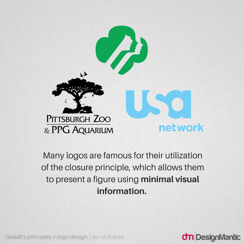
Many logos are famous for their utilisation of the Gestalt closure principle, which allows them to present a figure using minimal visual information. The logo redesign of Ontario Soccer by Brandfire (shown above) is one example. In their logo, we sense the five outer rings, representing the five stakeholder groups- Players, coaches, match officials, administrators, and volunteers-, and the classic centre trillium creating a contemporary 3-D soccer ball shape, even though there’s no actual line there!
Perhaps the hidden arrow in the FedEx logo is one of the most popular examples of the utilisation of negative spaces. Instead of having its own boundary lines, it borrows slyly from the borders of the “E” and the “x”.
![]()
Redesigned in 2005, The USA Network logo makes use of white space between the letters “U” and “A” to form the letter S. Similarly, the Girl Scouts logo creates multiple silhouettes using white space. It may take a few looks, but you will eventually work out the lion on the right and the gorilla on the left in the logo of the Pittsburgh Zoo.
3. Principle of Similarity
Objects with shared visual characteristics are automatically taken to be related. The more alike they appear, the more likely they are to be construed as belonging to a group. Similarity is not derived from what an object is, but what it looks like. Similarity can be achieved in myriad ways, including shape, orientation, value, colour, and size.
The logo for panda security touts the idea of transforming complexity into simplicity by focusing on the solution instead of the problem. The design concept is direct, honest, and pure. The logo renders an abstract but real face to threat by playing on an imaginative perception of viruses, using an optimistic and iconic language that works across all touch points. Not only is it a good deviation from the typical shield-and-lock metaphors of businesses in the niche, it perfectly links the logomark with the wordmark, rendering the abstract image of a panda in the same hues as the logomark.
![]()
The logo for Los Angeles’ Museum of Contemporary Art (MOCA), is also an intriguing example embodying the principle of similarity. “C” is the only proper letter, since the logo substitutes a square, circle, and triangle respectively for the remaining letters “M”, “O”, and A. Chances are that their audience will be inclined to view the black “C” as an outlier, and group all the coloured shapes together, even though they are not next to each other. Try as you might, it would be a strain to perceive the “C” and the triangle as a pair, and the square and the circle as another pair, even though this logical sequence would have taken precedence in any other case. That’s the similarity gestalt principle at work.
![]()
In another example from Sun Microsystems, the SUN logo only constitutes a U and an upside down U, arranged in a loop. However, when together, the reverted “U”s look like they are forming the word “SUN” on all the four sides of the quadrilateral, and are part of the same logo.
![]()
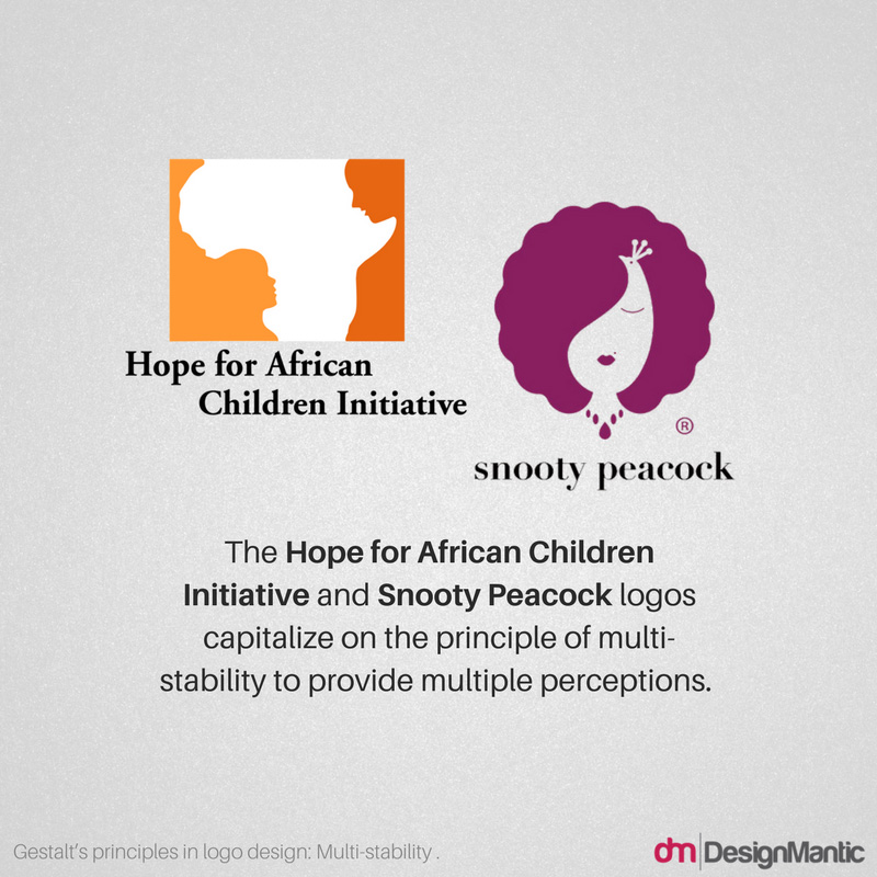
4. Multi-Stability
Multi-stability is the ability of our eyes to see two different things. When looking at an image, a viewer can have different experiences simultaneously, since there are myriad interpretations being triggered. However, the art of deception lies in the fact that the two interpretations cannot be seen both at once. The mind is caught up in the dilemma of juggling two ideas and contemplate back and forth on which is which. The mind eventually decides to make one the dominant interpretation. The longer you look at the dominant image, the harder it becomes for the eyes to intercept the other perception.
A great and timeless example is that of the Spartan Golf Club logo where the profile of a Spartan helmet and a golfer mid-swing are cleverly depicted in the same image.
![]()
This wonderfully minimalist logo design was created by Italian graphic designer Gianni Bortolotti for the company ED (Elettro Domestici), who combined the initials of the company name side by side to create the shape of an electric plug (Notice how your Eye uses the law of closure to automatically bring into focus the letter “E”, despite having no discerning boundaries). This logo design is a great example of how form and function can coexist harmoniously; the meaning is clear whether your brain first registers the plug or the letters.
Both the logos of “Hope for African Children Initiative”, and the jewellery boutique “Snooty Peacock”, capitalise on the principle of multi-stability to provide multiple perceptions. In the case of the former, the logo simultaneously depicts the map of Africa and the waning silhouettes of an adult and a child, while for the Snooty Peacock logo, you can see both a peacock with magnificent feathers unfurled and a woman with meticulously styled hair. What a stroke of genius!
5. Law of Continuity
Elements which are aligned with each other are visually associated. For instance, lines are perceived as a single figure as far as they are continuous. The smoother their segments, the higher the chances of being perceived as a unified shape. The Law of Continuity principle can be seen where a line is cutting through an object, aligning perfectly with a secondary element, and can be used to point towards another element in the composition. Our eyes follow a line naturally; when we see an object, we are automatically compelled to move through another object.
For instance, our eyes follow from the C in Coca to Cola, continuing on from the C in Cola through to the L and A in the word. This visual aid helps our eyes continue to move through the word!
![]()
It hardly comes as a surprise that the psychology of sight is so indispensable to a visceral field like logo design. If you are ready to infuse potent psychology principles in your design project, think about similarity, proximity, figure-ground, and other principles outlined above when creating a composition.
Have you seen stunning logo designs where Gestalt’s principles are at play? We’d love to discuss… Find Evan on twitter @EvanBrownDM or @DesignMantic, or chat with Ian (Logo Geek) at @Logo_Geek.
About the Author:
Evan Brown is a Marketing Manager and Blogger at DesignMantic, an online logo maker tool which can help start-ups and SMBs to DIY their business logo design. He has been working in the social media space since 2008, with a focus on design services, user interface planning, branding and others in the graphic design industry.