This is a guest blog from Del Mauricio, a multi-media designer and founder of Aesthetic Philosophies – a graphic design consultancy and blog.
For decades, logo designers have relied on a set of design principles and intuition to create successful logos. Most designers through years of experience and practice know what works. Yet, they may not understand why design works. That is why logo designers need to embrace insights from neuroscience and psychology about how the brain reacts to logos, so that they can make better and more strategic design decisions. This is called neuro design.
Think of neuro design as ergonomic design for the brain. Neuro design provides a set of fundamentals that tell us how to design logos that intuitively appeal to our brains and are more easily recognisable. Consequently, neuro design can augment the logo design process by using its principles to test designs against real human reactions.(1)
Before we delve into how neuro design can enhance logo design, let’s first understand how our brains process a logo.
How Our Brains See a Logo
Research has shown that when we see a logo, its visual elements are processed in different parts of the visual cortex. They are also processed at different times. The first element we perceive is colour, followed by form and motion. Then our brains decipher the meanings those visual elements convey and matches them up with previous experiences and memories.
If matching experiences exist, then the brain adds attributes from our previous experiences with the logo such as the product name, brand attributes, and preferences. All of this happens within 400 milliseconds. Entrepreneur.com offers an interesting infographic that illustrates How your brain “sees” a logo.
![]()
Now that we know how our brains decode logos, let’s discuss the neuro design principles that will allow you to create more effective logos based on scientific evidence.
Visual Saliency
Our worlds are full of visual stimuli everywhere we look. As a result, our brains have evolved to drive our attention to things that move or stand out from their surroundings. This is a quality neuroscientists call visual saliency.
This process is automatic and pre-attentive. In other words, our brains innately react to these triggers before we even pay attention to them. This is likely an evolutionary trait that aided early humans in spotting moving predators or finding fruit in trees for example. Harnessing the power of visual saliency allows designers to create logos designed to grab our attention.
In logo design, the prevailing ways to increase a logo’s visual saliency is through the use of colour, brightness, contrast, patterns, and depth. These properties are used to make the logo stand out from its background or surroundings. Thus, considering where and how the logo will be used is critical. For example, logos that have contrasting colours are more easily recognisable. As a result, contrast can feel aesthetically pleasing because it makes design elements jump out at us more strongly.
The Dropbox and PlayStation logos are good examples of how using depth can make a logo stand out more and thus more salient. A logo can also become more salient if it looks out of place, simply because it is not expected. The Apple logo can be considered salient because we do not usually associate a fruit with computers and technology.
![]()
Movement is another way to instinctively get our attention. Designers have already found ways to incorporate motion into logo designs. Implied motion is a neuro design term for logos that create a feeling of movement. This can be achieved through leaning shapes or italicised text.
Animation is another way to leverage movement in logo design. Animated logos have recently become a growing trend in the digital world, where motion is used to make logos more captivating. For example, iRobot uses an animated logo on its website to pique the attention of its visitors. Evidence shows that visually salient logos are seen earlier, more often, and for longer.(2)
Processing Fluency
Studies have shown that our brains have a bias towards logos that are easy to understand. The brain requires a lot of energy to process the information it consumes. So our brains have evolved to minimise energy consumption by preferring designs that are minimalistic and easy to decode. Neuroscientists use the term processing fluency to describe how easy it is for our brains to process an image such as a logo. So it makes sense why more and more brands are using simpler logos and branding to increase their appeal to our brains.
Good examples of fluent logos Include Target, Nike, Apple, and McDonald’s. These logos are fluent because their designs are minimalistic and easy to process. And just like visual saliency, fluency is also a pre-conscious feeling, meaning we are not aware of it unless we give it our attention.
Even though our brains have a bias for minimalistic design, they can also appreciate more complex designs if they convey a recognisable meaning. A great example of this is the logo for the World Wildlife Fund. There is evidence that indicates fluent logos tend to feel familiar and as a result they appeal more to us.(3)
![]()
Propositional Density
Too much simplicity however, can be boring. And with logos you cannot risk being lacklustre or uninteresting. In fact, the stakes for the modern logo to make an impression are higher than ever. Thus, a good way to make minimalistic logos more intriguing is to introduce rich meaning. This is called propositional density, the conveying of as much meaning as possible with the least amount of graphical elements.
Propositional density can be measured by taking a logo’s number of deep elements (the meanings graphical elements convey) divided by the number of surface (graphical) elements. If the result is greater than one, then the logo has good propositional density.
For instance, the Apple logo features just two surface elements (the apple with the bite and leaf on top), yet it conveys a lot of meaning. Relevant meanings for this logo include: apples are good for you, they are universal (for everyone), associated with intelligence due to Isaac Newton’s ‘aha’ moment when an apple hit his head, associated with education when students give apples to teachers, and it may also be thought as the fruit from the tree of knowledge.
Logos with high propositional density are far more interesting because both their simple visuals and rich meaning are easily understood. Images with high levels of meaning can surpass those that are just simple.(4)
![]()
Patterns Pique Our Curiosity
Our brains love to create shortcuts to save cognitive energy. So our brains love patterns because they are easy to process and remember. As a result, the brain has an intuitive bias towards discovering and learning new patterns.
Neuroscientists believe this is the very core that fuels human curiosity and eagerness to seek out new information. There are several ways to incorporate patterns into logo design. These include geometric patterns (grid design), symmetry, and regular proportions (golden ratio).
Patterns are not necessarily obvious as they can be hidden. There is suggestive evidence from eye-tracking research that people do sense, even non-consciously, hidden geometry in an image (5). Some logo designers already make use of patterns to construct their logo designs.
For example, the Twitter logo is formed via a combination of overlapping circles that shape up the iconic Twitter bird. The underlying pattern is not immediately apparent, but once you outline the circles used, the pattern emerges.
The iCloud logo is another design that uses overlapping circles to create a geometric pattern that shapes up the logo. Many logo designers also use the golden ratio to craft instinctively appealing logo designs. Thus, using patterns in logo design is an effective way to pique our brain’s curiosity and make logos more memorable.
![]()
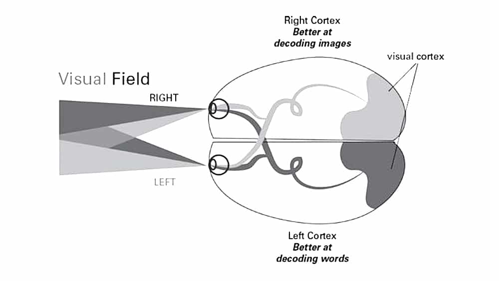
The Left Visual Field
Research has revealed that designs that feature an image on the left and text on the right are more aesthetically pleasing. That is because what we see on our left visual field is delivered to the visual cortex first, the right part of our brain that decodes visual patterns. And the information we see on the right reaches our left cortex, the analytical part of our brains.
We also have a tendency to pay more attention to visuals on the left side of our visual field, an effect called pseudoneglect(6). For cultures whose language reads right to left, the effect is the opposite. So it makes sense why a common solution in logo design has been to feature an icon or graphical element on the left side and a wordmark or business name on the right side.
Curves and Cusps
People have an innate preference for curves or tapered shapes rather than angular or spiky shapes. That is because sharp edges or angular shapes inherently remind us of objects that can hurt us. Visual saliency may also be partially responsible for our preference to look at curves and tapered shapes. Because curves are smoother and more unusual to occur in nature, our brains think they can offer something new and interesting. In fact, curvy designs suggest easiness and encourage interaction.
Studies has revealed that when people are shown both a curvy design and an angular design, they tend to look at the curvy design first(7). Curves can make a logo design feel approachable. While sharp angles and spikes can make a logo feel unapproachable. That’s not to say angular shapes don’t have a place in logo design. Our brains simply show a preference for curves and tapered shapes.
Interestingly enough, some experts suggest that shapes like cusps can be used to get our attention, even though they are pointy shapes. Because cusps signal fear, danger and caution to the brain, it has learned to pay close attention to them.
The Apple logo for example, features both curves and cusps in its design. Note that the curves are on the left side of the apple catering to our left visual field, and the cusps are on the right side. As a result, the logo is very effective at driving people’s attention. In conclusion, curves and cusps may be used in logo design to grab our attention.
Neuro Design: Scientific evidence that supports your design decisions
Neuro design lets logo designers understand why design works and how to appeal to our non-conscious brains. Its principles can provide you with a more strategic approach to your logo designs by supplying scientific evidence that supports your design decisions.
With an increasingly growing number of designers, logo makers, and AI applications, leveraging neuro design may be a tactical way to rise above and provide your clients with even more value.
Sources:
- Bridger, Darren. Neuro Design: Neuromarketing Insights to Boost Engagement and Profitability. 1st ed., KoganPage (February 28, 2017), pp.12.
-
Mormann, Milica Milosavljevic and Towal, R. Blythe and Koch, Christof, Visual Importance of Marketing Stimuli: Insights from Visual and Computational Neuroscience (December 29, 2015). http://ssrn.com/abstract=2709187
-
Bridger, Darren. Neuro Design: Neuromarketing Insights to Boost Engagement and Profitability. 1st ed., KoganPage (February 28, 2017), pp.43.
-
Martindale, C, Moore, K and Borkum, J (1990) Aesthetic preference: anomalous findings for Berlyne’s psychobiological theory, The American Journal of Psychology, 103(01) pp.53-80.16.
-
Bartlett, C (2011) The eyes have it: focal point choices and compositional geometry in painting, Proceedings of Bridges 2011: Mathematics, music, art, architecture, culture , pp. 489–92, Tessellations Publishing.
-
Bridger, Darren. Neuro Design: Neuromarketing Insights to Boost Engagement and Profitability. 1st ed., KoganPage (February 28, 2017), pp.66.
-
Bar, M. and Neta, M., 2006. Humans prefer curved visual objects. Psychological science, 17(8), pp.645-648.