I am pleased to have completed a new logo redesign project for French company, AngloForma, who offer English Language courses to French businesses and individuals.
The new logo has been designed to raise the profile of the business, to represent an established business, and to become a known name for English language courses in France. Instead of following the usual ‘textbook’ training format, which can often be perceived as boring, AngloForma aim to promote ‘the joy of communication’’ in a fun, friendly and personal environment.
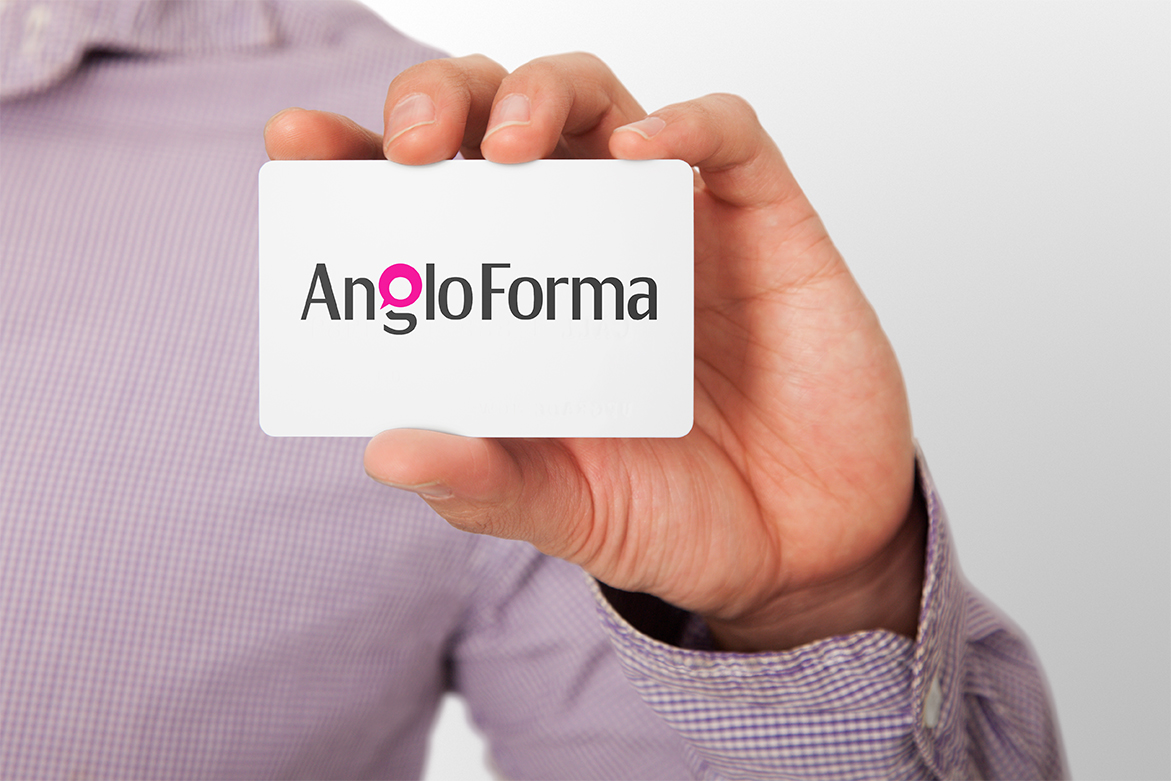
AngloForma Logo Design
The final logo design, presented below, gives the perception of a professional confident business, however to add an element of fun, the ‘g’ has been carefully crafted to represent a speech bubble. The colour, combined with the unbalance of the shape gives a fun slant to the design as a whole. The speech bubble, containing a circle (or globe) at its core, represents the hidden message’ talking to the world’
For more information on this project take a look at the AngloForma Logo Design case study.