If you’ve ever stared at a font browser with 500 options and felt completely paralysed, you’re not alone. I’ve been there too. Typography is one of those things that can feel overwhelming when you’re starting out. But over the years I’ve developed a process that makes it much more manageable, and I want to share it with you here.
The key thing I want you to take away from this post is that choosing a font isn’t really about personal taste. It’s about understanding what different fonts communicate, and then matching that to the goals of the project.
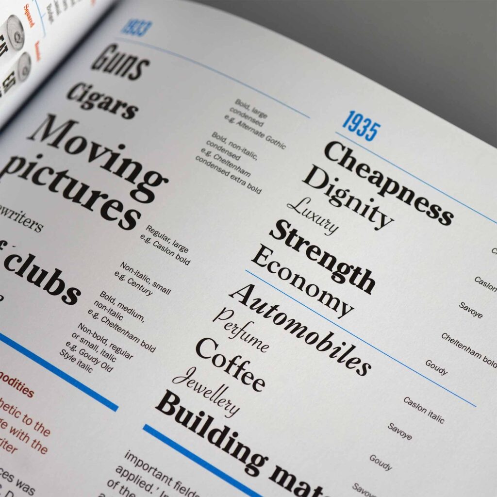
Different fonts have different personalities
I know that sounds obvious, but it’s worth sitting with for a moment. Fonts are entirely man-made, yet they’ve been around long enough that particular styles have become closely associated with specific objects, products, and industries. When you see a serif font on a law firm’s logo, something in your brain registers “credible, established, trustworthy”, even before you’ve read a word.
Here’s a rough guide I use as a starting point when thinking about style:
| Style | What it communicates |
|---|---|
| Serif | Classic, traditional, trustworthy |
| Slab serif | Vintage, masculine, sturdy |
| Sans-serif | Modern, minimal, clean |
| Script | Feminine, ornate, elegant |
| Handwritten | Playful, approachable, personal |
These aren’t hard rules… there are always exceptions… but they’re a solid foundation to build from.
If you want to go even deeper on this topic, I’d really recommend looking into the work of Sarah Hyndman at Type Tasting. She’s spent years running fascinating experiments to understand how people associate meaning with fonts, not just visually, but even how they might smell and taste. Her book Why Fonts Matter is brilliant, and it genuinely changed the way I think about type.
Understand the cultural context: Semiotics
Here’s something that took me a while to fully appreciate: the reason certain fonts feel right for certain industries isn’t random. It’s because we’re all drawing on the same shared cultural experiences.
From the moment we’re born, we learn to associate colours, shapes, and forms with different things. We see red traffic lights and know to stop. Most of us would assign blue to boys and pink to girls without being asked. None of this is knowledge we’re born with… it’s taught, and it evolves over time within the culture we live in. This is what semiotics is about: the study of signs and symbols and how meaning is created.
A discussion on Semiotics
I had a great conversation about this on the podcast with consumer psychologist Dr. Rachel Lawes, who wrote Using Semiotics in Marketing. She gave me a fascinating example about weddings, how brides want their day to feel unique and personal, but what actually makes an event feel special are its repetitive features. The dress, the bridesmaids, the ceremony. Take too many of those away and it no longer feels like a wedding, because you’ve stripped out all the semiotic signs.
The same thing applies to logo design. If you’re designing for an accounting firm, there are established visual codes, rooted in decades of cultural expectation, that make it feel trustworthy. Certain font styles, certain weights, certain levels of formality. If you ignore those codes entirely in the pursuit of being different, you’re fighting an uphill battle trying to re-educate people.
Understanding semiotics will open your eyes as a designer. You’ll start learning from everything around you… more observant, asking more questions, noticing why certain things feel the way they do.
Differentiation still matters, of course it does. But understand the language of the industry first, then decide consciously where to play within it and where to break from it.
My actual process for picking a font
So, with all that context in mind, here’s what I actually do when I start a new project.
I never just pick one font and commit to it straight away. Instead, I build up a shortlist of options that I think could work, and I compare them all together before making any decisions.
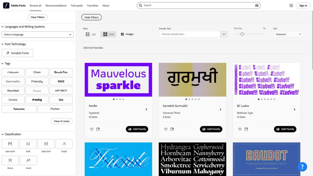
I usually start with Adobe Fonts. I’ll type the company name into the sample text field, then browse through the library using filters for style and classification. I’m looking for fonts that feel appropriate to the brief and look visually appealing in context. Anything that catches my eye gets noted and activated.
Then I open Illustrator, type the company name, and set it in each of the fonts I’ve shortlisted, stacking them all vertically on the same artboard so I can see them all at once. Seeing them together makes it much easier to spot which ones feel right and which ones are clearly wrong. From there I narrow it down to a handful, then eventually to one.
Once I’ve landed on a single option, I experiment with different weights and adjust the tracking until it looks exactly right. Even small adjustments to letter-spacing can completely transform how a name feels. It’s worth spending time here.
Jacob Cass of JUST Creative shared a technique he calls the “font wall”, and I use it all the time now. Create a template Illustrator document with the word “Logo” set in every font you use regularly, all stacked up. When a new project starts, use Find & Replace to swap the text to the actual company name. It’s a brilliant way to quickly preview your whole library in context, without starting from scratch each time.
Should you customise the font?
One thing I love to do when I have the chance is modify a chosen typeface slightly, or even draw custom letterforms from scratch. It can make a logo feel genuinely ownable in a way that an off-the-shelf font rarely does.
But I want to be honest about this: it’s not something to take lightly. Typography is a sophisticated art form. If the shapes aren’t quite right, if the optical adjustments haven’t been considered, if the stroke weights aren’t consistent, it will look amateur, even if the person looking at it can’t put their finger on why. The bar is high.
If you want to develop this skill, I’d genuinely recommend dedicating time to studying type design specifically. It’s a discipline in its own right, and even a basic understanding of how letterforms are constructed will make you a much more confident typographic designer overall.
Below is a great video on customising typography from Abi Connick.
I hope this helps take some of the overwhelm out of choosing type. The more projects you work on, the more intuitive it becomes, and once you start seeing the world through the lens of semiotics, you’ll find that the right font often starts to reveal itself pretty quickly.
If you’ve got questions or want to share your own approach, I’d love to hear from you. Drop a comment below or come and join the conversation in the Logo Geek community.