I’m always on the lookout for really great design resources, news and information so I can continue to learn and improve as a designer, and share with the community. I stumbled upon a blog from the team over at thoughtful regarding its logo design for Egg-n-Spoon (sadly the blog post is no longer online), which had an interesting comment:
“Being ex-Chase designer’s, we’ve been schooled to deliver the maximum message using the minimum of means – and if you can make an emotional connection too, well, you’ve found the Holy Grail of visual communication”
It’s got me thinking… how powerful is applying this technique to design work? Is less really more? Should I apply this rule to every design I create? To answer my question, let’s take a look at examples of designs which make use of this technique, then look at designs which don’t to compare.
Minimalistic Logo Designs
Below are a number of very well known logos which I believe are as refined and perfected as possible. There is nothing left to take away, and the meaning applied to each remains strong and intact.
Nike Logo Design
Possibly the most recognisable brand logo in the world is the Nike ‘swoosh’ designed by Carolyn Davidson when she was a student. Although very simple and perfectly refined the Nike logo is full of meaning, symbolising the wing of the Greek Goddess.
![]()
The London Underground Symbol
The London underground bulls-eye logo is instantly recognisable and incredibly simple. Take anything away and the identity is gone. So instant recognisable the roundel has to some extent become a symbol for London itself.
![]()
The Shell ‘Pectan’ Logo
For over a 100 years the Shell logo known as the ‘Pectan’ has represented the organisation. This has to be the most simple representation of a shells form.
![]()
WWF Panda Icon
The WWF panda icon makes a clever use of negative space, leaving the viewer to fill the gaps in order to complete the symbol.
![]()
The FedEx Logo
The FedEx logo is legendary amongst graphic designers of the world, and was recently voted as the world best logo ever in the book from Future publishing; 50 Best Logos Ever. There is nothing left to take away, and I believe it will stay this way for many years to come.
![]()
Logos which could be refined and simplified
When looking for logos which don’t use ‘minimum of means’ you may be interested to know its typically lesser known companies.
I have gone through the gallery on LogoMoose and pulled out a selection of visually appealing designs which could be simplified down further (below).
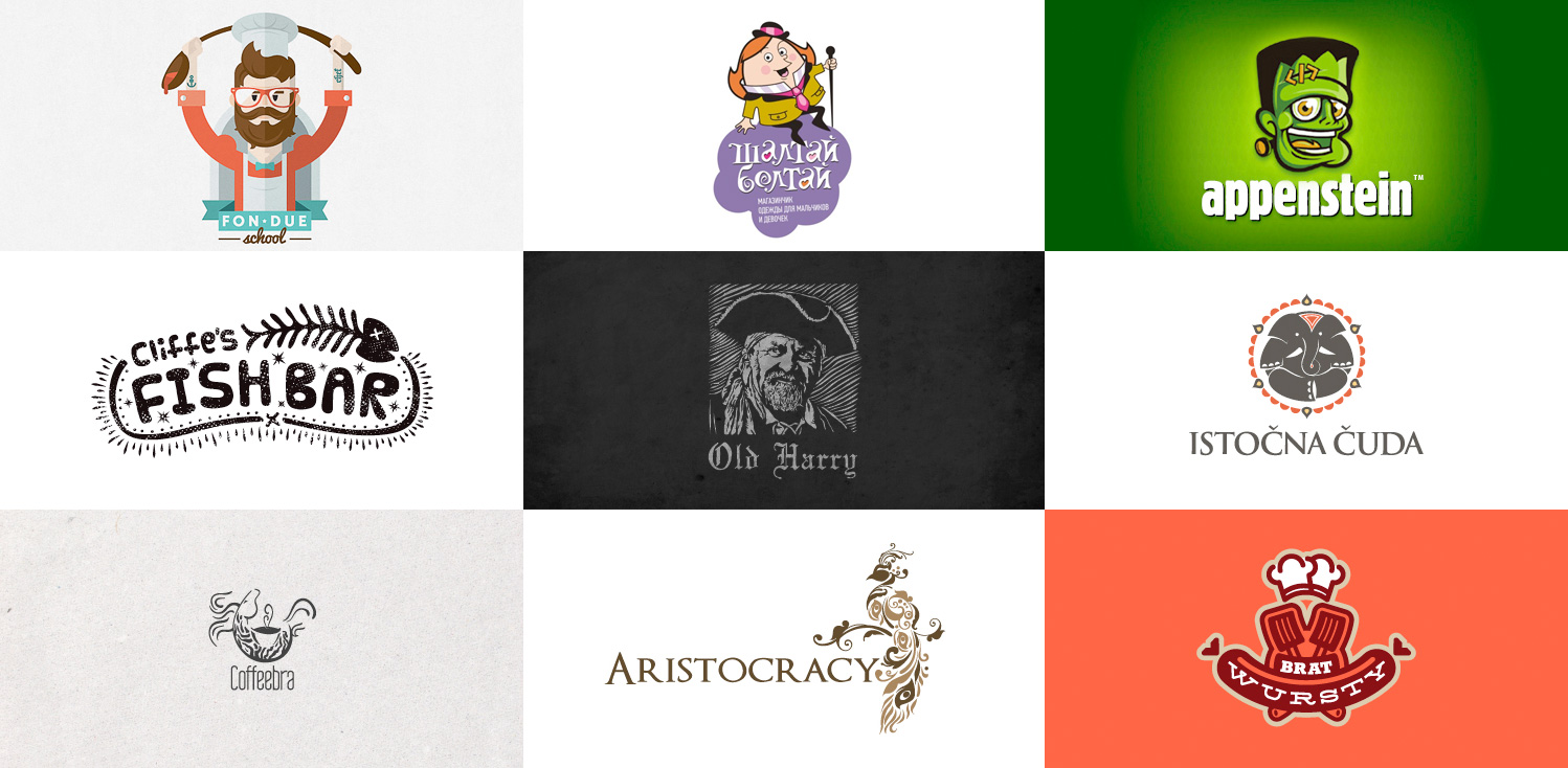
In most cases, I would prefer to refer to these as ‘illustrations’ rather than logo designs. Although well executed they could be simplified down much further, and when used in real life situations a number of problems could arise. For example, they could be difficult to reproduce, could have scalability issues (especially at smaller sizes), and being visually strong they could cause design problems when working on promotional and marketing materials.
A small number of these designs I personally like a lot, and although very detailed are well executed and relevant to the company and audience. For example, I really love the Old Harry logo, which feels very much like a high-quality vintage pub, and is a design which I don’t believe would work as effectively with less detail.
Although personally, I feel logo design should be simple in most instances, I don’t believe it’s always necessary. The fascinating thing with logo design is that there are no ‘rules’. We have ‘best-practice’ which does typically provide the best results, so it’s all about knowing when and how to break out. As with the Old Harry design, I believe the designer clearly understood the audience, business and its competition, and is clearly the work of a seasoned professional. Over complicating designs is typically a trait of a lesser experienced designer, which tends to cause the work to look amateur. Less is most always more when it comes to logo design.
Brands refine and simplify its identity over time
A fascinating observation is that a number of logos for large name brands have evolved over time to become more simplified to remove the elements which are ultimately ‘visual clutter’, making the identity more refined visually stronger. You can almost predict the future of some brand logos, as they get refined and perfected as time goes by to strengthen the identity.
The Starbucks logo evolution
The Starbucks logo has evolved over time, with each iteration losing elements not essential to the identity. Could it be refined further? I personally don’t think so.
![]()
Wendy’s Logo Design
Fast food chain Wendy’s logo has evolved and been refined over time. The latest version, released last year is much more refined and visually stronger. Could it be refined further? I think so yes.
![]()
WWF Logo Design
The very first logo designed for WWF was very detailed, even including fur. With time the shape and detail have been refined and perfected. Can it be refined further? I don’t think so – it’s ‘perfect’.
![]()
Although in some instances detailed logo design can work, I believe that maximum message using the minimum of means is the right way to go about logo design work, and the same way of thinking can be applied when redesigning a brand identity too. Applying this level of thought and refinement to a logo is clearly worth the time and investment. If you are looking for a logo designer then get in touch.
Have an opinion on this? Would love to hear your thoughts. Add a comment below and join in the discussion.