The Ice Cream Alliance (ICA), the UK’s only trade body dedicated to the ice cream industry, wanted to bring its brand up to date while launching a new awards programme.
Ian Paget was hired to redesign the ICA logo and design a badge for the Golden Scoop Awards, creating something that feels modern and professional, while still respecting the organisation’s 80-year history.
The Ice Cream Alliance sits at the heart of the UK ice cream industry. It’s more than just a membership group, it’s a support system. Whether it’s legal guidance, technical advice, or simply having a collective voice when the industry faces challenges like rising energy costs, the ICA plays a vital role in keeping businesses moving forward.
ICA is community driven. It's an organisation that brings people together, from long-established, family-run businesses through to a new wave of younger entrepreneurs joining the ice cream industry. With over 80 years behind it, there’s a real balance of heritage and forward momentum.
Alongside supporting its members, the ICA also hosts an annual Trade Show and a set of industry competitions. A big part of this rebranding initiative involved the complete revamp of the National Ice Cream Competition, which has been relaunched as the Golden Scoop Awards. The goal was to elevate it, and to put it on par with well-recognised achievements like the Great Taste Awards.
That meant creating a visual identity that felt more refined and prestigious. Something that not only celebrates excellence, but gives winners a real sense of pride in being recognised.
The primary challenge was to evolve the ICA's visual identity from having an outdated and “gimmicky” feel, to a modern, professional, and forward-thinking image, on par with organisations like the FSB. This required a design that was clean, simple, and versatile enough for both web and print applications.
For the Golden Scoop Awards, the objective was to create a badge that exuded elegance and prestige, drawing inspiration from awards such as Great Taste. A crucial aspect was ensuring the design's flexibility to accommodate variations for different award levels, such as star ratings (three, four, or five stars), for use on medals, certificates, and promotional materials.
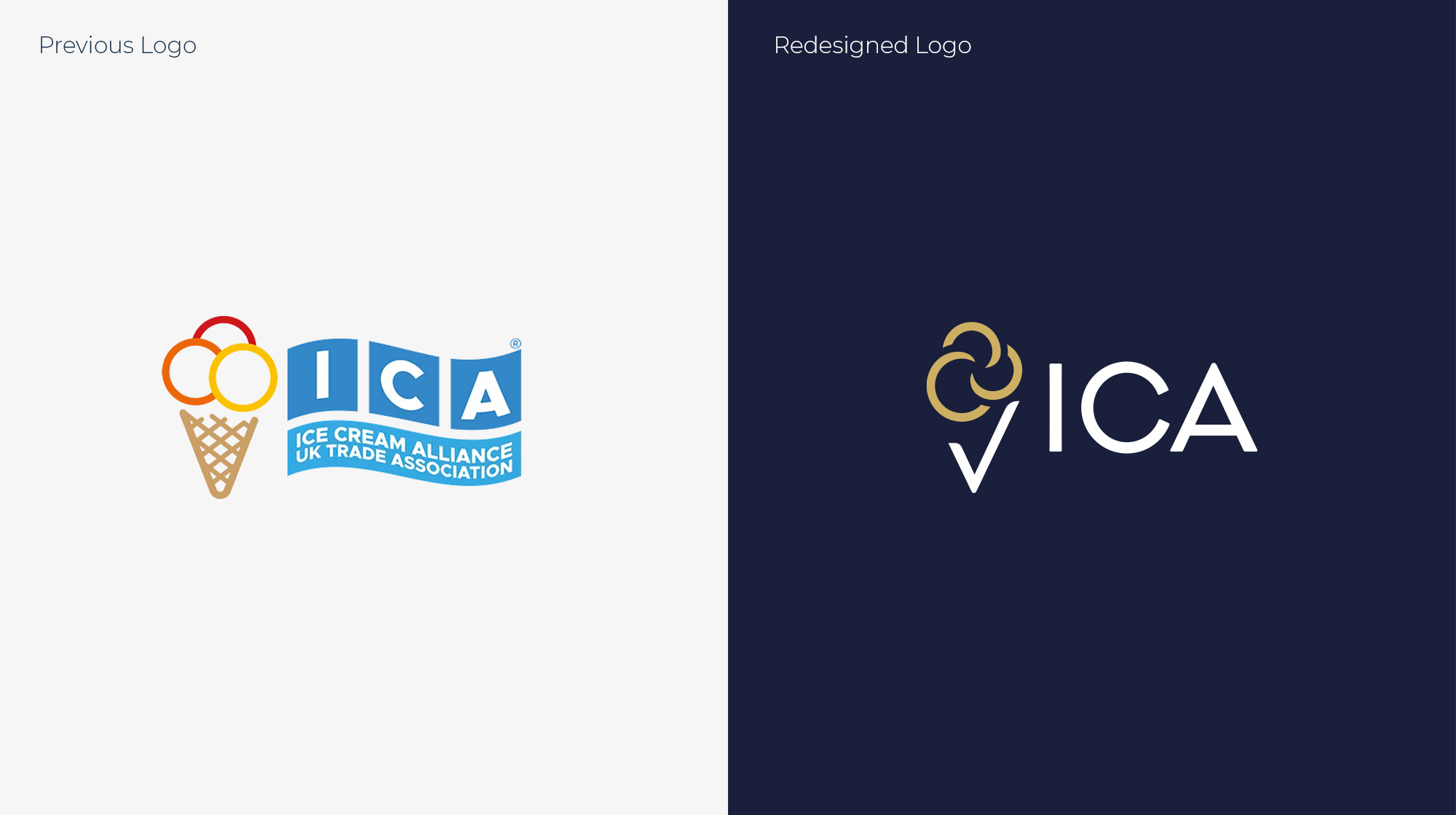
The solution for the Ice Cream Alliance logo features a simplified ice cream symbol, crafted from three interlocking rings and a tick. These rings represent the strong sense of community within the ICA while forming the shape of three ice cream scoops. Below this, a cone shape, which doubles as a tick, symbolizing approval, quality, and achievement.
The chosen colour palette incorporates navy blue, conveying professionalism and stability, with a gold accent adding a touch of prestige and celebration. The overall design is clean, professional, and avoids any overly ornate elements, aligning with the groups desire for a sophisticated and modern identity.
The new marks for the Ice Cream Alliance and the Golden Scoop Awards strike a much clearer balance between heritage and progress. By focusing on stronger, more deliberate symbols, the new logos feel more confident and professional. They’re designed to work just as well for long-standing members as they do for newer businesses entering the industry, while clearly signalling quality and credibility.
For the Golden Scoop Awards in particular, the shift was about raising the perceived value. The new badge gives winners something they can genuinely be proud to display, more in line with respected industry accolades.
Overall, this wasn’t about reinventing the ICA, but repositioning it, making sure the brand reflects the role it already plays as a central, trusted voice within the industry.