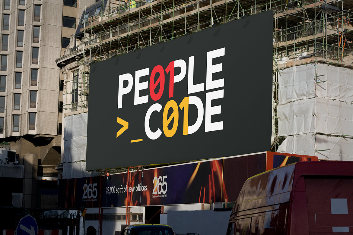
I have recently completed a new logo design for German recruitment agency, People Code, who target technology professionals seeking careers at the hottest international tech firms.
You can read more about the logo design for People Code by clicking here, but in this blog I want to show off some of the behind the scenes development of this particular design, to show the level of experimentation and development that goes into each logo I design.
Starting with a Sketchbook: Visual Brainstorming
At the start of any logo design project, I start by sketching ideas, and I try to keep this quick and loose, sketching down and exploring ideas as I think of them. I like to think of this as ‘visual brainstorming‘.
My initial focus for this particular project was to look at how I could incorporate binary or code into a typeface and keep the design very simple which was one of the clients initial requests (I will show some of these later in this blog post), but to properly explore the potential of the logo I also looked at how I could create a standalone icon to represent the business.
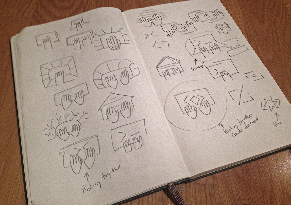
I had a number of concepts for the icon, but for the design that becomes the final symbol, I started to explore ways to visually represent someone writing code. My first thought for this was a hand, with a screen or keyboard of some type. Although my initial thoughts of this was that it was ‘a rubbish idea’ I took a visual note of it as it could potentially spark another ‘better‘ idea – it takes a few seconds to scribble down a thought, so even if it’s bad I get the idea down on paper to get it out of my mind.
I started to consider the concept that developers are creators, and looked at how I could visually represent this. It was through trial and error with visual brainstorming that the idea evolved.
As you can see in the image below these sketches are rough, but it shows the progress of how this quick visual brainstorming developed a weak idea, into a tangible concept that I could develop further.

Developing the icon design further as vector artwork
Following on from sketchbook work I start to further explore the rough ideas in Illustrator. I try to work fairly rough even at this stage as my designs are still developing – once a design is ‘perfect’ I will then recreate, improve and polish the design as required.
In the below image you can see a number of experiments, where I was exploring various concepts and ways of to execute the hands and screens based on my sketch work, which allows me to see if an idea has the potential to work or not. Sometimes what seems a good idea in concept, fails to work well as a real design.
The icon design at the bottom right is what become the foundations for the final icon design.
![]()
Selecting a Typeface
Once I had an icon I was happy to proceed with, I then started to look at various typefaces which could work in harmony with and compliment the icon design. I experimented with a number of fonts, including custom made typefaces.
I selected a typeface which would look modern, yet with a subtle electronic look to it whilst maintaining a professional feel.
As you can see in the image below, the final selected font maintained the same visual weight as the icon design. I also selected this font due to the electronic, technology feel it has to it.
Along with the font selection, I made further refinements to the logo design to perfect it. (At this stage you may be interested to read my recent blog post where I discuss tips for finessing and perfecting a logo design.)

Alternative Presented Logo Designs
During the initial design phase, as mentioned at the start of this post I explored a number of logo concept which included code, as this was one of the initial requests from the client.
One of these designs I am particularly proud of, as I feel the design is simple, unique and identifiable, which are traits I look for in identity design. I also feel it’s very distinct and has an attitude that I believe developers will be attracted to, and want to be associated with. Would love to hear what others think in the comments below.

