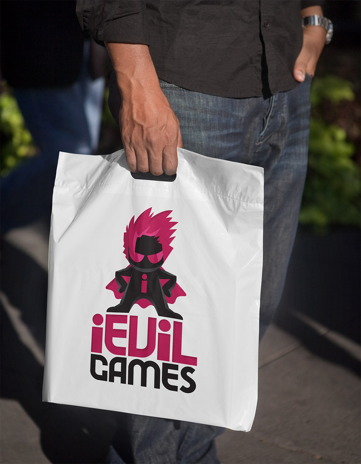
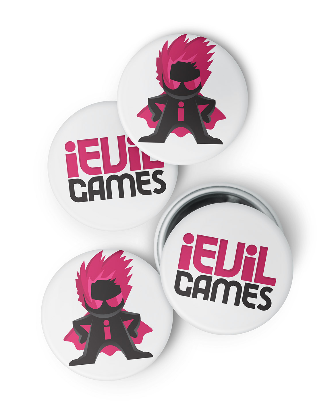
A new logo has been designed for iEvilGames, a games development company from Evil Twin Artworks. iEvilGames develop and publish mobile games and apps for the App Store, Google Play and Facebook, creating a range of games from bright physics games such as GooHoo (which I also worked on too), to realistic strategy simulations such as Victory at Sea. I was approached to redesign the logo.
Problems with the existing game logo design
The games company had an existing logo in place, however, I raised a number of problems which I wanted to fix with the new design:
- Firstly it was far too corporate. Being direct to consumer, the company logo needed to appeal to a games market. I believe a logo design should represent who a business is and what they stand for, but the current logo failed to capture the attitude of the iEvilGames team. The team are young, fun and inspiring, and constantly pushing their capabilities into unknown territory. I wanted to make sure the new logo reflected who they really are as a group of people.
- Secondly, personally, I felt the name was a problem. Using the ‘i’ within the name was clearly an attempt to sound like an apple product. My concern with this attempt to leverage on the apple brand is that it sounds cheap and second rate – to me anyway. Changing the company name at this stage was not an option, so wanted to find a graphic design solution to this ‘problem’.
The final iEvil Games logo
The first area I was keen to solve was the problem highlighted with the iEvil name. I came up with the solution to create a brand character called ‘I Evil’, which I felt could be used as a short way of saying “I am Evil’. This idea removes the direct connection with apple and gives the games company name a unique purpose.
An evil villain character could work well as an identifiable brand feature, but could also potentially one day become a character in an iPhone game (I’d love this to happen!!). I designed the character initially as a black shadow with a pink ‘I’ on its chest. I then added piercing eyes, manga style hair and a cape which really finished the character off to create a unique identifiable character. Simple highlights were added to add depth, and lift iEvil from the screen, but also ensures the character logo works well even on a pure black coloured background.
A bespoke ‘quirky’ typeface was designed to support the character icon, which I created to capture a real sense of attitude, whilst remaining professional in appearance. By keeping a simple colour palette of black together with a piercing vibrant pink, I was able to keep uniformity across the whole design.
The final game logo design captures the brand spirit of the business and targets the audience it’s intended for. I’m confident this new identity will perform well.
If you are a games development company and require a company logo design, please contact Ian Paget for further details.


