After being in business for 1 year, Vpurple approached Logo Geek to redesign their logo to better represent the business, and ultimately create an identity that the two founders were both satisfied with for ongoing growth and success.
Vpurple: IT support and consultancy
Vpurple is an IT support and consultancy business based in Doncaster. Frustrated by the services by 3rd party IT contractors, 2 geeks with a deep passion for technology set up a business because they simply believed they could do better. Creating Vpurple, an honest, reliable, high-quality IT support and consultancy business. With a focus on building long-term partnerships, collaborative working with transparent, easy to understand communication, the business aim to target FTSE 100 organisations with complex problems, start-ups with ambitious plans and everyone in-between.
With competition including JMC, ANS, Xtravirt, ONI and Adapt the business wanted to look approachable and friendly, remaining professional, whilst not looking stuffy or ‘too formal’. The business wanted to look ‘real’ and not a faceless corporate.
The final logo solution
Maximum message using the minimum of means is one of the core strengths of a strong brand. From a design perspective Vpurple certainly offers this potential, however finding the most effective ‘simple’ and clever logo solution was a challenge. I explored various routes, however, the most effective solution was the final designed logo presented below.
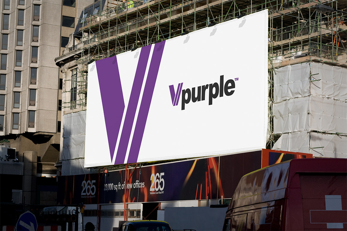
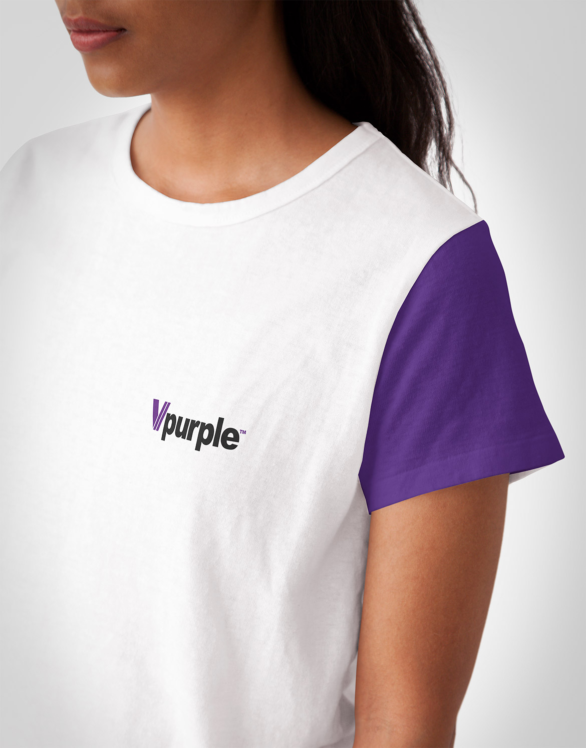
The final logo design is bold, striking and very identifiable, yet remains friendly and approachable. The V icon has been designed to look like two forward slash symbols (//) which gives reference to computing, code and development, yet the two upward pointing lines can also represent two businesses working together simultaneously for ongoing growth and success. The typeface used is simple and timeless, representing simple and easy to understand communication.

![]()
Alternative presented company logo design
During the design phase various routes were taken, with several options presented to the client. One other option was a strong contender in the decision-making process, causing a long discussion between the two founders (which is always great to hear!) – it’s only fair I also show this option here too!
I was very keen to explore the concept of continuous communication between the client and its customers, building on partnerships, as well as represent those who have a deep passion for the IT. An infinity symbol bridged all of this, representing ‘fluid’ communication, reliability, trustworthiness, continuous learning and ongoing partnership. By taking the infinity symbol and modifying to look like a V symbol creates a clever monogram. I also feel the icon can look like an owl, on the lookout for the solution to the problem. The font is custom designed to work effectively with the icon whilst being professional, yet remaining friendly and approachable.
If you’re an IT solutions business also looking for a logo design do not hesitate to get in touch.
![]()