Some exciting news!! I’ve been featured in this months issue of Photoshop Creative (issue 144) in the advanced feature Branding in Photoshop, where they aim to uncover the secrets behind branding projects and the role Photoshop plays in the design industry.
A few weeks ago I was contacted by one of the magazine editors to answer a few questions and provide examples of my work. Quite a few snippets were included in the feature, but for those interested below is the full Q&A.
(It’s worth noting that I was requested to relate the answers to Photoshop where possible, however, I will always personally use Adobe Illustrator for logo design)
Questions for Logo Designer Ian Paget
What do you think makes a good logo? What are your top tips for a designer approaching logo design for the first time?
The most successful logos are simple. They typically have only one concept within them and have been refined and perfected to use the least number of objects whilst keeping the integrity of the idea. Simple logos help the logo to be scalable, memorable and timeless, which are all attributes of a strong logo design.
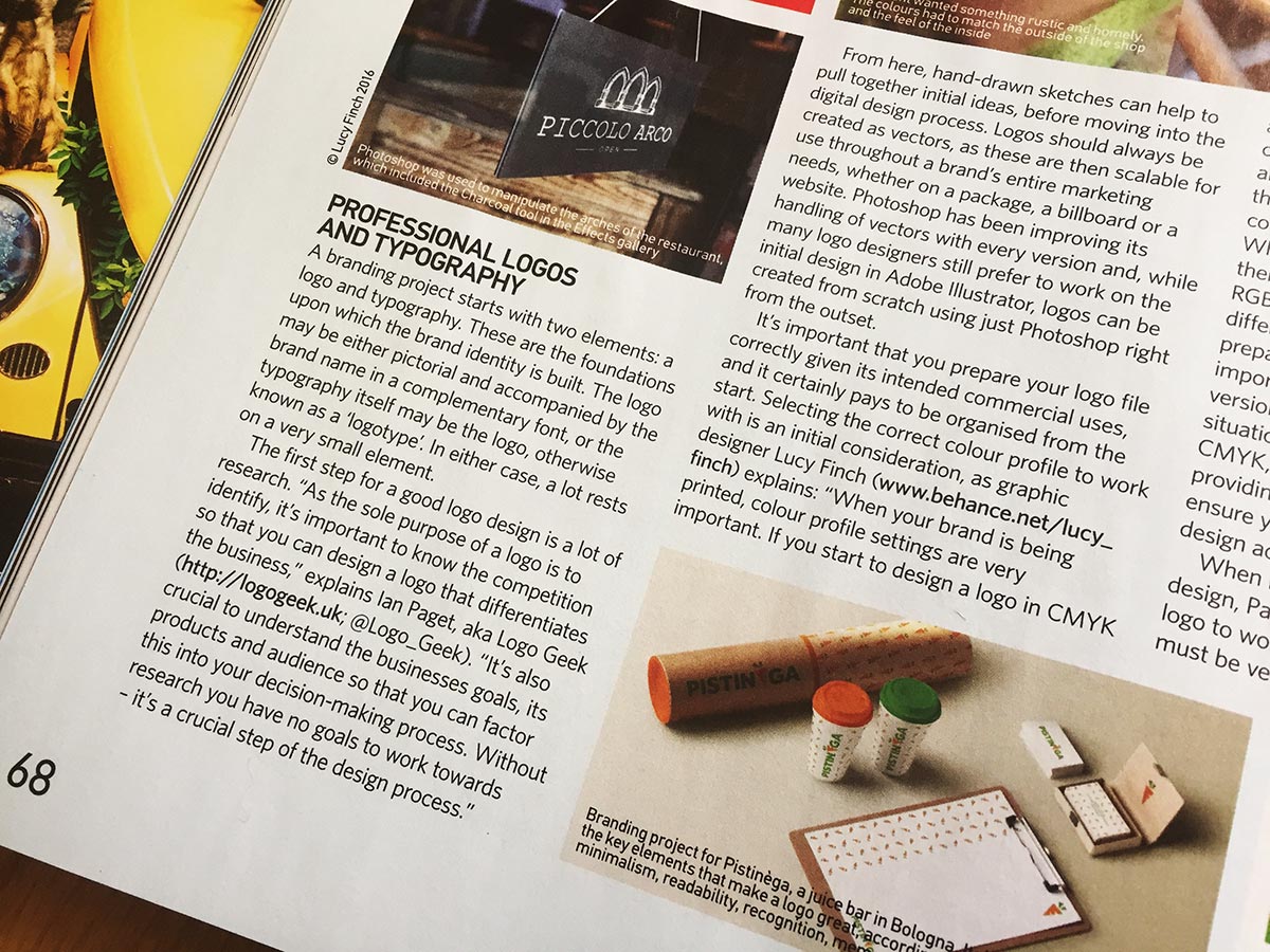
Prior to design, it’s essential that you do your research. As the sole purpose of a logo is to identify it’s important to know the competition so that you can design a logo that differentiates the business. It’s also crucial to understand the businesses goals, its products and audience so that you can factor this into your decision-making process. Without research you have no goals to work towards – it’s a crucial step of the logo design process.
I always recommend starting the design phase on paper. You can quickly throw down ideas, exploring which of your ideas work, and which don’t. I suggest to even sketch down your bad ideas, as happy accidents can happen when you see them on paper.
Once you have strong ideas, start to work them on a computer using scalable vectors. To perfect an idea I get the design down on the screen, then take a copy and refine, and continue to do this until the design can no longer be perfected. I recommend spending some time away from the design before the presentation so you can see the logo with a fresh pair of eyes and refine if necessary.
The below image shows the logo I designed for Rocks & Road, along with notes explaining my design decisions.
![]()
When creating a logo for a branding project, what are the key considerations for ensuring that it works across all different kinds of materials and products?
For a logo to work across every medium the logo must be versatile. To achieve this I design and refine the logo in solid black before applying colour. This also allows me to perfect the overall concept and execution of the design, ensuring it will work well in every situation with or without colour or effects.
It’s important to provide the client with different versions of the logo design for different situations across web and print, for example, CMYK, black, white and Pantone. By also providing supporting usage guidelines you can ensure your client makes the best use of your design across all marketing collateral.
In a practical sense, what do you need to think about when it comes to designing a logo? For example, file size, using scalable vectors, colour profile, saving in layers, using smart objects and adjustment layers, etc.
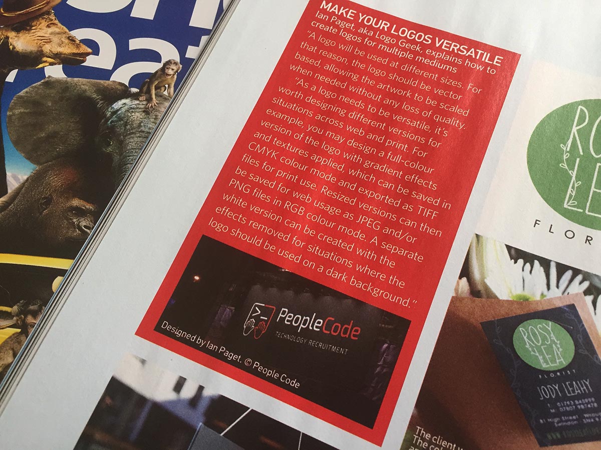
A logo will be used at different sizes, ranging from a favicon, right up to a shop sign or billboard. For that reason the logo should be vector based, allowing the artwork to be scaled when needed without any loss of quality.
As a logo needs to be versatile it’s worth designing different versions of the design for situations across web and print. For example, you may design a full-colour version of the logo with gradient effects and textures applied, which can be saved in CMYK colour mode, and exported as TIFF files for print use. Resized versions can then be saved for web usage as JPEG and/or PNG files in RGB colour mode. A separate white version can be created with the effects removed for situations where the logo should be used on a dark background.
What role does Photoshop play when it comes to designing a logo in a branding project? Please give specific examples of what Photoshop is used for and any essential tools/techniques that you use).
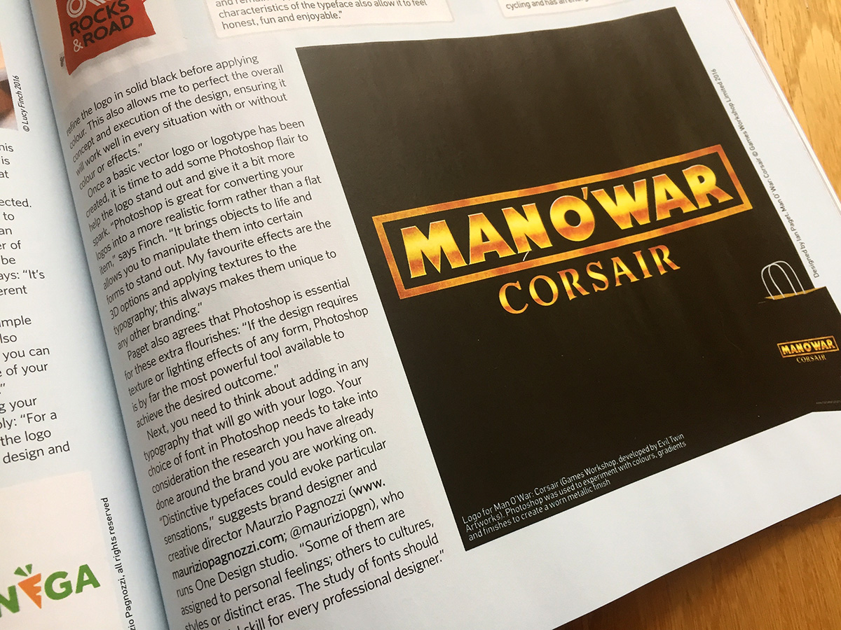
Typically I work in Illustrator for logo design, however, if the design requires texture or lighting effects of any form Photoshop is by far the most powerful tool available to achieve the desired outcome.
I recently redesigned the logo for Man O’War Corsair, a computer game from Games Workshop, developed by Evil Twin Artworks. I felt it needed a worn metallic finish to match the tone and feel of the game. Photoshop allowed me to experiment quickly with different colours, gradients and finishes to get the desired results.
When presenting logo designs I also feel it’s important to present the design in real life use, on a shop sign, a bag or t-shirt for example. Nobody will ever see a logo on a white sheet of paper, so using Photoshop together with stock imagery or photographs you can help your client to imagine how the logo will be used in the real world – this helps to get faster approvals too!
Boxout – working to a brief
Can you explain a little about working to a brief on a logo project? What sort of information would the client typically provide, how much personal input do you get to put in and what are the key tips you have for working to a client’s requirements?
Most clients need support to create a concise logo design brief. For that reason, I always create my own. I ask questions covering areas of the business & its brand including its vision, mission, products, competition and audience.
Using the collated information I prepare a list of objectives that I use as a reference during the design phase and final presentation. I get the clients approval on this before proceeding, ensuring they add any expectations. By doing this I remain in control and can encourage the client to review the designs strategically.
As an example, People Code are a specialist recruitment agency for web developers who promise to match the right talent with the right jobs. I designed an icon which represents a developer writing code, whilst simultaneously looking like 2 sides coming together – On the left the recruitment agency with talent, and on the right the company with the vacant position.
So there we have it! Ok, only a small amount of my interview was included in the magazine, but I’m proud nether-less to be there in print, along with a few other designers I admire! Woohoo!
Got any questions about anything mentioned? Find me on twitter (@Logo_Geek), and let’s get chatting logo design. If you’re looking for logo design tips, make sure to take a look at my free eBook, 50 Logo Design Tips from the Pro’s, which features top tips from some of the world’s best and most influential logo designers.