It has been an exciting few months for me. Last month I was invited to join the jury for Logo Lounge book 9, and now I have been confirmed as a media partner, and judge for the 2015 Transform Awards Europe. This is the second time I’ve been involved with the awards, and I’m still just as excited about it as I was the first time round. You can read my first experience judging the transform awards here.
A Global Celebration of Brands
The Transform Awards is a global celebration of brand development, reputation management and rebranding, that recognise best practice in corporate, product and global brand development work, with categories that focus on strategy, execution, content and evaluation.
The submitted entries for 2014 were ‘outstanding’, with some big names in the mix. The submissions that stood out were the ones who took on their client’s challenge, had a clear strategy in place, then exceeded expectations.
Below I have listed a few of the entries that not only stood out but also had a lasting impact on me as a graphic designer.
The Best Identities of the 2014 Awards
Brand Identity Design for Schillings
Across the board, the single entry that left me literately blown away was the brand identity redesign for Schillings, by Brand Consultancy Goosebumps, which won the gold award for best visual identity from the professional services sector, among others.
The redesign was required to support the companies move from a law firm to a multidisciplinary business dealing with all aspects of reputation defence. You can read more about the update in an excellent blog from The Drum ‘Schillings unveils new brand identity with Goosebumps‘
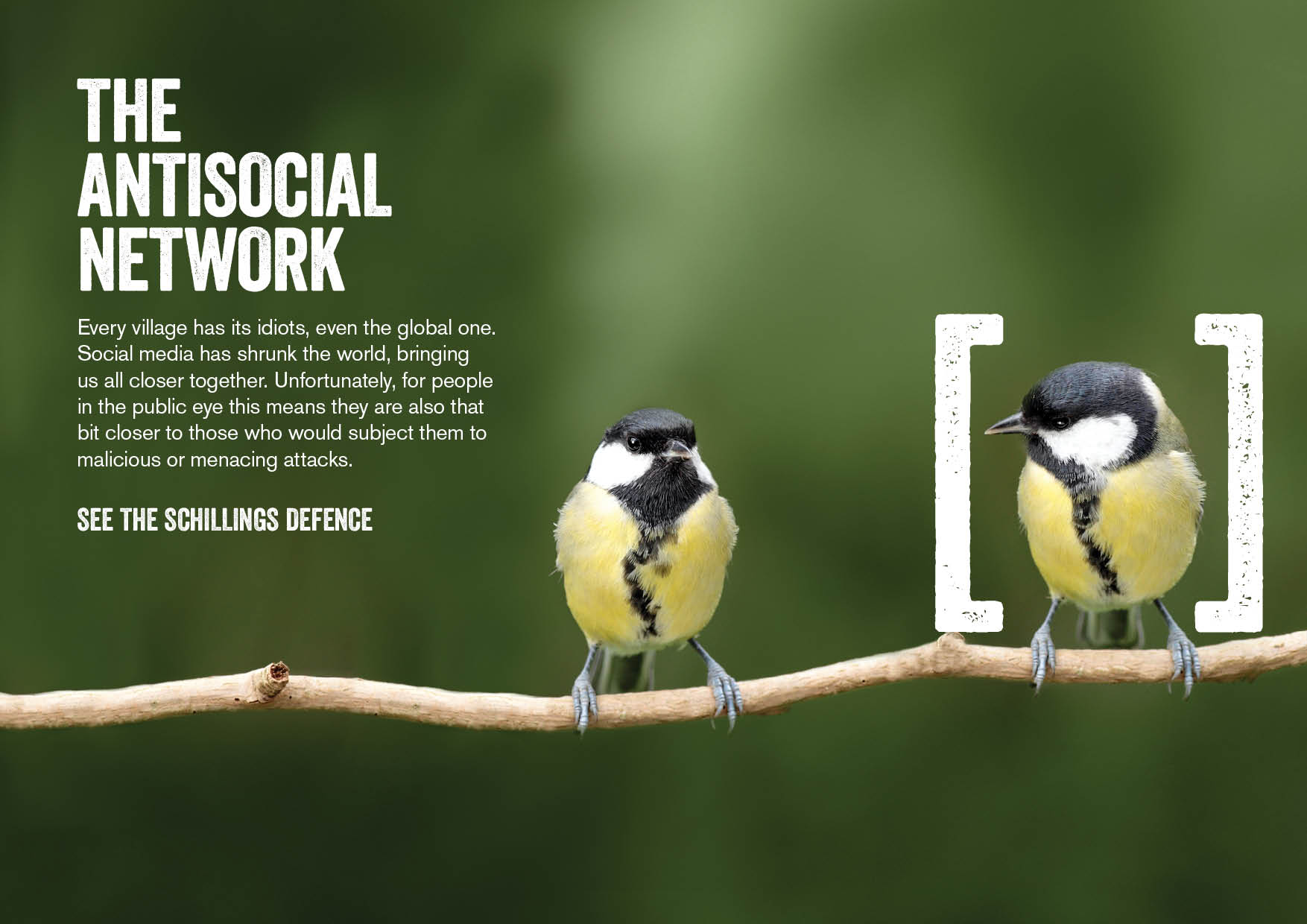
The team was faced with a very complex brand repositioning situation, but they exceeded my expectations of a solution and came up with a very intelligent visual communication system and strategy.
“The new identity uses a pair of square brackets for ‘containment of the threat’, while headlines such as ‘The Anti-Social Network’ and ‘The Friends in the Wrong Places’ look to promote issues such as internet trolls to supply chain risk.”
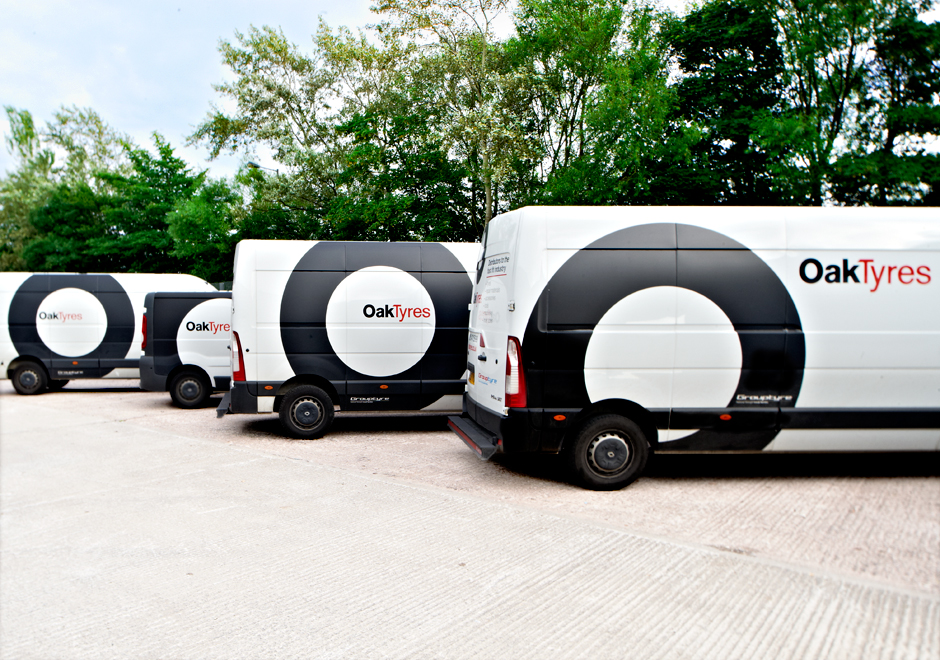
Logo Design for Oak Tyres
Is it possible to make tyres ‘cool’? Most would think no, but the team over at Detail proved it’s possible with its identity design for Oak Tyres, which won gold for Best visual identity from the industrial and basic material sector.
I’m a big fan of logo design which has maximum message using the minimum, and this identity certainly proves that statement to be true. An adaptable thick black circle is incredibly simple, but a powerful identity when applied to all brand touch-points. Click here to check out the brand video to see the full story behind the identity.
Visual Identity for ITV
The one piece of work which stole the show was the identity redesign for ITV, which won a massive 6 awards in total, including Best implementation of a rebrand, and the best prize of the night; the Grand Prix for excellence in rebranding.
The challenge faced was tough, but the strategy was well thought out, the work was well designed, and well implemented too across web, print and video. It was by far the best of the transform awards, but possibly the single best piece of identity design work of 2013. The ITV internal design team did an outstanding job, and continue to do so. Check out the video below for an overview of the identity design project.
If you’d like to know more about the ITV rebrand, check out this blog post: ITV launches rebrand on air and online.
How can you enter your design work?
For more information on how to enter, tips and advice visit the Transform Awards website.
If you get your entry in by the 4th November, you receive £100 from your total entry cost. The final deadline for entries is 2 December 2014.
I can’t wait to see the entries early next year! Exciting times.