I was recently contacted by Miho Aishima, a very talented graphic designer who specialises in brand identity design, to join her to celebrate the work of women graphic designers to help promote the launch of the exhibition; A+: 100 years of graphic communication by women‘ at Central Saint Martins in London.
In the UK women outnumber men by up to 70% to 30% on graphic design courses. In the graphic design industry, women make up 44%. But this level of female presence is not reflected in the graphic design arena, with most books and blogs focusing on the well-known male designers (even my own). I noticed this situation in the book Graphic Design Visionaries which includes only a handful of female designers (which it fairly noted), so I’m keen to support this cause to help change the situation ongoing.
To help celebrate, and to raise awareness I’ve asked Miho to collate and write about the logo designs of female designers.
Logo design by female graphic designers
A well-crafted logo can be the jewel in the crown of a strong brand identity. It captures the essence of a brand in a few small shapes or letters and can often be deceptively simple, yet it can take hundreds of hours of painstaking craft before it reaches its final form. In its lifetime, a logo can appear countless times on a wide variety of applications from digital to print, including 3D printing, whilst also appearing in either colour or black and white.
Throughout history, there have been many truly iconic logos designed by women. Some of these have been used to represent powerful brands and have been embraced by many across the globe. Others have added a touch of elegance or unexpected humour to an otherwise sensible brand. The examples outlined below are a selection that I felt have remained potent throughout time.
1925: Chanel logo by Coco Chanel
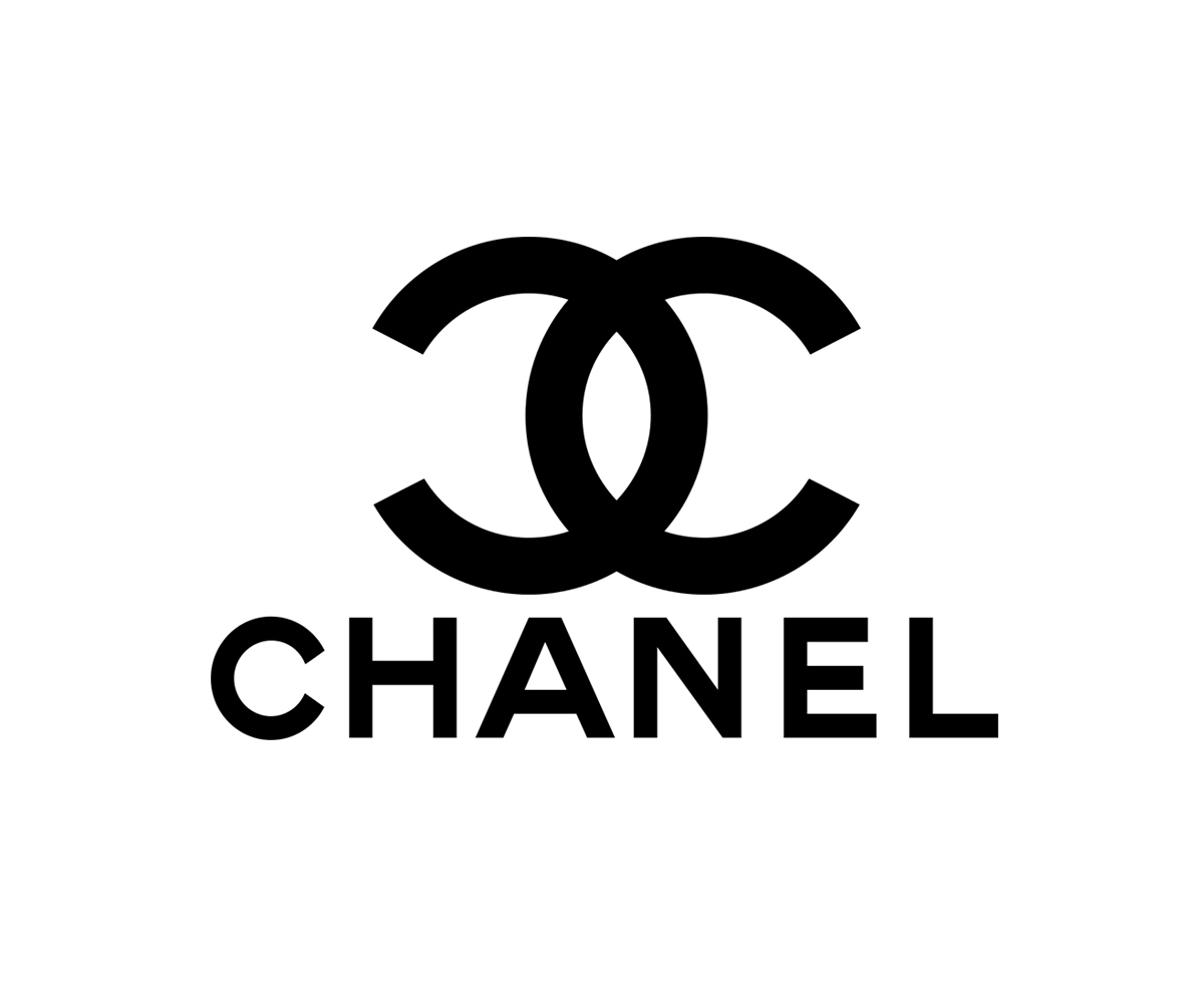
Although Coco Chanel wasn’t a graphic designer by trade, she certainly understood the power of image and communication to reach her target audience.
There are conflicting stories about the origins of the Chanel logo: the ‘double c’ design was based either on the stained glass windows of the Château Crémat in Nice or on the Aubazine monastery near where she grew up, or possibly even drawn from a combination of her initials and those of her co-founder Arthur Capel.
Regardless of its beginnings, the simplicity and boldness of the logo make it one of the most recognisable fashion brands in the world.
1971: Nike logo by Carolyn Davidson
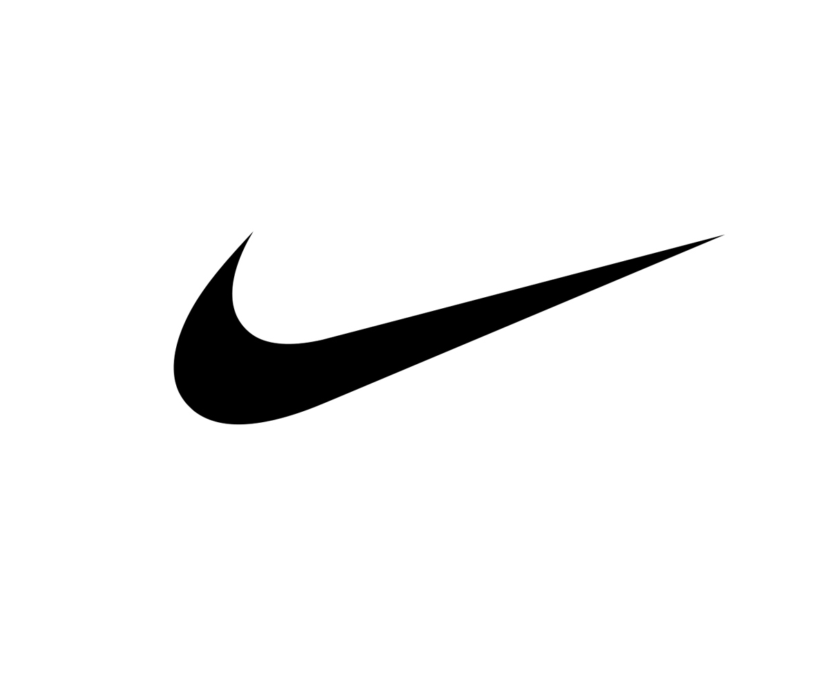
The eponymous swoosh was designed by graphic design student Carolyn Davidson back when she was a student at Portland State University where Nike founder Phil Knight was teaching.
Phil Knight said at the time,’I don’t love it, but it will grow on me.’ And grow Nike did, now valued at number 18 on Forbes’ world’s most valuable brands list at $86.2 million. Although this is not just down to the logo, it certainly had its part in making Nike one of the world’s most recognisable brands.
Crane & Co logo by Louise Fili
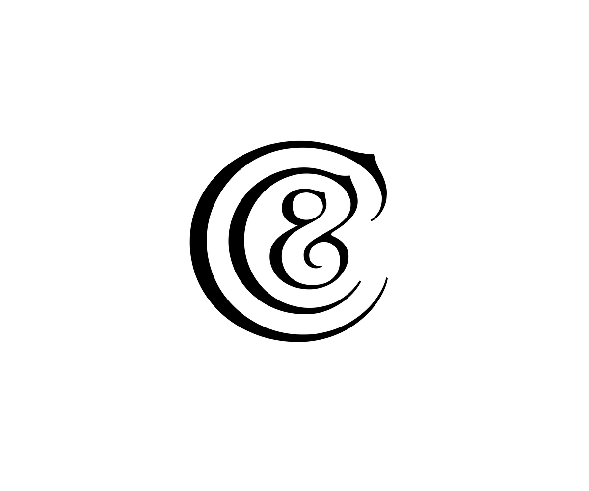
Louise Fili’s logo designs are really elegant. I am not sure when this logo for US paper mill Crane & Co was used, but I really like the way the Cs nest around the ampersand. It is apparently based on the flowing river where the mill was located. I think it’s a really clever solution and lovely to look at.
2000: Tate Logo, directed by Marina Willer

Whilst Marina Willer was at Wolff Olins, she creative directed the Tate brand identity development with chairman Brian Boylan. I am not sure exactly how many variations of the logo exist but they encompass four types: standard, blurred, faded and halftone, which appear to fade in and out of focus.
Nowadays, dynamic brand identities are almost the norm, often including multiple variations of the logo and other identity elements. Back in 2000, this was ground-breaking.
2001: High Line logo by Paula Scher of Pentagram
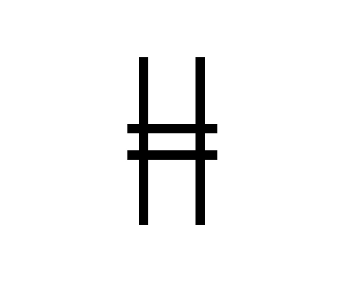
Paula Scher has designed many inspiring brand identities with typographic logos. The Highline is a 1.45-mile-long park in New York built on a disused rail line elevated above the ground.
What I loved about the logo is that the very simple mark is an ‘H’ that doubles as the rail line. The condensed type also mimics the narrow passage.
2013: Whitney Museum logo by Marieke Stolk, Erwin Brinkers and Danny van den Dungen
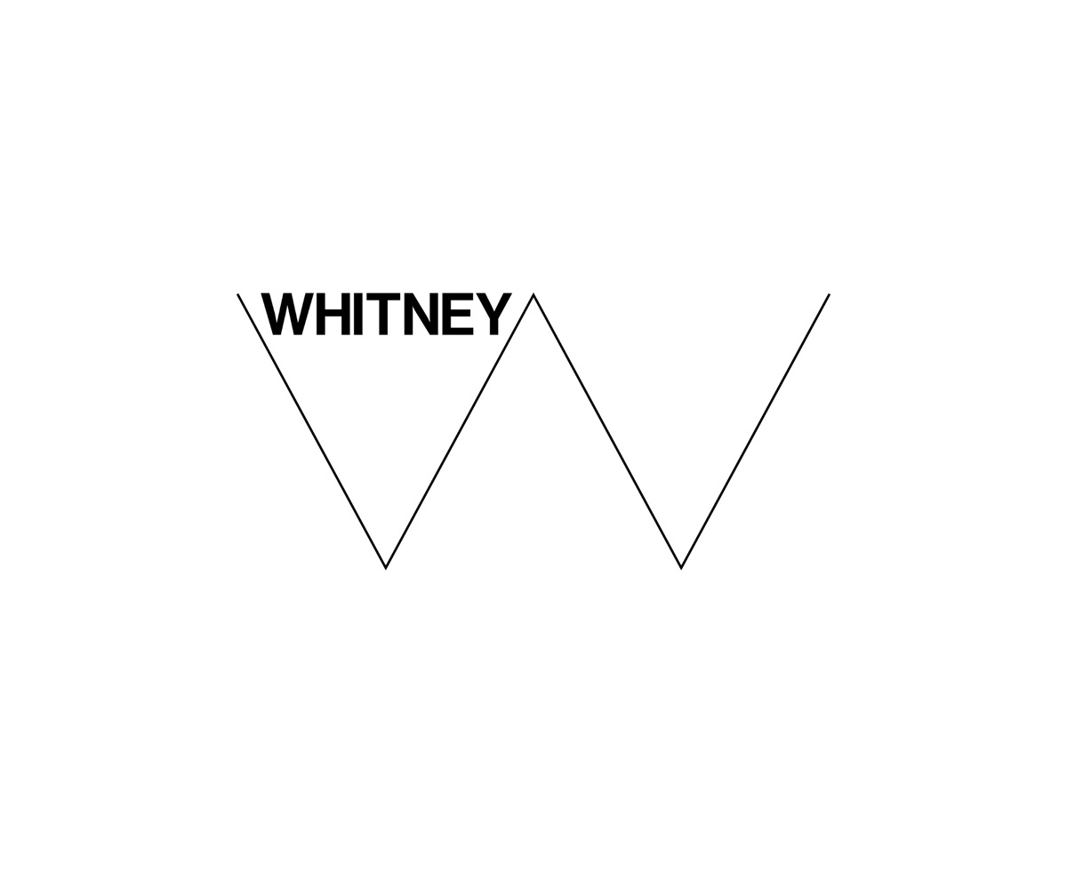
Stolk, Brinkers and Dungen of Experimental Jetset worked collaboratively on this project. Titled the ‘Responsive W,’ it is simple and dynamic at once. It zig-zags into different depths depending on the application but is instantly recognisable as a ‘W’ across all of them.
2015: Hill and Friends logo by Georgia Fendley of Construct
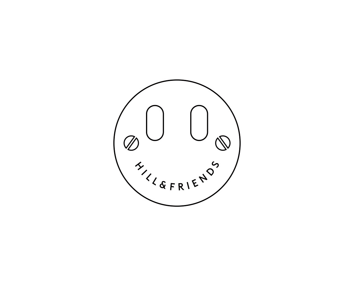
Fashion often seems to take itself too seriously, but this logo for Hill and Friends is the opposite.
Conceived by Georgia Fendley of Construct, it is a smiley face logo which also serves as the metal clasp on all of its £500+ handbags. This means when you go to close your bag, the eyes which are the metal screws wink at you when they rotate. I think this definitely adds a bit of humour in an elegant way.
Help us raise awareness of women graphic designers
This blog features just a few examples of outstanding logos designed by women graphic designers, but there are much more. To coincide with the opening of ‘A+: 100 years of graphic communication by women‘ at Central Saint Martins, we would love to hear your thoughts on others.
Share images of work by outstanding women graphic designers with us on Twitter simply by posting and hashtagging them with #CelebrateWomen. Let’s celebrate the work of women graphic designers!
For more about Miho and her brand identity design work visit www.aishima.co.uk.